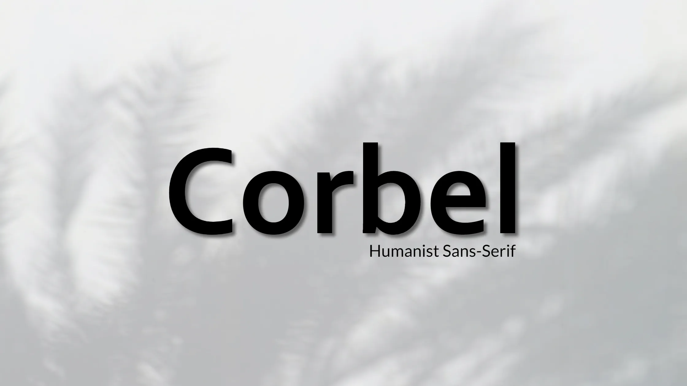


Hey there! Let me tell you more about Corbel font, which is one of the most elegant and legible sans-serif typefaces.
Created by renowned typographer Jeremy Tankard, Corbel is a versatile font that has a humanist touch, making it an excellent choice for both print and digital designs. It’s known for its unique letterforms, which are open with soft, flowing curves, giving it a clean and modern appearance.
Corbel is designed to be legible and clear at small sizes, making it perfect for body text in books, magazines, and websites. At larger sizes, the details and style of the shapes become more prominent, highlighting the elegance of the font.
The font’s italic style is a true italic, with influences from serif fonts and calligraphy. Its many letters have a tail pointing to the right, adding a touch of elegance to any design. Corbel is slightly more condensed than average, which gives it a modern and sleek look.
One interesting fact about Corbel is that it renders numbers as text figures, also known as lowercase or old-style numerals. This is an unusual choice for sans-serif typefaces, particularly those designed for display on a screen. However, it’s an excellent choice for integrating figures into running text.
Corbel is part of the ClearType Font Collection, which also includes other popular fonts like Calibri, Cambria, Candara, Consolas, and Constantia. All of these fonts were designed to work well with Microsoft’s ClearType text rendering system.
In conclusion, if you’re looking for a legible and elegant sans-serif typeface, Corbel is an excellent choice. Its unique letterforms and humanist touch make it a versatile font that can be used in a wide range of design applications. Just remember that the license for this font is for personal use only!

