
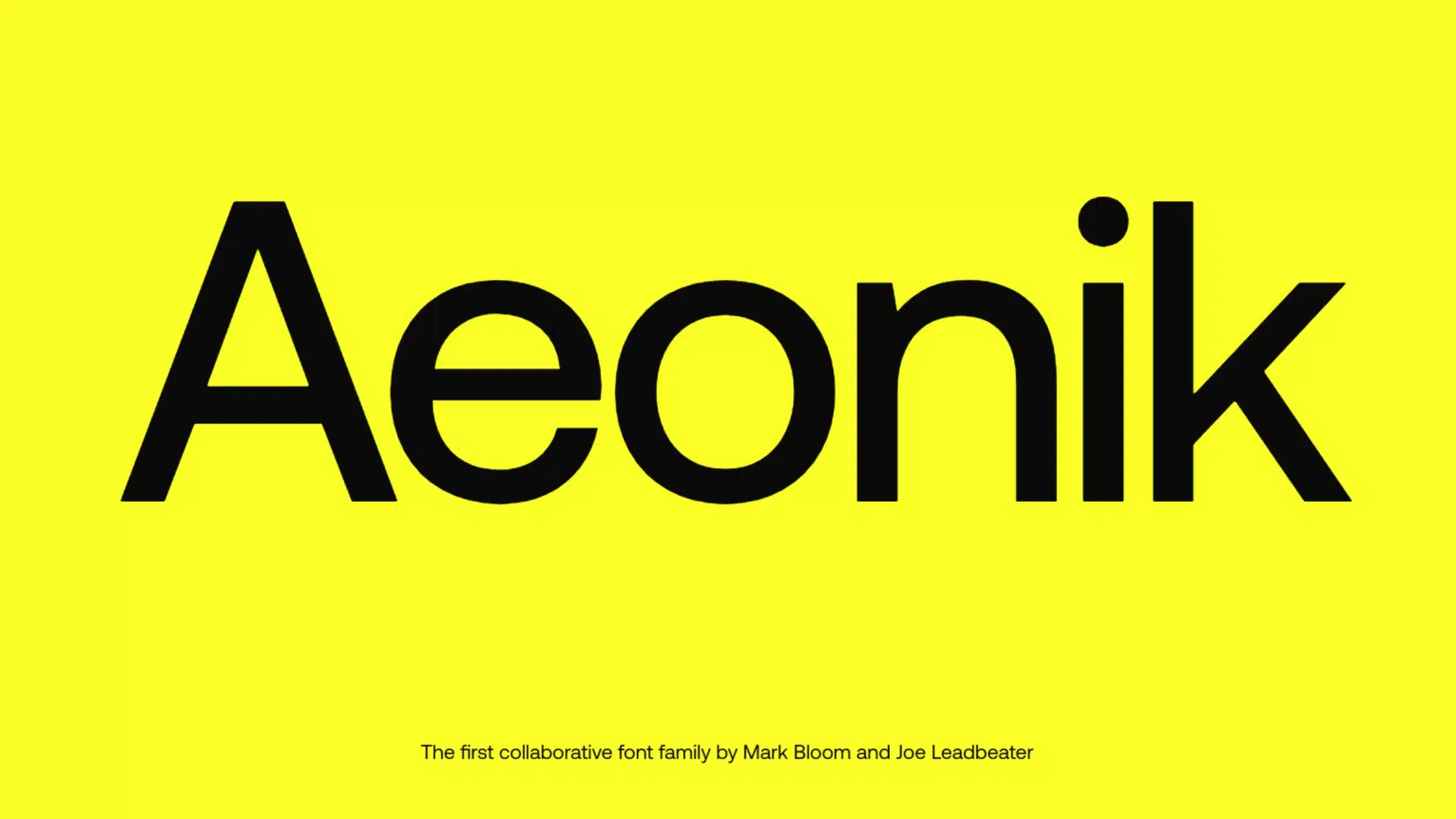

Aeonik, a meticulously designed sans-serif typeface by Mark Bloom and Joe Leadbeater, is a beautiful creation from the CoType Foundry. Combining elements of old Grotesks and geometric shapes, it presents itself as a modernist neo-grotesk with a geometric skeleton.
This font family is wider than a typical grotesk. But, it is slimmer than a typical geometric sans. Also, It strikes a perfect balance for both display and text.
Aeonik Font Download
Features of Aeonik Font
This typeface set features seven broad weights to provide just the proper hierarchy. The designers’ craft is evident in how they’ve balanced these weights proportionally. They made sure that one weight could sit next to another.
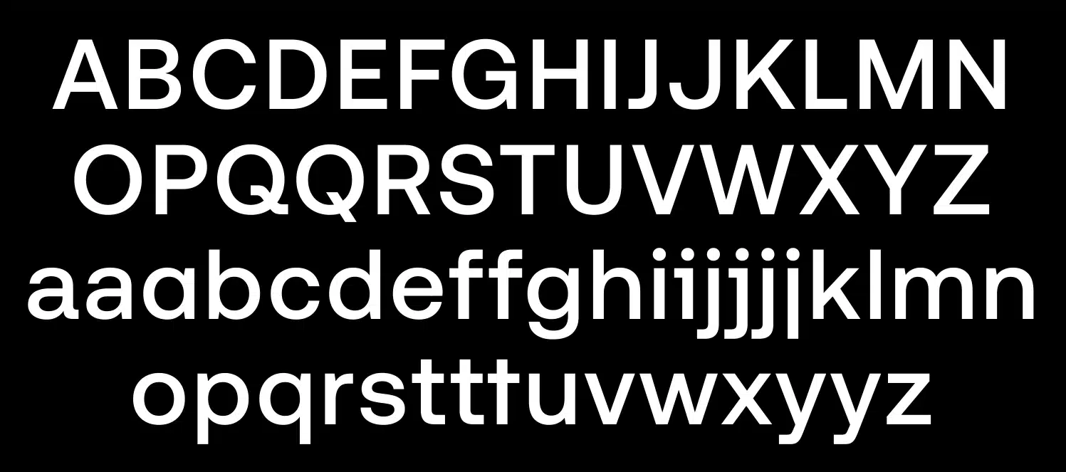
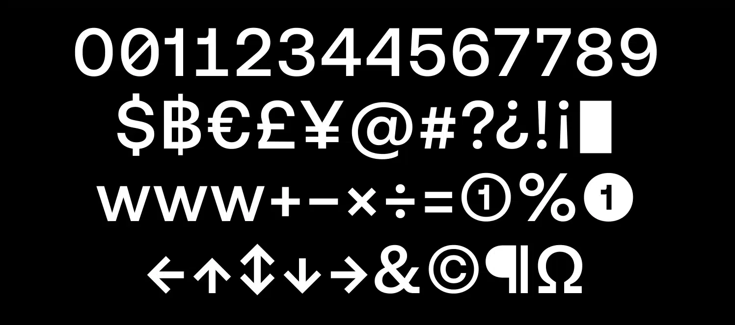
Aeonik font has a vast character set for each weight. It includes all Western European diacritics, punctuation, numbers, and old-style.
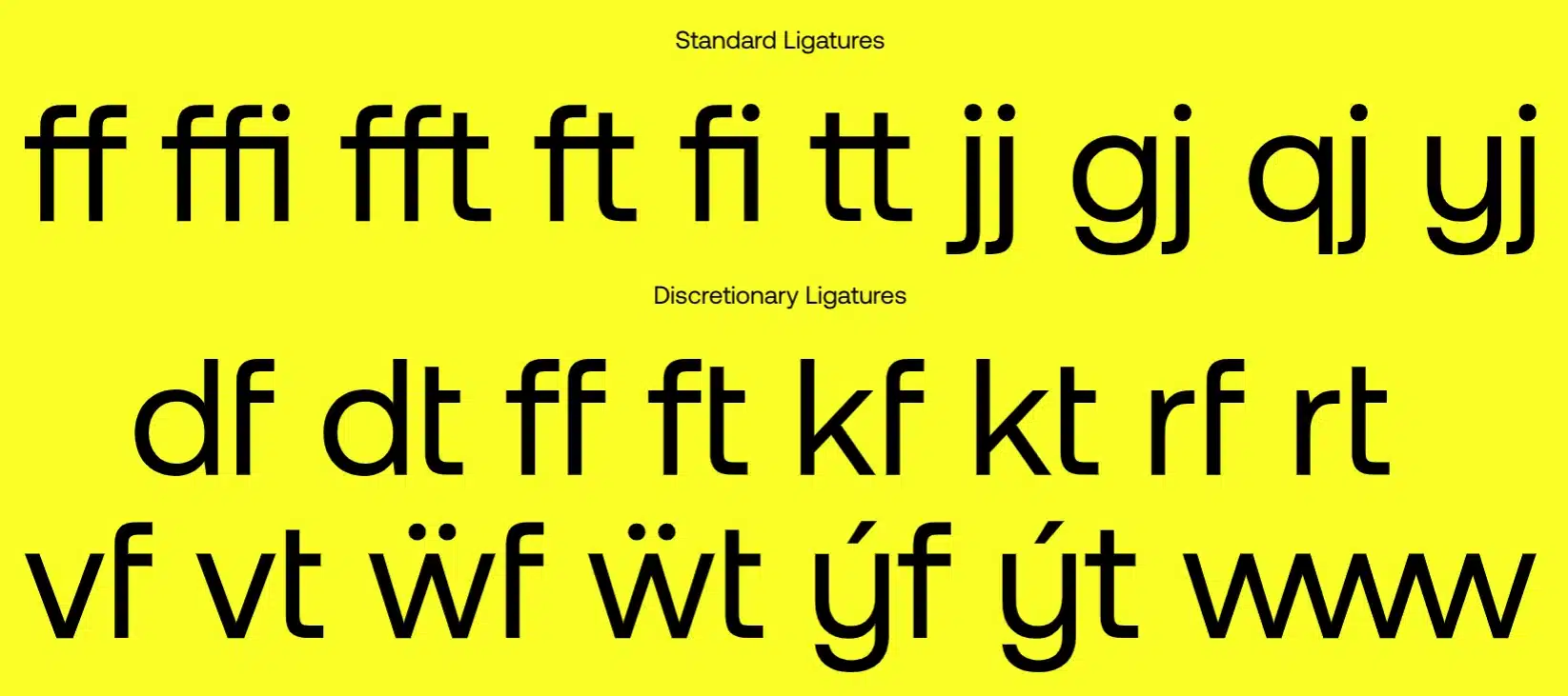
The alternate and numeral OpenType features in Aeonik offer multiple subsets, including caps alternates, proportional styles, and stylistic sets. The italics look oblique. But, the curves and diagonals have been fixed. This keeps their weight true to the upright ones. Slightly thinner stems allow the appropriate stress that italics provide within the text.
Aeonik also supports Cyrillic and Greek. It offers flexibility in font pairings, too. This boosts its use as a workhorse in typography. With this typeface, you’re investing not only in a font but also in a robust and flexible aesthetic.
Where Can You Use the Aeonik Font?
Aeonik’s flexible design makes it an exceptional choice for many uses. It balances the demands of both display and text well. It emphasizes clarity and readability. This makes it ideal for digital interfaces like websites and mobile apps, where legibility is key.
Aeonik can support a broad range of weights, from light to heavy. The differences in weight provide a hierarchy. This makes Aeonik well-suited for editorial and publishing work.
Aeonik’s mechanical positions are great for branding and corporate identity. They are paired with stylistic alternates and proportional, old-style numerals. This combination offers a creative playground for designers.
The meticulous care ensures that diagonals are fixed and weights stay true to their upright counterparts. This care keeps logos, headings, and corporate reports looking professional and coherent.
Also, Aeonik pairs seamlessly with many fonts. This adds to its usefulness as a workhorse in typography. It makes it a strong and flexible choice for designers. Whether it’s for digital marketing material, UX/UI design, or creative projects, Aeonik not only brings an aesthetic quality but also ensures the practicality of use across various mediums, including both print and digital formats.
Font License
This font is free for personal use. For commercial use, you can download Aeonik from CoType Foundry’s website.
So, if you want to elevate your work with a font that borrows from modernism and the harmony of geometric skeletons, Aeonik is your go-to typeface. Its unique features and broad range of applications make it a fantastic choice for various creative projects.
What is the easiest way to install this font on my device?
There’s no reason to be worried. Please follow our directions.
You may also find out more about typography and how it is classified from here.
Please do not hesitate to contact me if you have any questions. Thank you very much!


Leave a Reply