

Imagine you’ve spent hours crafting the perfect resume: meticulously listing your skills, experiences, and achievements. You think you’ve done everything right, only to be left wondering why hiring managers aren’t giving you a call in response to your job applications. You ask yourself, “Could it be that the font I used is driving them away?” A resume is not just about the content; the presentation, including the typeface, should not be underestimated.
To increase your chances of getting hired, it is important to have a professional and easy-to-read resume. Choosing the right font is crucial for achieving this. In this article, we will explore how to select fonts that best represent you and enhance your chances of landing your ideal job.
Importance of Font Selection in Resumes
The importance of font selection in resumes cannot be overstated, as it greatly impacts the overall impression you make on potential employers. A well-chosen font conveys professionalism and readability, demonstrating your attention to detail and ability to organize information effectively. Additionally, certain fonts are more compatible with Applicant Tracking Systems (ATS), ensuring your resume can be easily processed and reviewed.
In general, classic fonts such as Arial, Calibri, and Times New Roman are popular choices for their legibility and versatility. However, your font choice may vary depending on the industry and the role you’re applying for. Opting for a unique font, while maintaining readability, can help you stand out in more creative fields. Ultimately, selecting the right font contributes to a polished and professional resume that successfully showcases your skills and experiences.
Tips for Choosing the Right Font Size for Resumes
When it comes to selecting the ideal font size for your resume, readability is key. Aim for a font size between 10 and 12 points, ensuring that the text is easy on the eyes and skimmable for hiring managers and applicant tracking systems (ATS). The font type you choose also plays a significant role in presenting a clean and professional look. Classic fonts, such as Arial and Times New Roman, are highly recommended by experts for their readability and ATS compatibility.
In addition to stylistic details, consider the industry you’re applying to and remain mindful of your resume’s overall appearance. Avoid overly stylized or non-standard fonts, as they might not be well received by an ATS or human reader. Remember, the main goal is to create a resume that showcases your skills and experiences in a clear, concise, and visually appealing manner.
How Font Style Impacts Readability and First Impressions?
The font style used in your resume plays a crucial role in its readability and the first impression it creates on potential employers. Choosing an appropriate font ensures that your resume is easy to read and highlights your professionalism, helping you stand out from other applicants. Serif and sans-serif fonts, like Arial, Calibri, and Times New Roman, are great options for resumes because they are clear and elegant.
To grab employers’ attention, choose a font that is both attractive and easy to read since they often go through resumes quickly. The font style you choose for your resume can significantly impact its readability and the first impression it creates on potential employers. A clean, simple font ensures that your resume is easy to read, thereby increasing the chances of grabbing the attention of hiring managers. Serif and sans-serif fonts are the most popular choices for resume writing since they offer a professional look that doesn’t distract from the content.
When selecting a font, it’s essential to ensure it’s also easily readable on mobile devices, as many recruiters review resumes on-the-go. Using a mobile-friendly and easy-to-read font can improve the image you present to potential employers and make their experience better. Remember, a well-chosen font style can go a long way in making a strong first impression and securing an interview opportunity.
Stand Out with These Top 8 Resume Fonts
Standing out from the crowd is essential when it comes to your resume, and choosing the right font can make a significant difference. To ensure that your resume remains both professional and eye-catching, consider using one of these top eight fonts:
Calibri Font
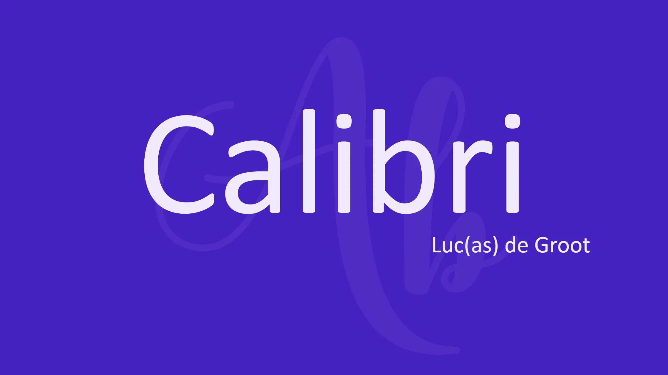
The Calibri font has become a popular choice for resumes as it exudes a professional and modern look. This clean, easy-to-read font helps your resume stand out among others while still maintaining a crisp and polished appearance. Thanks to its excellent spacing and readability, Calibri is the perfect choice for creating an appealing and easy-to-navigate document.
Applicant Tracking Systems (ATS) can clearly decipher the Calibri font, ensuring that your resume isn’t overlooked because of technical issues. Furthermore, this font prints well, making it ideal for physical copies of your resume too. If you want to leave a lasting impression on potential employers, consider using Calibri to convey a fresh and contemporary vibe.
Cambria Font
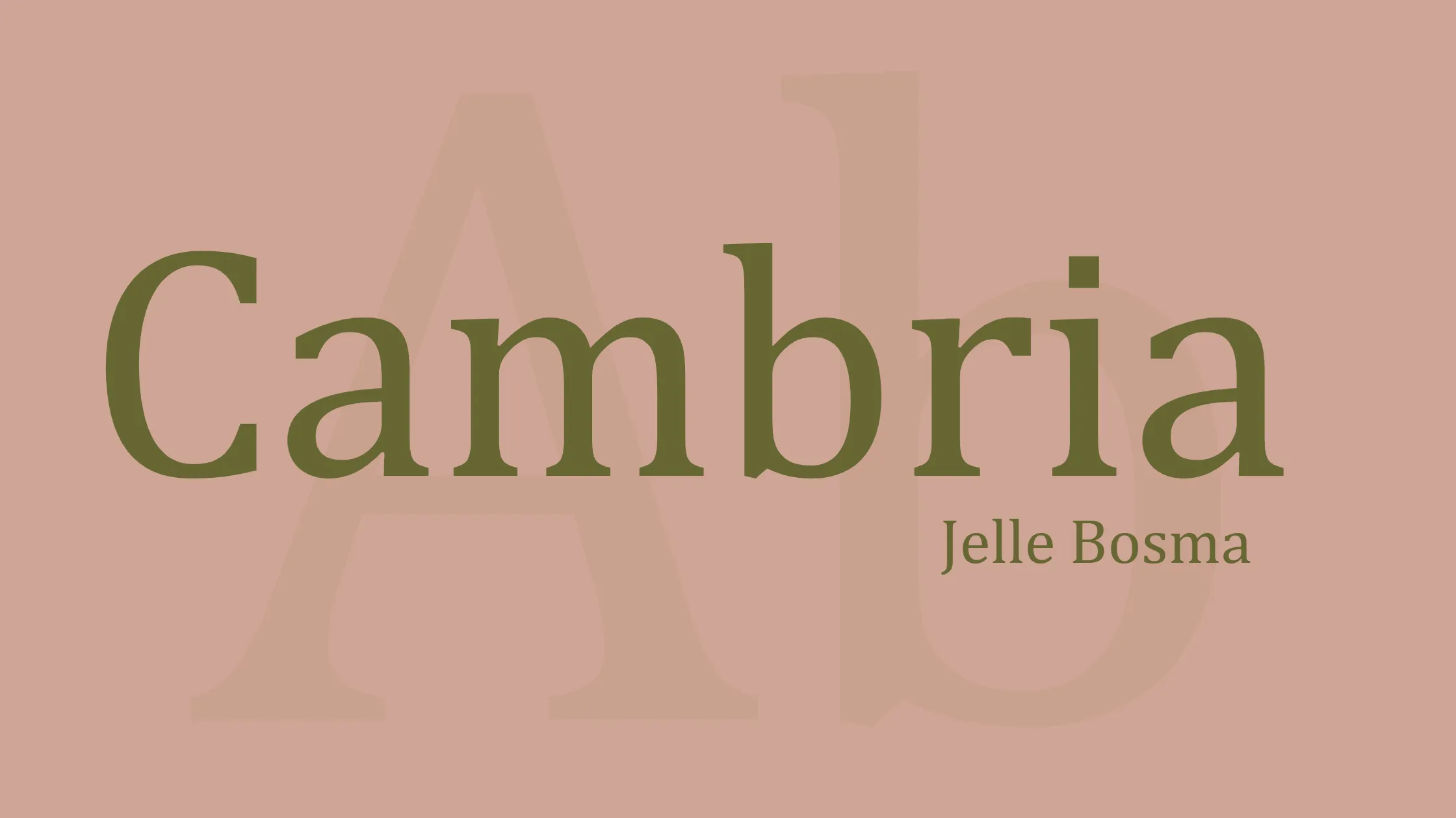
Cambria is a popular font choice for resumes due to its modern and professional appearance. Designed by Microsoft in 2004, this serif font was specifically created to ensure readability on screens, making it a perfect option for resumes submitted electronically. With its blocky design and squared full stops, Cambria projects a sophisticated yet approachable vibe.
It is important to note that Cambria may not be available on all devices, such as Macs. In this case, the font can be replaced by metric-compatible alternatives like Caladea. Overall, Cambria remains a tried-and-true option for those looking to create a resume that is both eye-catching and easy to read.
Helvetica Font
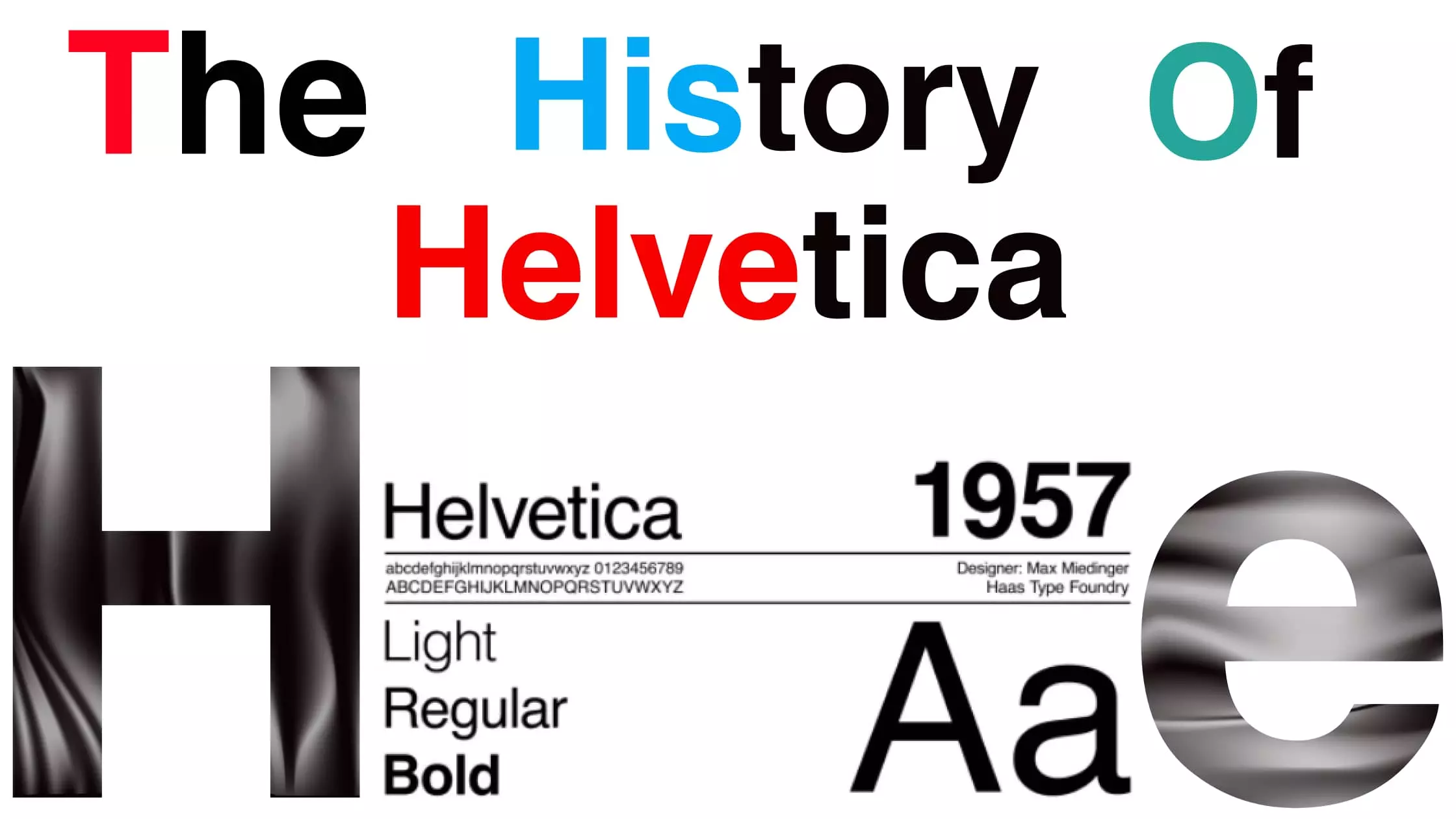
The Helvetica font is a popular choice for resumes due to its clean, modern, and professional appearance. This font is a sans-serif that is easy to read and looks great, making it a top choice for communicating information in a clear and concise way. Employers and recruiters prefer resumes in Helvetica font. This is because its simplicity and clarity help them focus on the content instead of being distracted by fancy typography.
Use a consistent font size of 12–16 points and avoid using bold or italic styles too much when using Helvetica on your resume. This will help emphasize important information and present a professional look. This will ensure that your resume remains visually appealing and easy to read, while also helping you make a great first impression on potential employers. Overall, choosing Helvetica as your resume font can contribute to a polished, professional, and eye-catching presentation that sets you apart from the competition.
Georgia Font
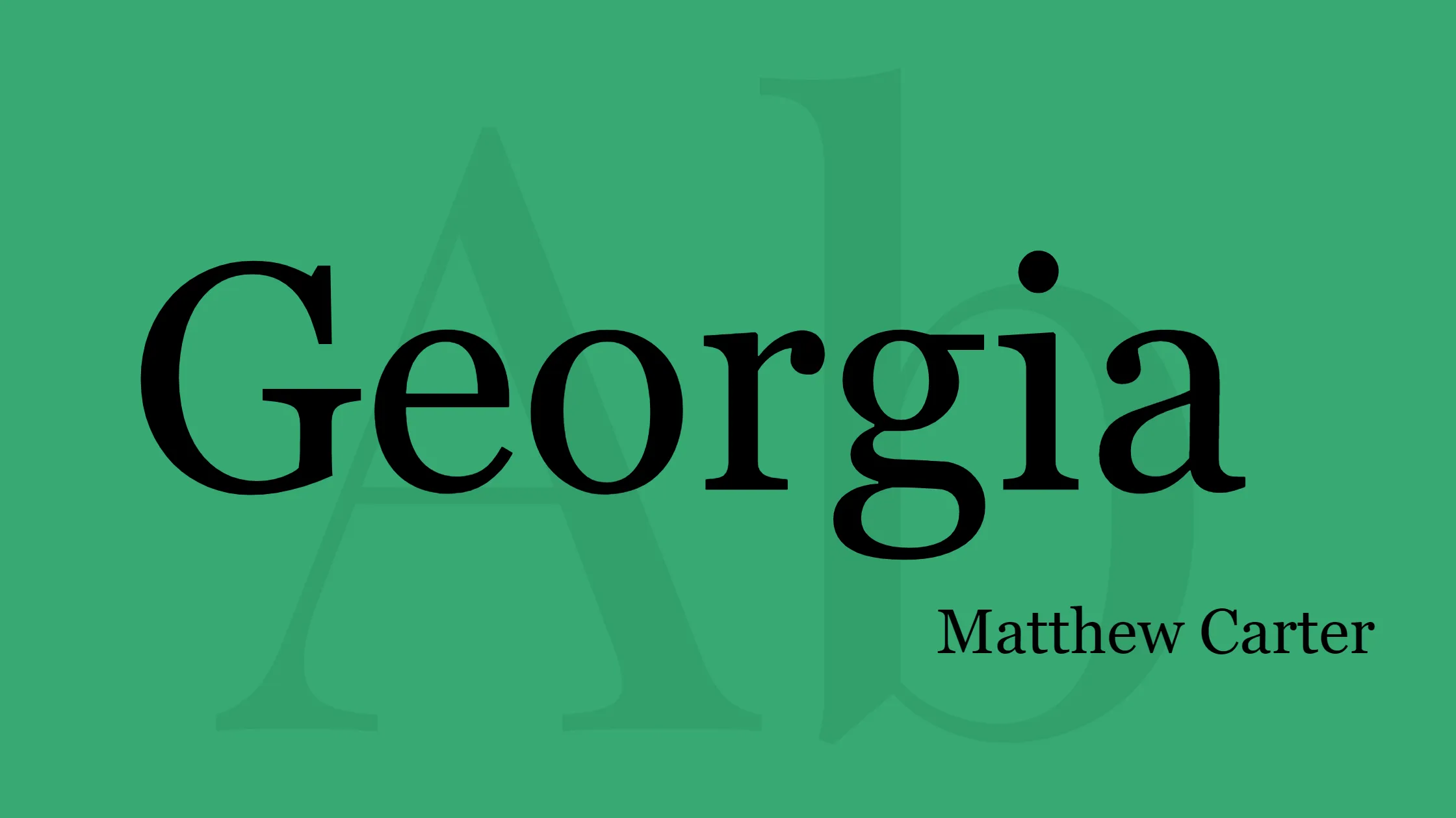
The Georgia font is a highly popular choice for resumes due to its excellent readability and consistent performance across various platforms. Designed specifically for the internet in the 1990s, it aimed to suit all screens and resolutions. This adaptability makes Georgia an ideal option for those who want their resumes to leave a lasting impression on recruiters and hiring managers.
Widely used by prestigious publications such as The New York Times, the Georgia font has earned a reputation for conveying professionalism and elegance. Its timeless design ensures that your resume doesn’t appear outdated, even in today’s rapidly evolving job market. Altogether, Georgia font is a reliable, stylish, and accessible choice that can help you stand out from the competition.
Verdana Font
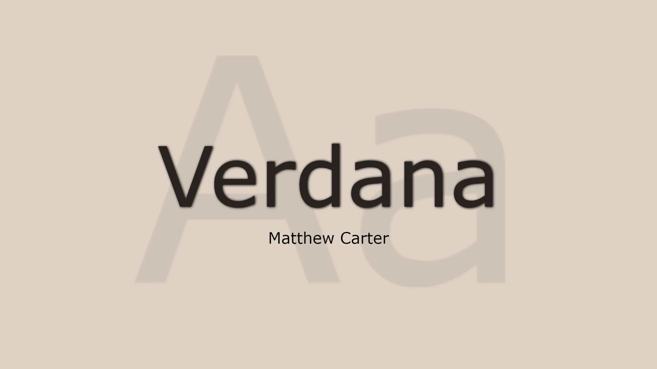
The Verdana font is a highly recommended choice for creating resumes that stand out among the crowd. Matthew Carter designed this sans-serif font in the 1990s for Microsoft with the purpose of ensuring readability on computer screens. It is suitable for digital and print resumes.
One of the many benefits of using Verdana for your resume is its clear and clean appearance. Your resume has an easy-to-read font and enough space between the lines. This helps recruiters and hiring managers to quickly scan through your resume. Additionally, Verdana is widely available on most devices and platforms, ensuring that your resume retains its formatting and style regardless of where it’s opened.
In summary, Verdana is an excellent choice for a resume font due to its readability, accessibility, and professional appearance. Using this font in your resume design can boost your chances of grabbing the interest of employers and getting a job interview.
Garamond Font
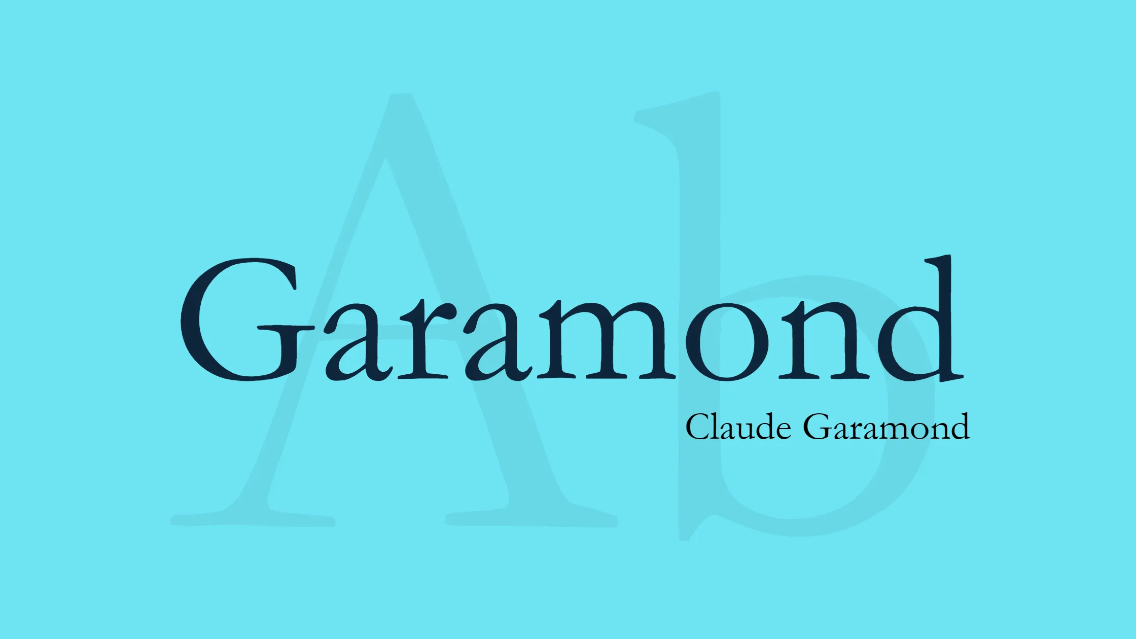
Garamond is a classic, elegant option for those looking for the perfect font for their resume. Although Garamond is a classic serif font with origins in the French Renaissance, it is still a great choice for resumes due to its timeless appeal and many digital versions.
Adobe Garamond, one such contemporary adaptation, offers a regal and easy-to-read typeface that will certainly appeal to both wordsmiths and hiring managers alike. This font is highly recommended for those who want to convey sophistication and professionalism through their resume.
Garamond is a great option for those who want their resume to leave a positive impact. The font looks elegant and is easy to read.
Lato Font
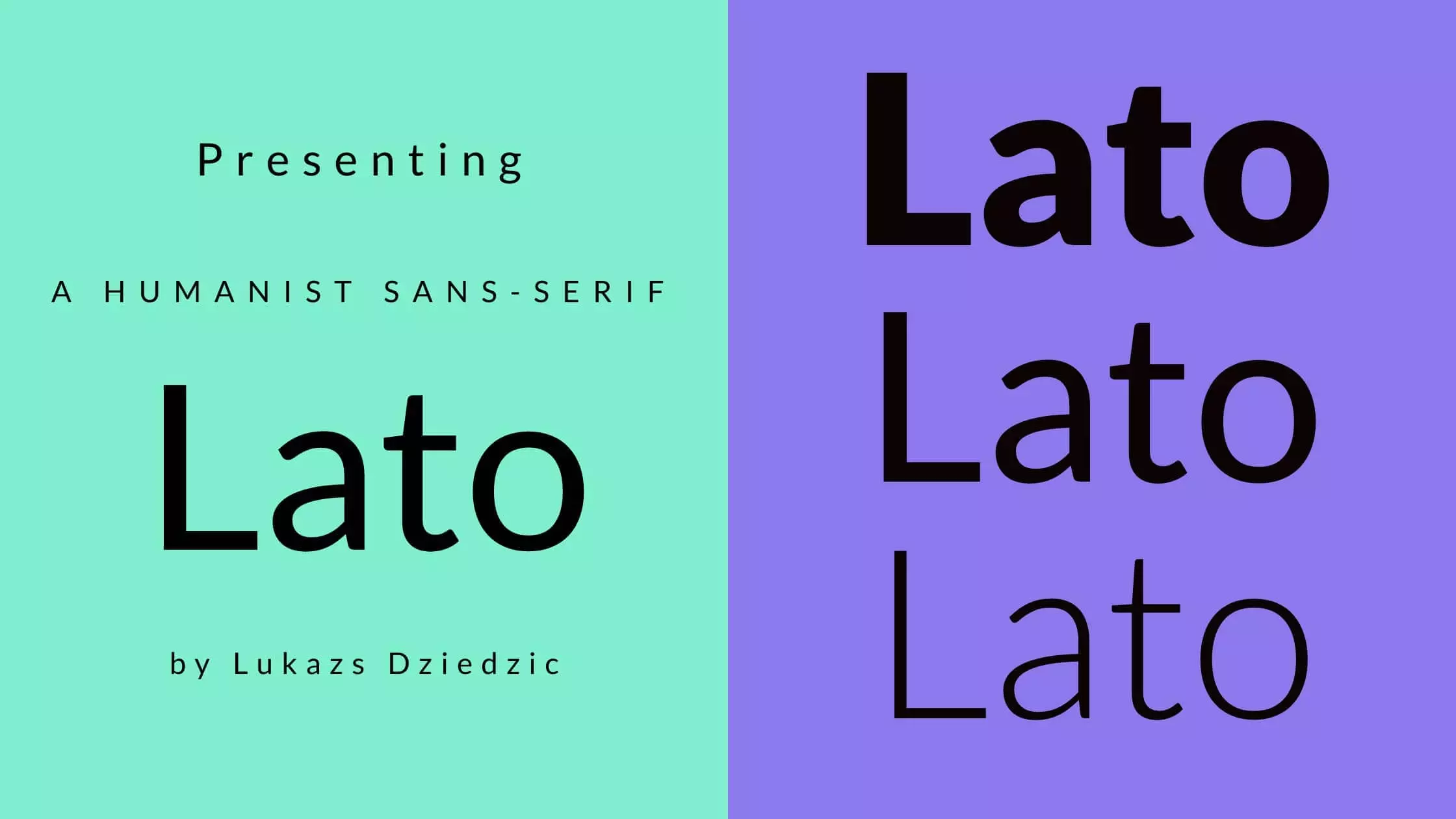
Lato, designed by Łukasz Dziedzic, is a sans-serif font that offers a touch of elegance and warmth to your resume. With its semi-rounded details and sleek lines, Lato creates a professional yet friendly appearance that leaves a lasting impression on recruiters and hiring managers. This versatile font works exceptionally well for both print and digital resumes, ensuring that your application maintains a consistent look across various platforms.
One of the reasons Lato has gained popularity among jobseekers is its excellent readability, even at smaller sizes. This allows you to showcase all your qualifications without sacrificing clarity or legibility. Lato is a great font choice for your resume. It combines modern sophistication with approachability, helping you stand out from competitors in the job market.
Avenir Next Font
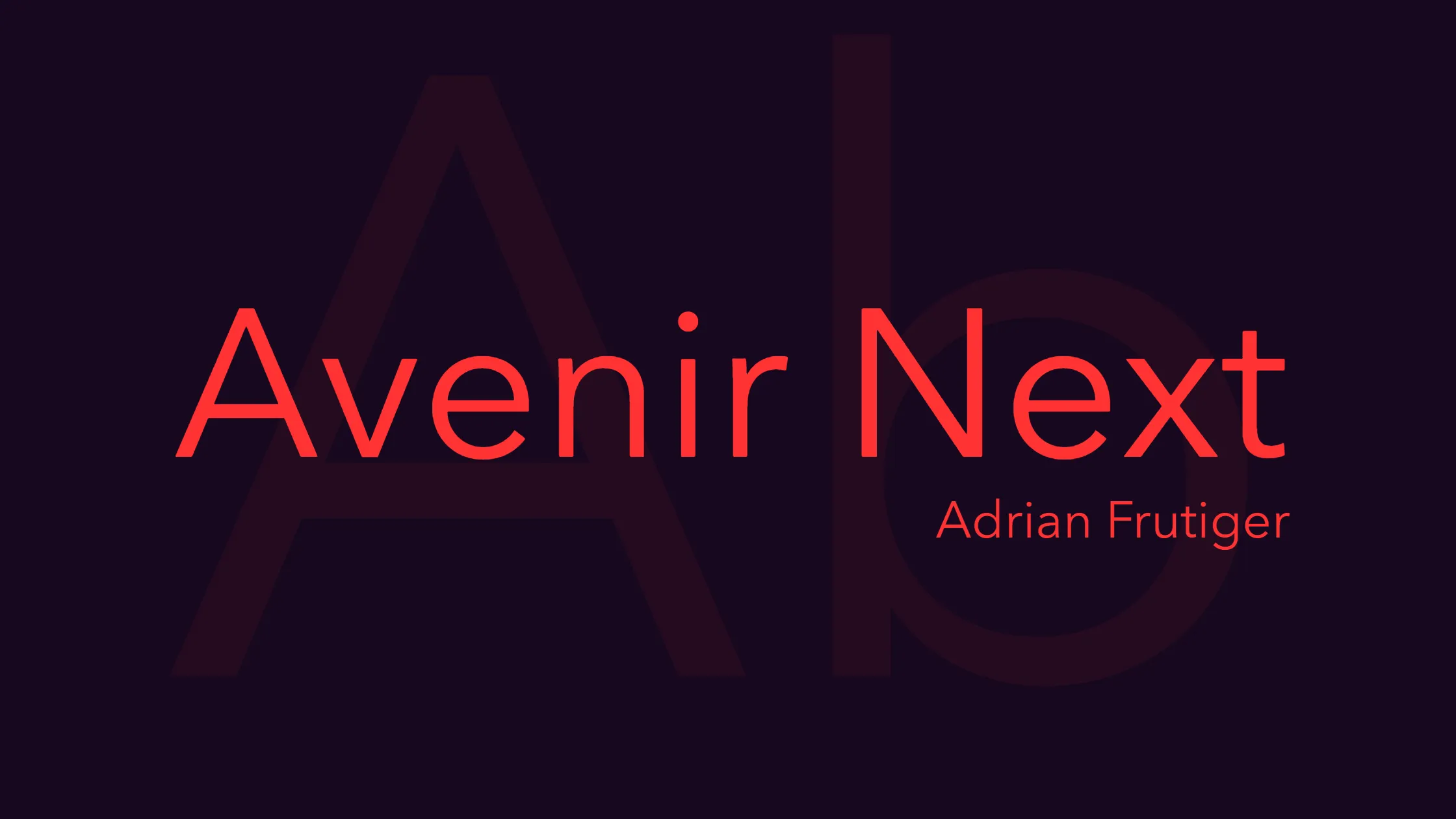
Avenir Next is a versatile and modern font that can make your resume stand out from the competition. Its clean and minimalist design works well with various industries and job positions, showcasing your professionalism and attention to detail. As a sans-serif typeface, it offers great readability on both print and digital screens, ensuring that your resume remains accessible to recruiters and hiring managers.
Moreover, Avenir Next is complementary to various design elements and formatting options, allowing you to create a cohesive and visually appealing resume. Its numerous weights and variations provide flexibility in emphasizing key information and creating a well-structured resume. In summary, Avenir Next presents you as a forward-thinking and organized candidate, increasing your chances of landing that dream job.
Professionalism vs Personalization in Font Selection for Resumes
When selecting fonts for a resume, striking the right balance between professionalism and personalization is crucial. A well-chosen font can demonstrate both individuality and conformity with industry standards, while also making a strong first impression on recruiters and hiring managers.
Popular font options for resumes include Garamond, Calibri, and Helvetica. These fonts are easy to read and work well on different devices, making your resume accessible while looking professional. On the other hand, utilizing more unique fonts can display creativity and help distinguish a candidate from the competition. Ultimately, the key is to select a font that aligns with your professional goals and serves as an accurate reflection of your character and expertise.
Final Verdict
In conclusion, selecting the right font for your resume can make a huge difference in how it’s received by potential employers. The fonts we’ve discussed in this article are all great options to consider, depending on your personal style and the industry you’re applying for. Remember to keep it simple and easy to read, while also showcasing your unique skills and personality. Don’t be afraid to experiment a little bit with different fonts until you find the perfect one that represents you best. Now go ahead and create a killer resume that will stand out from the crowd!


