
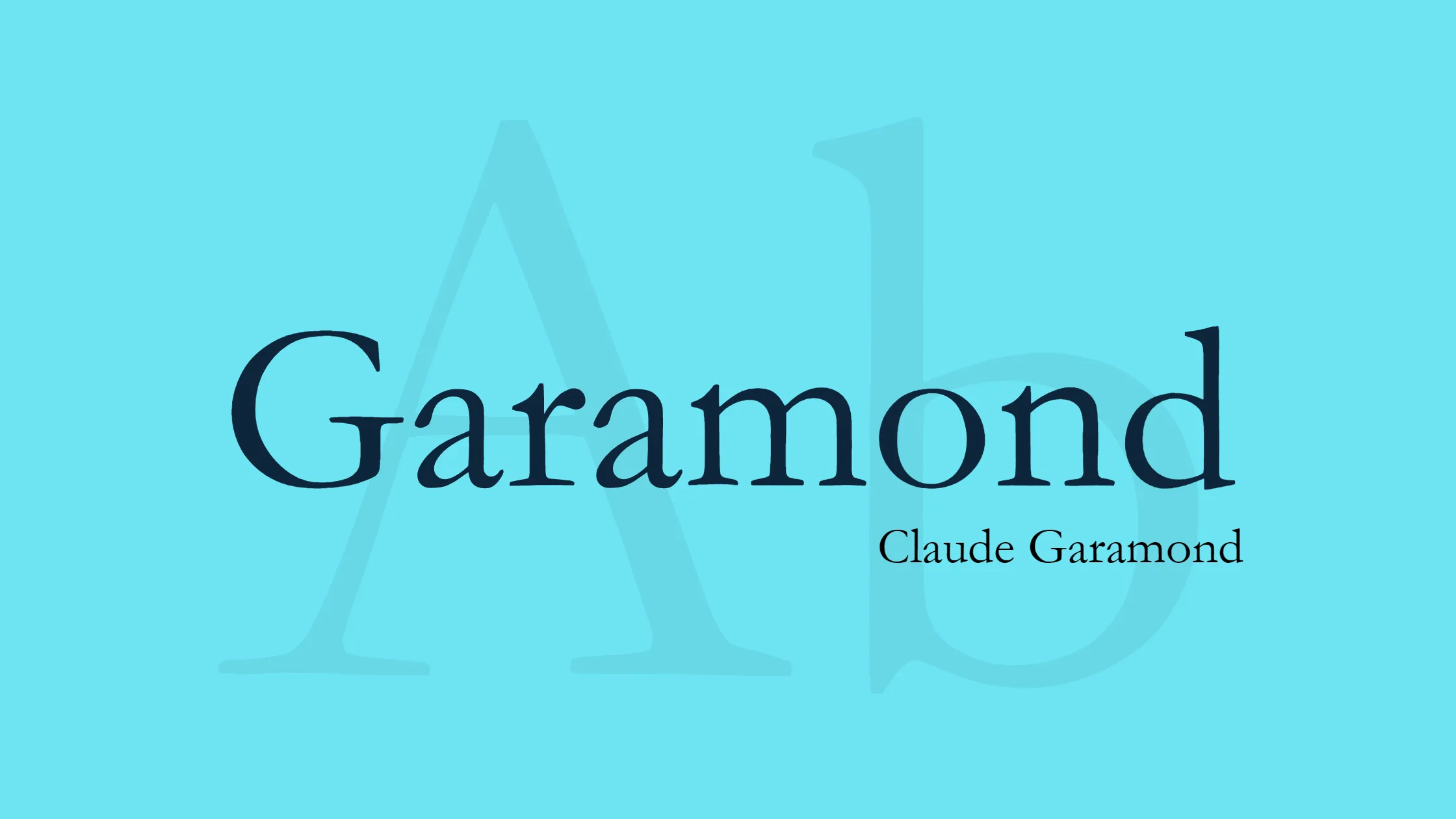


Garamond is a classic serif font family named after Claude Garamond, a famous sixteenth-century Parisian engraver (also spelled as Garamont during his lifetime). The Garamond style has been widely favored and commonly employed, particularly for printing body text and publications.
Claude Garamond was an engraver. The punch cutter was a specialist who made punches, the essential tools used for making matrices in order to cast metal type. His designs followed the influential pattern set by Venetian printer Aldus Manutius, with the assistance of punchcutter Francesco Griffo in 1495. Garamond created a letter design called old-style serif, which looks like handwriting but is more structured and upright.
Garamond’s fonts have stood the test of time and are still widely appreciated today. Their timeless elegance and readability make them a popular choice for various print materials. Whether you’re reading a book, a magazine, or a scholarly journal, there’s a good chance you’ll encounter the Garamond font within its pages.
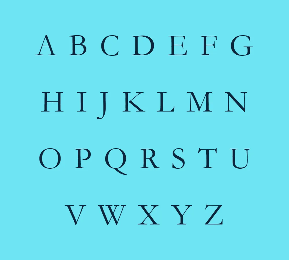
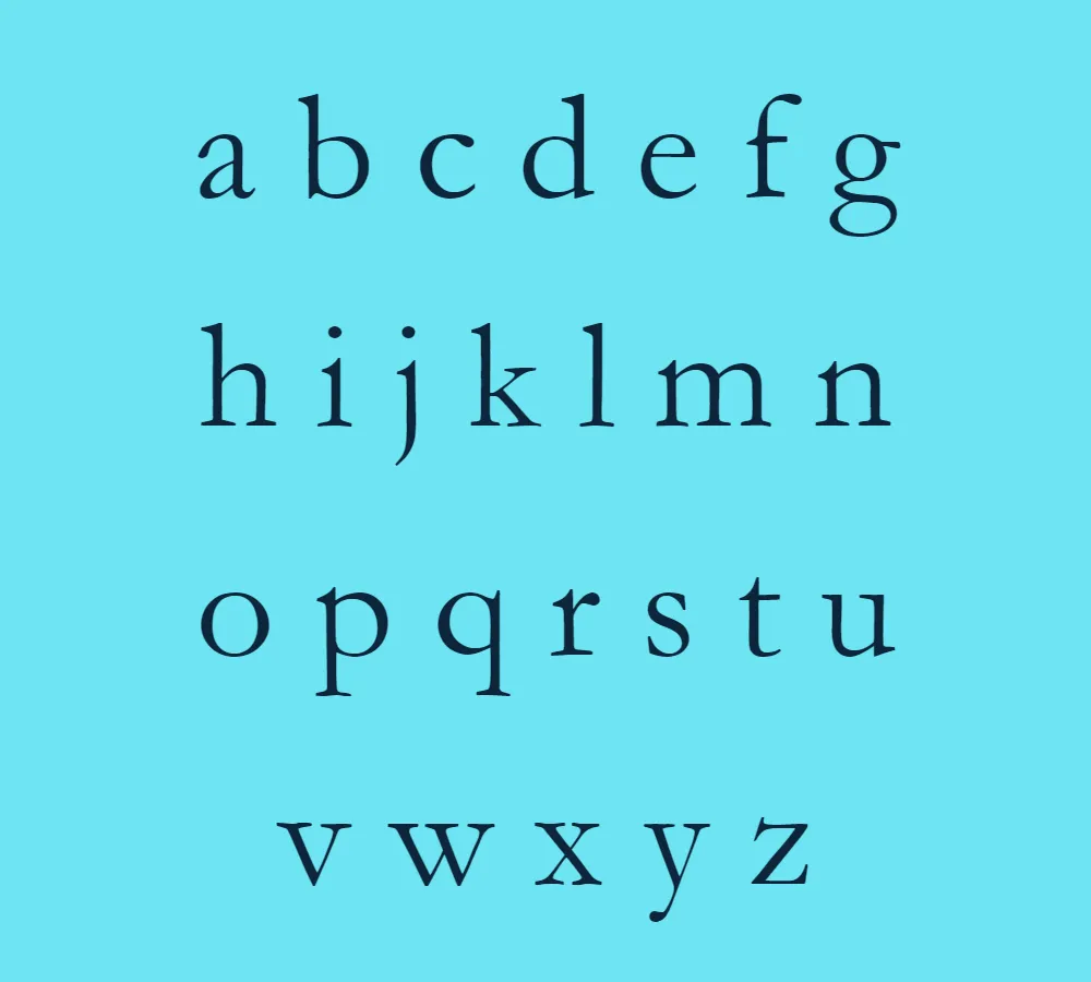
One of the notable features of Garamond fonts is their legibility. The well-crafted letterforms and balanced proportions contribute to a smooth reading experience. The letter shapes are graceful and exhibit a harmonious flow, which aids in maintaining a comfortable pace while absorbing written content. This quality is especially valuable for lengthy texts, as it reduces eye strain and fatigue.
Garamond’s fonts also possess a sense of refinement and sophistication that adds a touch of elegance to any printed piece. The subtle variation in stroke width, along with the delicate serifs, gives the typeface a refined appearance without sacrificing readability. This balance between aesthetics and functionality makes Garamond fonts versatile and suitable for a wide range of design applications.
The designer behind the Garamond font, Claude Garamond, has left a lasting legacy through his typographic contributions. His meticulous craftsmanship and attention to detail are evident in the enduring popularity of his typefaces. Today, Garamond fonts continue to inspire contemporary designers who seek to evoke a sense of tradition and timeless beauty in their work.
It is worth noting that Garamond fonts are often available for personal use free of charge. However, for commercial usage, it is essential to check the specific license agreements associated with each variant of the font. By respecting these licensing terms, designers can ensure that they are using the Garamond font appropriately and legally.
In conclusion, Garamond fonts, named after the master engraver Claude Garamond, have become synonymous with classic elegance and readability in print. Their organic letterforms and balanced proportions make them a popular choice for body text and publications. With their timeless appeal and versatile applications, Garamond fonts continue to captivate readers and inspire designers, embodying the enduring beauty of typography.


