


Instagram Sans Font
Instagram uses a variety of fonts for different purposes. The main font used by Instagram is the Instagram Sans font, which comes in a variety of styles. This font reflects a dedication to simplicity and craft. It lets users express themselves well across diverse languages.
Instagram Stories and Reels use different fonts.
- For ‘Modern,’ the platform uses Aveny-T Font.
- For ‘Neon,’ it uses Cosmopolitan Font.
- For ‘Bold,’ it uses San Francisco Italic Bold (iOS) and Roboto Black Italic (Android).
- For ‘Typewriter,’ it uses Courier Bold Font.
Additionally, Freight Sans is another font used by Instagram for stories. These fonts cater to different styles and themes within Stories and Reels.
In terms of the Instagram logo, the platform previously used the Billabong font but now uses Sans as its logo font. The Instagram logo is represented by a camera-shaped icon enclosed in a square known as a “squircle”
Instagram Font Generator
The Refined Artistry of Instagram Sans
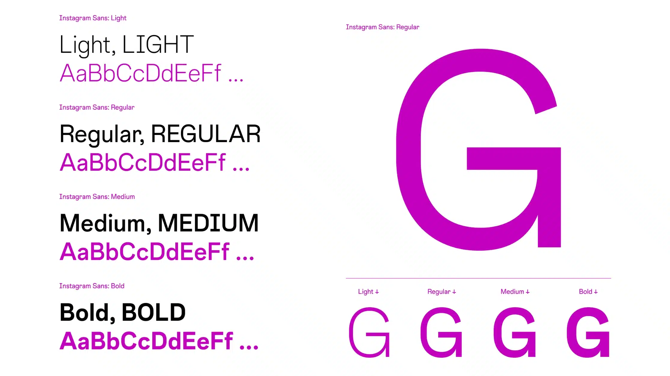
Instagram’s typeface is a mix of simplicity and modern elegance for easy reading. The exclusive font, Instagram Sans, is designed by Mackey Saturday, renowned for creating brand identities. It’s tailored for screen legibility, reflecting the platform’s modern, approachable style.
Instagram itself reveals much about Instagram Sans. It notes, “Instagram Sans reflects the shape of the glyph and our commitment to simplicity and craft.” The in-between moments of a perfect circle and a square, affectionately termed the ‘squircle’, permeate the essence of the typeface.”
This unique shape not only sets apart the font but also aligns perfectly with Instagram’s ethos of blending creativity with ease of use.
It is a contemporary remix of grotesque and geometric styles. Details like sheared terminals that suggest the flick of a human hand, unexpected quirks seen in the “Q” and the interior teardrop of the “a” add a friendly personality.
The typeface letterforms are inspired by our iconic glyph. Circular motifs, titles, and punctuation marks further connect these two elements of our brand identity. Let’s find out some more details about the font.
Characteristics of Instagram Font
- Clarity and Legibility: The sans-serif font enhances the legibility of the text across various screen sizes, keeping the focus on the message.
- Clean Aesthetic: There’s a certain cleanliness to the character design that aligns with Instagram’s penchant for the uncluttered aesthetic. Each letter seems meticulously drafted to occupy its digital canvas, just as an image on its platform.
- Friendly Demeanor: The choice of curvature and varying terminal angles gives it a friendly appeal, despite the geometric rigidity that’s synonymous with sans serif fonts.
- Consistent Branding: It allows Instagram’s brand guidelines to be expressed consistently, reinforcing brand recognition.
“While Instagram Sans is an excellent choice for legibility, it’s important for designers to consider font pairings that can enhance the visual appeal of their posts,”
Maria Garcia, a seasoned design consultant.
Alternatives to Instagram Sans Font
While Instagram Sans is Instagram’s official typeface, it doesn’t have exclusivity on the platform. Users have the liberty to communicate with a variety of fonts. Here are some popular alternatives that creators leverage to inject a dash of personal style into their posts.
1. Helvetica Neue: A timeless classic, Helvetica Neue, presents a sleek and professional feel, often used for captions and bios.
2. Proxima Nova: Known for its extensive family, Proxima Nova, stands out with its balance between friendly and futuristic, a favorite for longer texts and stories.
3. Gill Sans: Offering a more ‘retro’ vibe, Gill Sans can be an eye-catching departure from the platform’s typical minimalist look when used sparingly for emphasis.
4. Avenir Next: With its geometric yet humanist forms, Avenir Next is a modern sans-serif that sits comfortably, influencing and harmonizing with the general aesthetic.
5. Lato: For an open, modern feel that’s universally pleasing, Lato is often the choice of content creators who want a touch of playfulness.
Each of these fonts brings a different flavor to your Instagram profile or content. The trick is to match the right font with the right context and audience. When done right, it amplifies your message tenfold.
How does the choice of font types contribute to the user experience on Instagram?
The font types have a big impact on Instagram. They affect readability, visual appeal, and the emotions of users on the platform.
What font does Instagram typically use for overlay text in Stories on iOS devices?
Instagram typically uses the ‘San Francisco’ font for overlay text in Stories on iOS Apple devices.
Why is it essential for Instagram to provide a variety of font options for its users?
Offering many font options lets users customize their stories. They can also keep a consistent look with their brand and engage their audience well. They can do this using different text styles.
How do the default Instagram Stories fonts differ between iOS and Android devices?
The default ‘Classic’ font on iOS devices is San Francisco, while on Android phones, it is Roboto. Additionally, Freight Sans is used as another font in the Instagram app.
What is the easiest way to install this font on my device?
There’s no reason to be worried. Please follow our directions.
You may also find out more about typography and how it is classified from here.
Please do not hesitate to contact me if you have any questions. Thank you very much!


Leave a Reply