
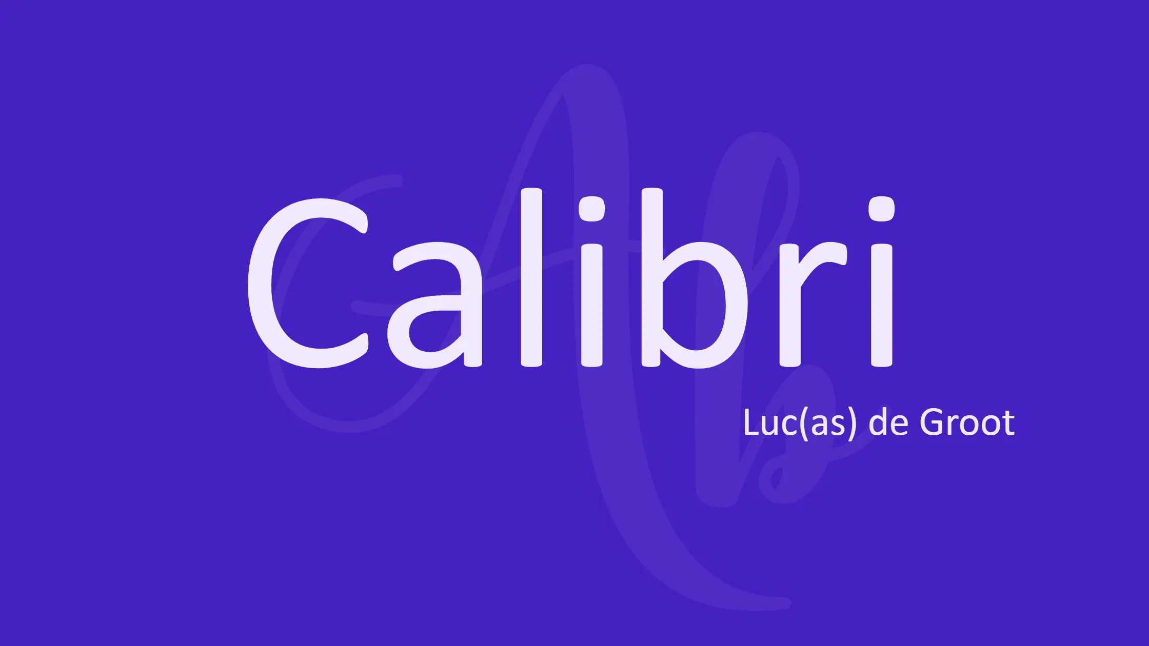

Calibri is a widely recognized sans-serif typeface that has gained popularity since its introduction to the public in 2007. Designed by Luc(as) de Groot, this font became the default in Microsoft Office 2007 and Windows Vista. It replaced Times New Roman in Word and Arial in PowerPoint, Excel, Outlook, and WordPad. With its subtly rounded structure, Calibri is known for its warm and smooth character, making it a favorite choice for various applications.
Designer: Luc(as) de Groot. Luc(as) de Groot is the person who created the Calibri font. He developed this typeface family between 2002 and 2004, ensuring that it possessed a distinct and appealing design. De Groot is a renowned Dutch type designer who has contributed significantly to the field of typography. His expertise in creating readable and aesthetically pleasing typefaces is evident in Calibri’s elegant and modern appearance.
Font License: Free For Personal Use. Calibri is widely available and can be used by individuals free of charge for personal projects. This license allows users to utilize the font for their personal documents, presentations, and other non-commercial purposes. However, it is essential to review the specific terms of the license agreement to ensure compliance with its usage guidelines. For commercial applications, it may be necessary to acquire additional licensing rights.
Font Features: Calibri boasts several features that make it a popular choice for various design and communication purposes. Let’s explore some of its notable characteristics:
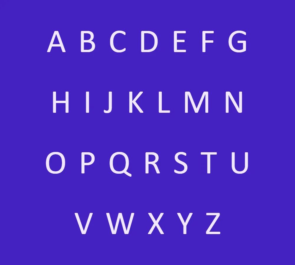
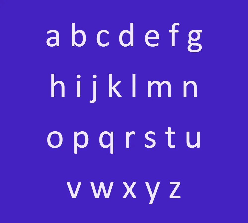
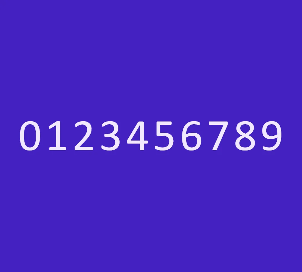
- Warm and Smooth Design: Calibri’s rounded and subtly curved letterforms give it a friendly and approachable appearance. The font’s smooth contours contribute to its legibility and make it visually appealing.
- Excellent Legibility: The design of Calibri prioritizes legibility, ensuring that text is easily readable across different sizes and mediums. Whether in print or on digital screens, Calibri maintains its clarity, making it suitable for both body text and headings.
- Multiple Weights and Styles: Calibri offers a range of font weights, including regular, bold, italic, and bold italic. This versatility allows designers and users to effectively create visual hierarchy and emphasize important information within their projects.
- Optimized for Screen Usage: As an increasingly digital society, the demand for fonts that excel on screens is essential. Calibri was specifically optimized for on-screen reading, making it a reliable choice for electronic documents, websites, and user interfaces.
- Unicode Support: Calibri supports Unicode encoding, enabling the representation of various scripts and languages. This feature makes it suitable for multilingual projects and enhances its versatility on a global scale.
- Consistency across Platforms: Calibri’s widespread adoption as a default font in Microsoft Office and Windows systems ensures consistent rendering across different devices and platforms. This reliability is particularly advantageous when sharing and collaborating on documents.
In conclusion, Calibri is a versatile and widely used sans-serif font designed by Luc(as) de Groot. Calibri is a widely used font because it looks nice, is easy to read, comes in different styles, works well on screens, and is compatible with different platforms.The fact that the font is free to use for personal purposes has helped it become very popular. People can use it in their daily communication and benefit from its elegant style.


