
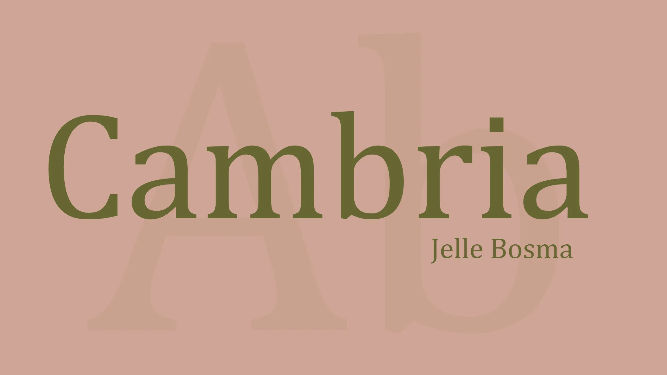

When it comes to typography, choosing the right font can greatly impact the readability and overall aesthetic of a text. One such font that has gained popularity over the years is Cambria. Commissioned by Microsoft and distributed with Windows and Office, Cambria is a transitional serif typeface that offers both readability and elegance. Designed by Jelle Bosma in 2004, with input from Steve Matteson and Robin Nicholas, this font has become a favorite for many users.
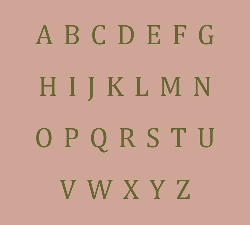
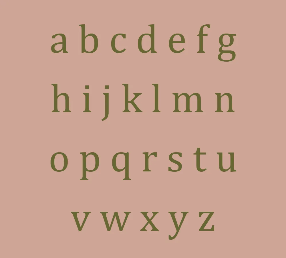
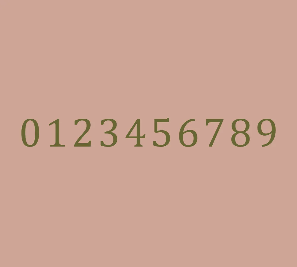
Cambria was specifically created to be a serif font suitable for body text. Its primary goal was to ensure readability, whether the text was printed small or displayed on a low-resolution screen. The designers wanted to provide a font that would maintain clarity and legibility in various digital formats. With its even spacing and well-proportioned letterforms, Cambria successfully achieves this objective.
Part of the ClearType Font Collection, Cambria is among the fonts designed to work seamlessly with Microsoft’s ClearType text rendering system. This collection was released alongside Windows Vista and aimed to enhance the legibility of text on LCD monitors. All fonts in this group share a common starting letter, ‘C,’ to indicate their compatibility with the ClearType technology. Alongside Cambria, the other fonts in this collection are Calibri, Candara, Consolas, Constantia, and Corbel.
The designer behind Cambria, Jelle Bosma, skillfully crafted a typeface that embodies elegance and readability. The font’s transitional serif style strikes a balance between the traditional serif fonts and the more modern sans-serif fonts. This unique blend makes Cambria suitable for a wide range of applications, including body text in documents, presentations, and websites.
One of the key aspects of any font is its licensing. Cambria Font, like other fonts in the ClearType Font Collection, is distributed under the Microsoft End User License Agreement (EULA). This means that it is typically available for free with Windows and Office installations for personal use. However, it’s essential to consult the licensing agreement specific to your software and ensure compliance with the terms and conditions set by Microsoft.
Cambria offers several features that contribute to its popularity among designers and users. Its well-designed letterforms provide excellent legibility even at small sizes, making it ideal for long-form reading. The font’s balanced spacing ensures consistent and comfortable reading experiences across various media. Whether on paper or on-screen, Cambria delivers clear and visually pleasing text.
Furthermore, Cambria’s elegant curves and subtle serifs add a touch of sophistication to any text. It carries a timeless quality that suits both formal and informal contexts. The font’s versatility allows it to adapt to different design styles, making it a reliable choice for a variety of projects.
In conclusion, Cambria Font stands as a testament to the artistry and functionality of well-crafted typography. With its emphasis on readability, even spacing, and elegant proportions, Cambria has become a widely used typeface for body text. Whether in documents, presentations, or websites, this transitional serif font brings clarity and elegance to the written word. Its availability as part of the ClearType Font Collection ensures that users can access this remarkable font with ease. So, next time you’re selecting a font, consider Cambria for a delightful reading experience.


