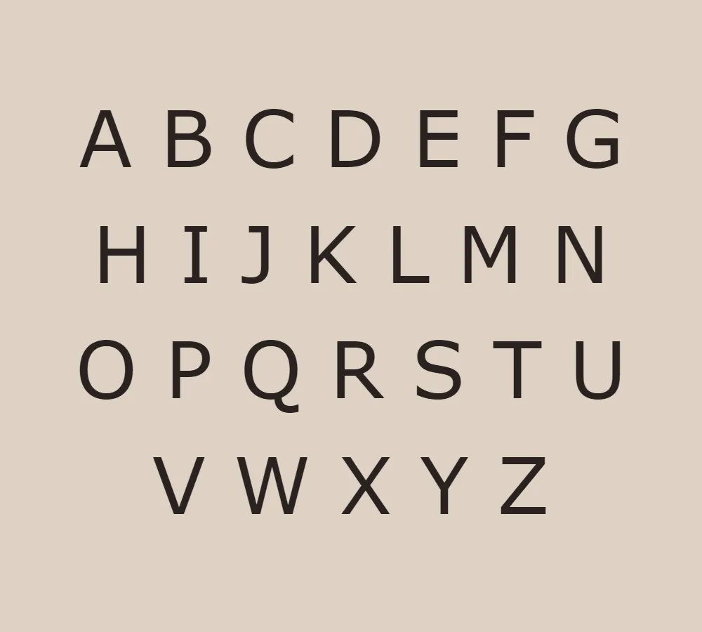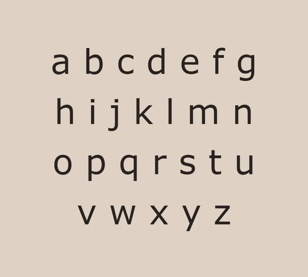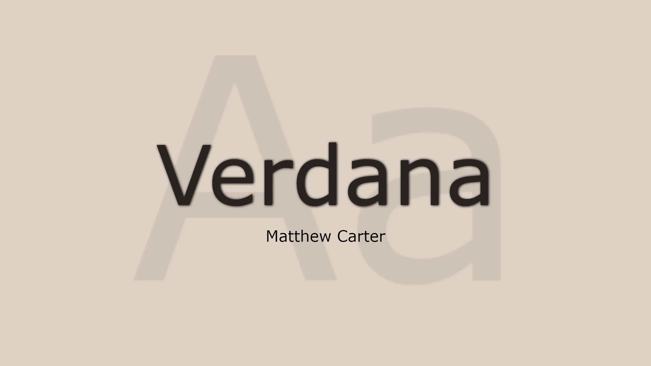


When it comes to selecting a font for any written material, readability is paramount. One font that consistently delivers excellent legibility is Verdana. Designed by the talented typographer Matthew Carter, Verdana is a humanist sans-serif typeface that was specifically created for Microsoft Corporation. With its clear and clean design, Verdana has become a popular choice for both print and digital media.
Verdana was created by Microsoft’s typography group due to the need for a typeface that could be easily read on computer screens. She commissioned the renowned designer Matthew Carter to create a font that would address this requirement. Carter, with his expertise and meticulous attention to detail, worked diligently on crafting Verdana, ensuring it would excel in legibility and maintain its aesthetic appeal.
To further enhance the readability of Verdana, Thomas Rickner from Monotype was brought in to add hand-hinting. Hand-hinting involves adjusting the font’s outlines and metrics to optimize its appearance on low-resolution screens. This attention to detail in the font’s design and fine-tuning significantly contributes to Verdana’s exceptional legibility across various devices and resolutions.
The name “Verdana” is derived from the word “verdant,” which means green and lush. This choice of name is a nod to the font’s clarity and freshness. Additionally, “Ana” in the name Verdana is a tribute to Virginia Howlett’s eldest daughter, adding a personal touch to the font’s identity.
License: Personal Use Only!
Regarding the licensing of Verdana, it is important to note that the font is licensed for personal use only. This means that individuals can freely utilize Verdana for personal projects, such as personal websites, documents, or personal creative endeavors. However, when it comes to commercial use, a separate license is typically required. It is crucial to respect the terms and conditions of the font’s license to ensure proper and legal usage.
Font Features:
Verdana boasts a variety of features that contribute to its readability and versatility. Here are some notable characteristics:
- Clear and Clean Design: Verdana’s design prioritizes clarity, making it easy to read in various sizes and contexts. The spacing between characters and the proportions of its letterforms are thoughtfully crafted to ensure optimal legibility.
- Ample x-Height: The x-height of Verdana is relatively large compared to other fonts, which means the lowercase letters are more prominent. This characteristic improves readability, especially at smaller sizes or on screens with lower resolutions.
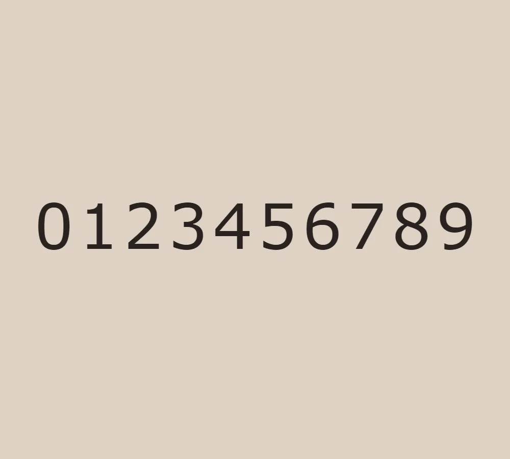
- Well-Defined Letterforms: Each letter in Verdana has distinct shapes and features, making it easy to differentiate between similar characters like “l,” “1,” and “I.” This feature reduces the chances of confusion and enhances overall readability.
- Versatility: Verdana is suitable for both on-screen and print applications. Its design translates well across various mediums, from computer screens and mobile devices to magazines and printed materials.
- Multilingual Support: Verdana supports a wide range of languages, including Latin-based scripts used in Western and Central European countries, Cyrillic, Greek, and more. This versatility makes Verdana a valuable choice for multilingual projects and global communication.
In conclusion, Verdana is a highly legible and versatile font designed by Matthew Carter with hand-hinting by Thomas Rickner. Its clean design, ample x-height, and well-defined letterforms contribute to its exceptional readability. However, it is essential to respect the font’s licensing terms and understand that Verdana is licensed for personal use only. Verdana is a font that makes your content easy to read and visually appealing. It’s great for personal websites and creative projects.


