
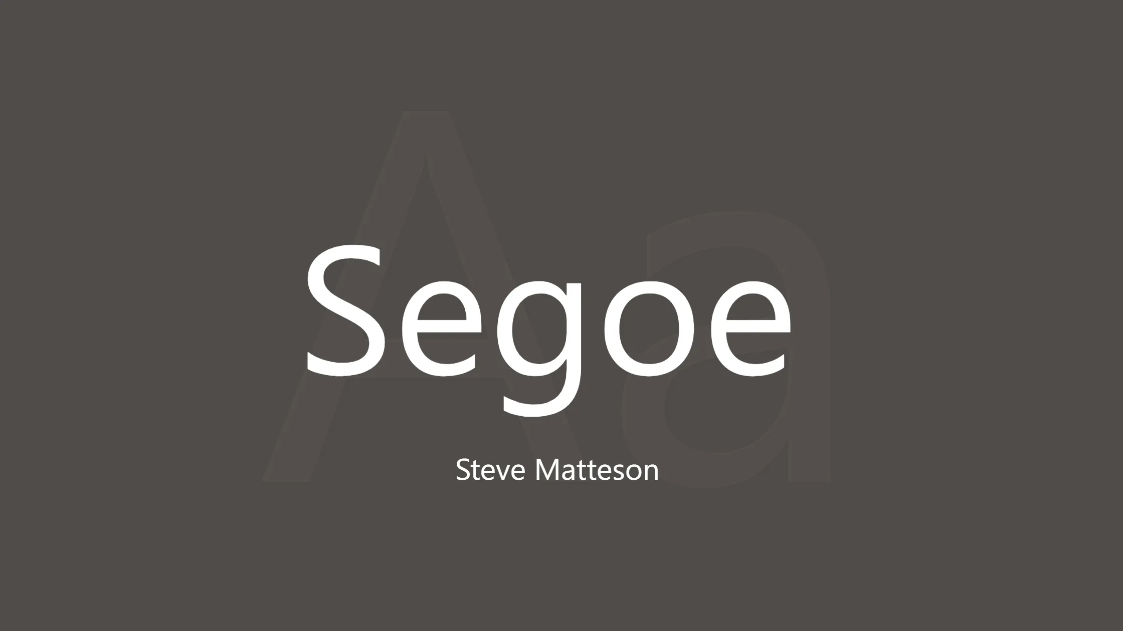

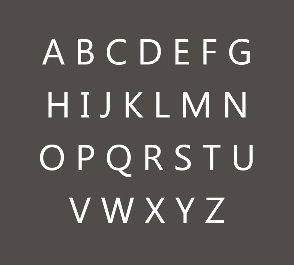
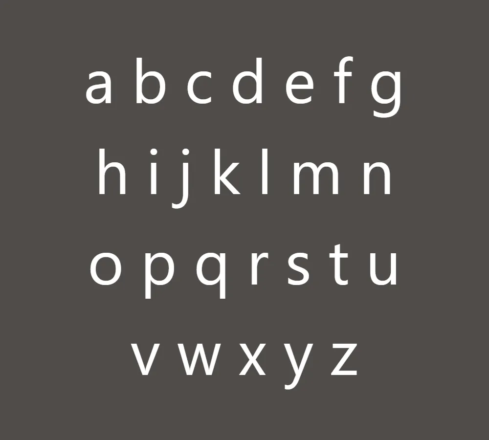
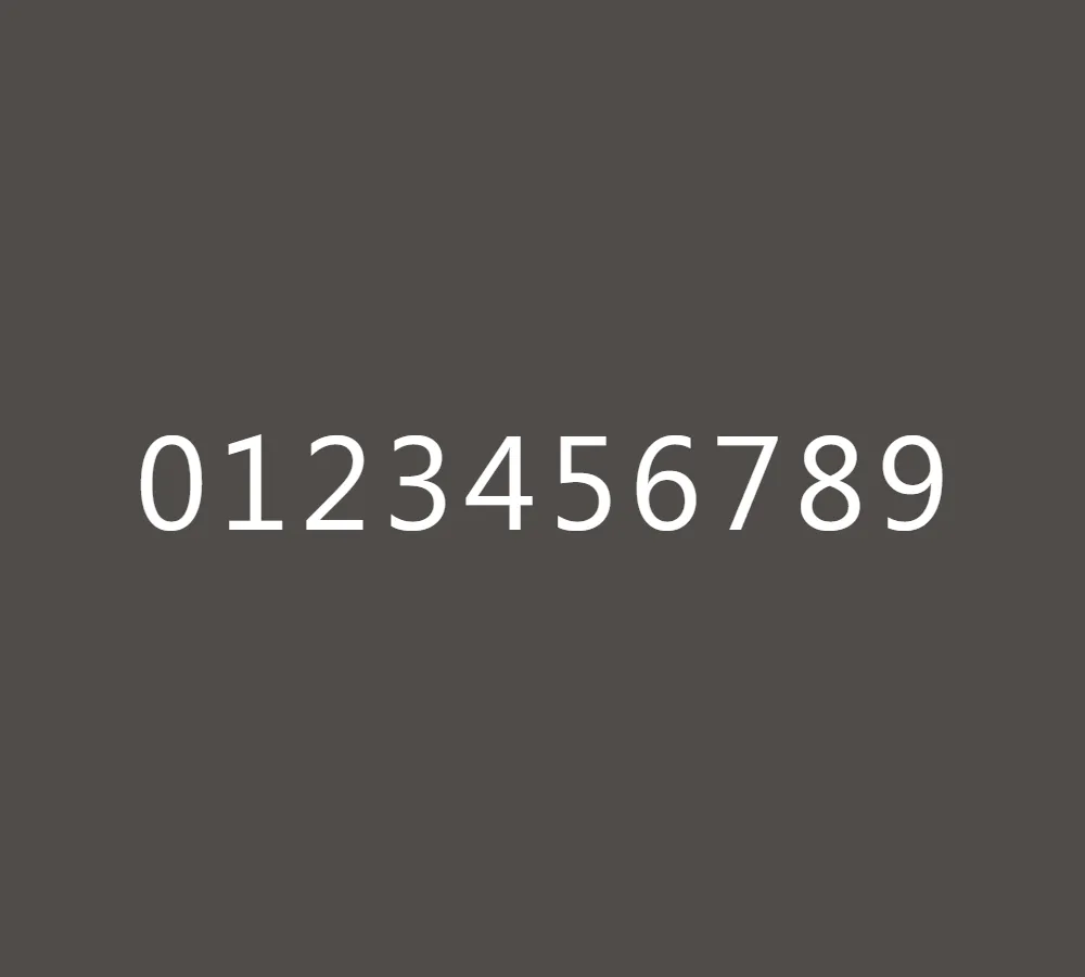
When it comes to typography, few typefaces have gained as much recognition and popularity as Segoe. Developed by Monotype and adopted by Microsoft, Segoe has become synonymous with the tech giant’s brand identity and user interface design. Segoe is a widely used font made by Microsoft. It is found in many applications and marketing materials, and it is the default font for Windows Vista and newer versions. Its clean lines, easy-to-read appearance, and approachable style have made it a favorite choice for many users.
The story of Segoe begins with its designer, Steve Matteson. During his tenure at Agfa Monotype, Matteson created the Segoe typeface with the goal of making it both friendly and easy to read. He meticulously crafted a range of weights and italics, giving the font a humanist touch that resonates with users. The result is a typeface that strikes a balance between professionalism and approachability, making it ideal for a wide range of applications.
Microsoft recognized the potential of Segoe and licensed it as a branding typeface and user interface font. Its widespread usage across various Microsoft platforms and products has contributed to its rise in popularity and recognition. You can find Segoe prominently displayed in Microsoft’s online and printed marketing materials, including recent product logos. Additionally, the Segoe UI font subfamily has become a staple in numerous Microsoft applications, providing a consistent and visually pleasing experience for users.
One of the notable milestones in Segoe’s journey was when Microsoft unveiled its new corporate logo in August 2012. The logo, typeset in Segoe, marked a significant shift in the company’s visual identity, replacing the logo it had used for the previous 25 years. This move further solidified Segoe’s association with Microsoft and showcased its versatility as a font that can adapt to different design contexts.
The influence of Segoe isn’t limited to Microsoft’s sphere of influence. Its usage extends to outlook.com, Microsoft’s popular web-based email service, where it maintains a consistent and cohesive look with the rest of the Microsoft ecosystem. This consistency helps create a seamless user experience, allowing users to feel familiar and comfortable while navigating Microsoft’s digital landscape.
It is worth noting that while Segoe has become widely recognized, it is a registered trademark of Microsoft Corporation. As such, its usage may be subject to specific licensing terms and restrictions. It is essential to review and adhere to the licensing requirements when considering the use of Segoe in personal or commercial projects.
In conclusion, Segoe font has solidified its position as a favorite typeface within the Microsoft ecosystem. Designed by Steve Matteson with the intention of being friendly and legible, Segoe strikes a harmonious balance between professionalism and approachability. Its clean lines, wide range of weights, and humanist feel have made it a go-to choice for Microsoft’s branding, user interfaces, and marketing materials. Segoe is a font that is widely used in Microsoft applications, outlook.com, and on the Microsoft logo. Its popularity is due to its clear and friendly typography.


