

Tiktok Sans Font
TikTok has introduced its own custom font called TikTok Sans, which replaced the previous font, Proxima Nova. The new font was designed in collaboration with Grilli Type. It features simplified characters with bigger openings and clearer strokes. The goal is to optimize legibility across the platform.
The change from Proxima Nova to TikTok Sans was met with mixed reactions from users. Some expressed dissatisfaction and longing for the old font.
The new font is part of TikTok’s effort to reflect its diverse community of creators. It also aims to improve readability across different languages.
Tiktok Font Generator
Characteristics of TikTok sans font
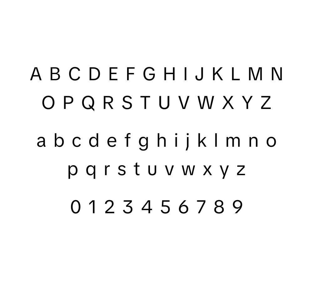
The TikTok sans font isn’t just a typographic choice; it’s the heart of the brand’s identity. It’s all about fun vibes with a simple, no-frills style. Even though it’s laid-back, there are key elements that define its unique style, and understanding these is key to capturing the TikTok spirit.
- Geometric Simplicity: The sans font of TikTok uses geometric shapes as its basis, giving it a balanced, modern feel. The uniform stroke widths perfect circles and straight lines contribute to its minimalism and legibility.
- Round and Soft Edges: The letters in the TikTok font eschew sharp edges, opting for a friendlier, smoother look. The rounded terminations and aperture of letterforms contribute to a playful feel.
- Consistent Weight and Spacing: Each letter in the TikTok sans font carries a consistent weight, and the spacing between characters is crucially managed, fostering harmony in the overall design.
Understanding these characteristics will be key as I pinpoint the font or its substitutes for your creative projects.
Alternatives to Tiktok sans font
Here are three widely accessible and free-to-use alternatives that carry the same spirit as TikTok sans:
- Avenir Next: Already noted as a likely contender for the TikTok font, Avenir Next is a humanist sans-serif that comes in various weights and styles. It possesses a comparable geometry and visual balance, making it a plausible stand-in.
- Proxima Nova: A modern classic, Proxima Nova remains a popular choice for designers looking for a clean, adaptable sans-serif. Its letterforms echo the simplicity and approachability of the TikTok font, with its distinct round ‘o’ being an especially close match.
- Circular: Circular is another typeface that shares mutual characteristics with TikTok’s font. Developed by Lineto, it was created as an alternative to the geometric typefaces that were becoming trendy in the 20th century.
These alternatives are not carbon copies but offer a similar vibe, making them well-suited for projects where the TikTok font is desired but not accessible.
What Font Does Tiktok Use In The Logo?
While TikTok hasn’t officially spilled the beans on the font in its logo, analysis points to it resembling a tweaked Avenir Next.
Tools like WhatTheFont or Font Squirrel’s matcherator can help you spot similar fonts. Remember, it’s all about the little things — even a tiny change in the serif, stem, or counter can give a whole new vibe.
Learn More: TikTok Font.
What is the easiest way to install this font on my device?
There’s no reason to be worried. Please follow our directions.
You may also find out more about typography and how it is classified from here.
Please do not hesitate to contact me if you have any questions. Thank you very much!


Leave a Reply