

Fonts are an integral part of the content on your blog, website, social media page, or any other type of content. There are a few different sub-categories that font designers and users can fall into serif, sans-serif, monospace, and script. But, the Sans-Serif fonts are the most popular font style on the web today. In this article, you will learn the strengths and classifications of the sans-serif fonts as well as find out what is trending in today’s world.
What is a Sans-Serif Font?
A sans-serif font is a typeface that doesn’t have serifs. Serifs are the little endpoints on the tops and bottoms of strokes in a font, and they give fonts a classic appearance. Sans-serif fonts, by contrast, are more modern looking and can be more legible in small sizes. They’re also popular for body text because they look less formal than serif fonts.
There are lots of different sans-serif fonts, but some of the most common ones include
Types of Sans Serif Fonts
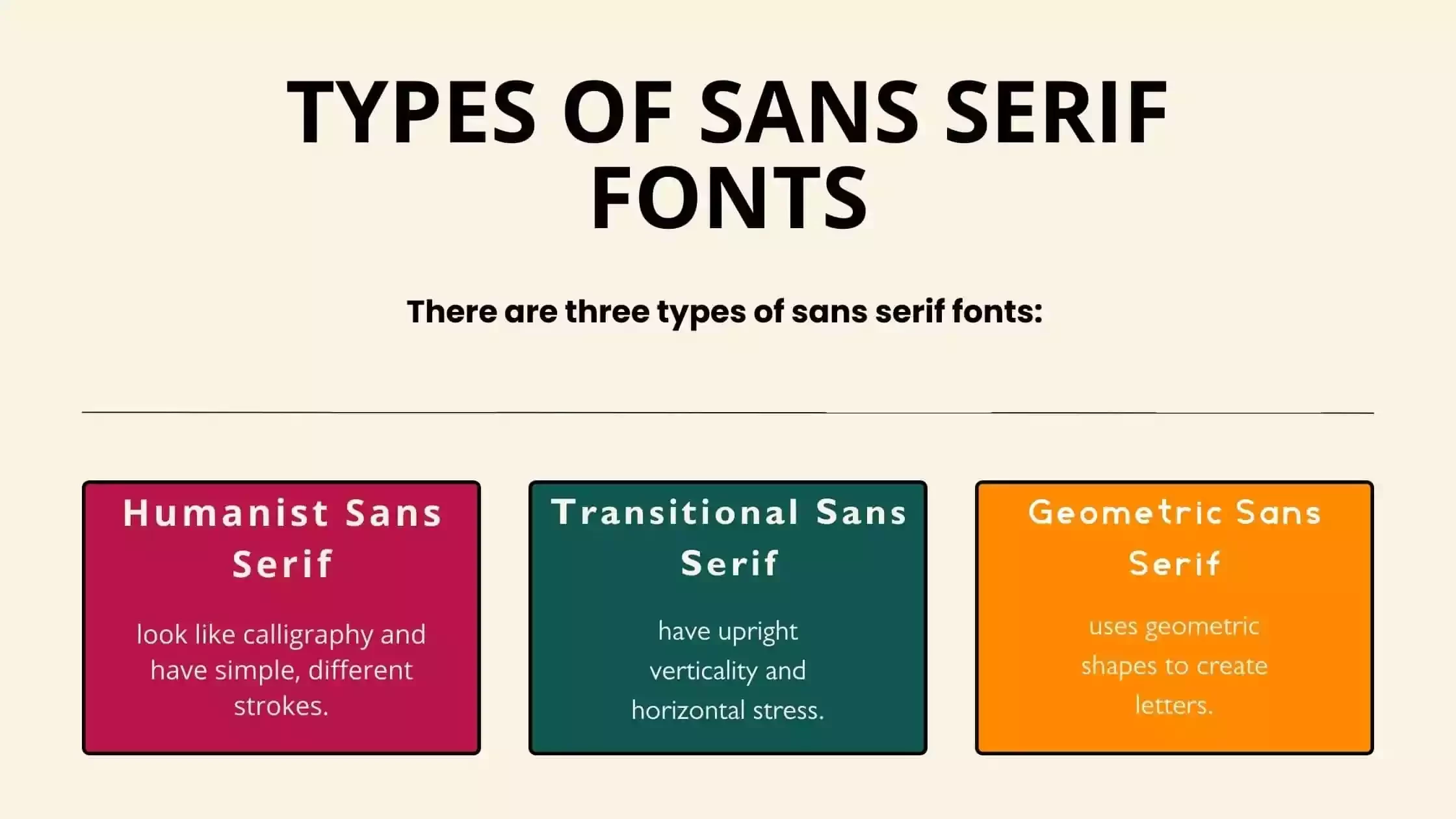
There are three types of sans serif fonts:
Humanist sans serif fonts look like calligraphy and have simple, different strokes. They first showed up at the beginning of the 20th century. They are commonly used in government, education, and finance because of their design’s ability to accommodate small text. Humanist typefaces might be the best choice if you want a font that is easy to read and will never go out of style. Open Sans, Fira Sans and Optima are one of the most popular free humanist sans-serifs.
Transitional Sans Serif typefaces are similar to Transitional Serif letterforms in that they have upright verticality and horizontal stress. But Transitional San Serif fonts are different because they don’t have serifs. These types of fonts have characters that stand up straight and are more uniform than Humanist typefaces. Their frank and modern style makes them great for writing about technology and transportation.Transitional Sans Serif fonts were first used in the 20th century. Helvetica is a popular transitional sans serif font. It is also likely the sans-serif that is used the most.
Geometric Sans Serif is a typeface that uses geometric shapes to create letters. The typeface is easy to read and can be used for a variety of purposes. It is popular among online businesses because it looks professional and clean. In the early 1920s, they were first seen. Some of the popular geometric sans serif fonts include Josefin Sans, Eras Font, Lack Font and Caviar Dreams Font.
Is Sans-serif Font Best For Web?
In today’s world, typography has become more important than ever. Good typography ads polish and a professional feel to any website or document, but it can also help improve search engine rankings. So, what type of font should you use for your web projects? One popular option is sans-serif fonts, which are often seen as more legible and user-friendly than their Serif counterparts. But is sans-serif really the best font for web design?
There are a few factors to consider when choosing a font for your website or document. One thing to keep in mind is legibility. Sans-serif fonts tend to be less ornate than Serif fonts, meaning they’re easier to read at a distance. They’re also more common on mobile devices, where space is at a premium. However, some people believe that Serif fonts look better on printed documents than Sans-Serif fonts do.
Another factor to consider when choosing a font for your website or document is whether it will look good on different browsers and devices.
Things To Remember When Using Sans-serif Fonts
There are many Sans-serif fonts on the market today, which can be a great choice for a variety of design projects. However, before you choose a Sans-serif font, it’s important to keep in mind some key points.
- First and foremost, Sans-serif fonts are designed to be legible in small sizes. So if your design will be used in smaller sizes, a Sans-serif font may be the best choice.
- Secondly, Sans-serif fonts are often less formal than other types of fonts. This means they can be used in a variety of contexts, from advertising and web pages to printed materials and signage.
- And finally, it’s important to consider the context in which your Sans-serif font will be used. Some fonts are better suited for specific uses, such as headlines or text boxes, while others can work in more general contexts.
What are the best sans-serif fonts?
There are a ton of great sans-serif fonts out there, and it can be hard to decide which one to use for your blog. But, If you are looking for the best Sans Serif fonts, then you can choose from the list below:
- Open Sans.
- Helvetica.
- Lato.
- Roboto.
- Eras.
- Chicago.
- Atami.
- Lack.
- San Francisco.
- Proxima Nova.
Where can I download sans-serif fonts?
If you’re looking for sans-serif fonts to use in your projects, there are a few places you can download them. Some popular browsers, such as Chrome and Firefox, have dedicated sans-serif fonts, but if you want to enhance your font library with so many amazing free fonts, the Free Fonts Lab is the perfect place for you. Besides, Google Font library is another place where you can download so many popular sans-serif fonts for free.
FAQ – Sans-Serif Fonts
Ans: Helvetica is not only the popular sans-serif but also the most popular among all types of fonts. Max Miedinger and Eduard Hoffmann designed this typeface in 1957.
Ans: There are so many standard sans serif fonts available, But according to professional type designers, Helvetica is the best standard font.
Ans: Sans serif fonts are typography classics. They look clean and elegant, making them perfect for headings, titles, and other important text. While many people think of sans serif fonts as being only for formal documents or newspapers, they can be used in any type of text. Sans serif fonts are ideal for a modern, professional look.
Ans: Sans serif typefaces are often used for headings, titles, and other text that needs to be legible at a distance. They are also popular for body text because they are easy to read. Sans Serif fonts are available in a variety of styles, including modern, classic, and transitional. Some sans serif fonts include Helvetica and Arial.
Ans: In contrast to serif fonts, sans-serif fonts have a slight advantage in readability. Sans-serif fonts are very suitable typefaces for both body copy and headings, which is why they are so popular.
Lastly
Thank you for reading! In this article, we will be discussing the different types of sans-serif fonts, their benefits, and how to use them effectively in your designs. We encourage you to take the time to read through all of the information present here so that you can make an informed decision about which type of sans-serif font is best suited for your next project.


