
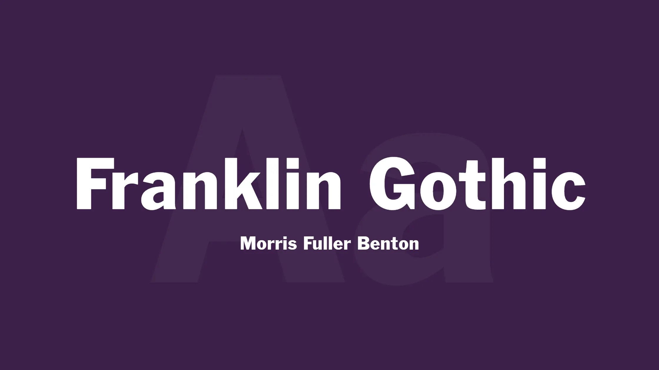


When it comes to sans-serif typefaces, one name that stands out is Franklin Gothic. Franklin Gothic is a typeface family designed by Morris Fuller Benton from American Type Founders. It is very versatile and extensive. Originally, the term “Gothic” referred to sans-serif typefaces, although it is now less commonly used.
Over the years, Franklin Gothic has gained popularity in various advertising campaigns and newspaper headlines. Its distinct style has enabled it to maintain a prominent presence in different forms of media, from textbooks to billboards. Although it became less popular in the 1930s due to the rise of European fonts such as Kabel and Futura, American designers once again found the appeal of this font in the 1940s, and it has remained popular ever since. Benton’s Franklin Gothic fonts are great for headlines and commercial use, but not suitable for reading long paragraphs of text. As a result, numerous variations and adaptations of this typeface have been created over time.
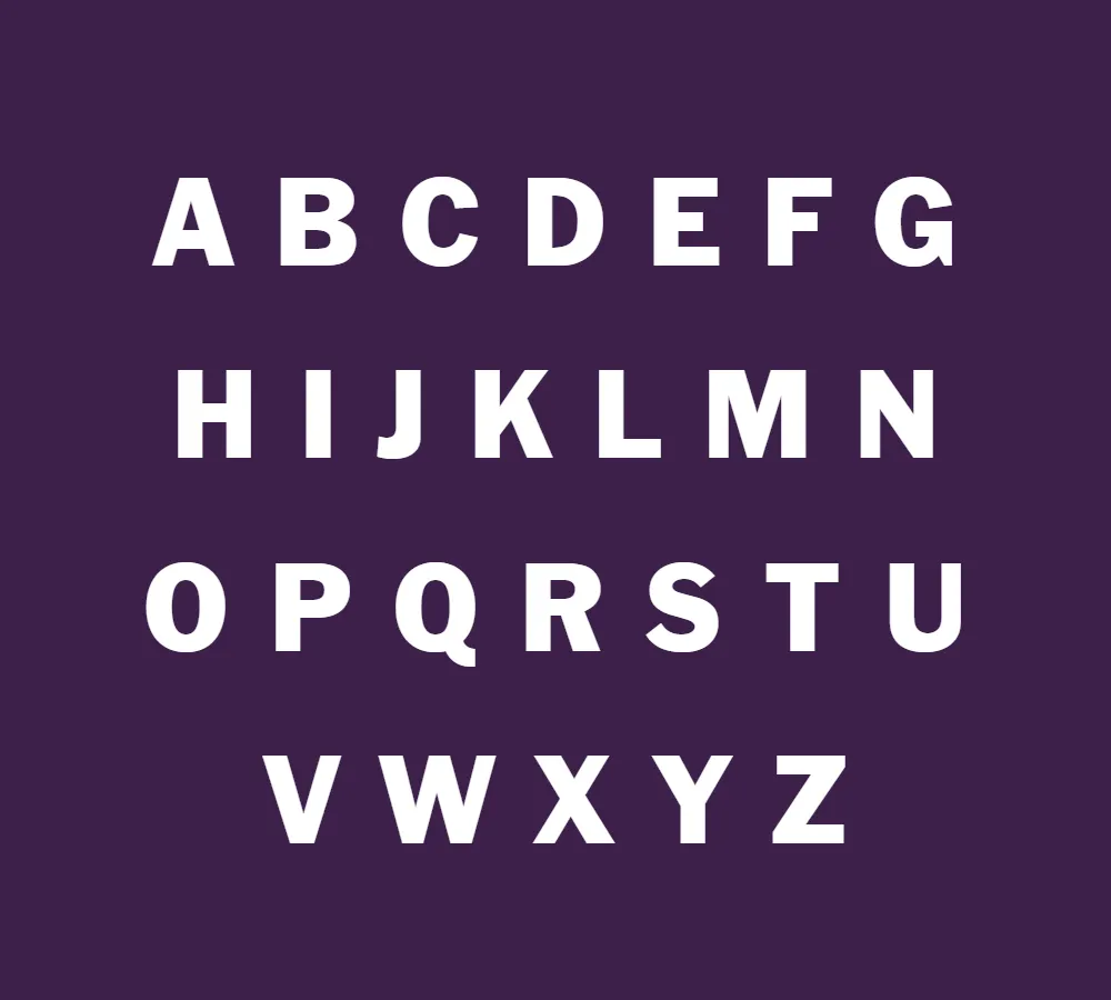
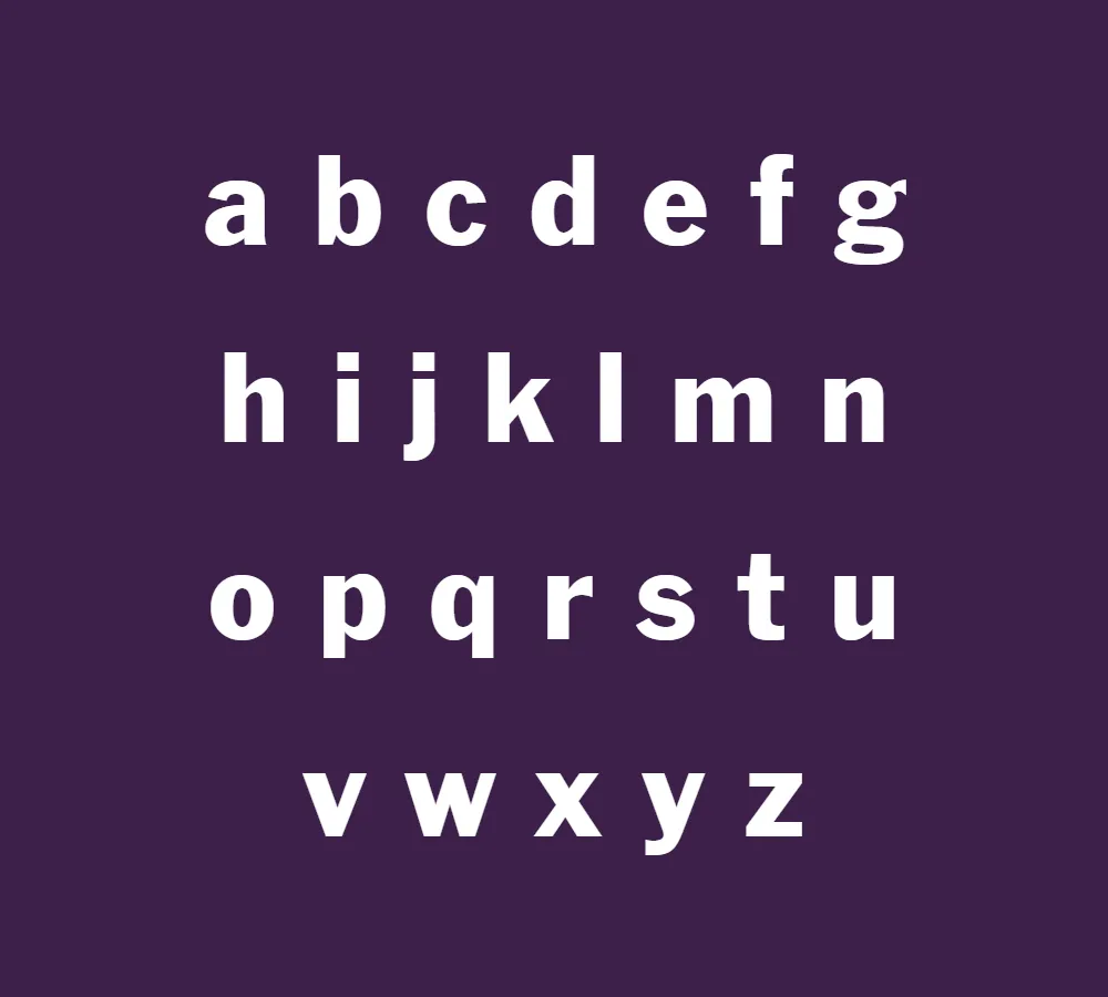
Morris Fuller Benton, the designer behind Franklin Gothic, was a visionary in the field of typography. His creativity and expertise allowed him to craft a font that effortlessly combines modernity with a touch of classic elegance. The letters in Franklin Gothic possess a clean, straightforward structure, making them highly legible even at small sizes. This readability is crucial, especially in the fast-paced world of advertising and media, where messages need to be conveyed quickly and effectively.
The enduring appeal of Franklin Gothic lies in its versatility. It is equally suitable for both print and digital media, adapting seamlessly to various design contexts. Whether it’s used in print advertisements, web banners, or mobile applications, Franklin Gothic consistently delivers a professional and polished look.
Moreover, Franklin Gothic’s strong and bold characteristics make it an excellent choice for creating visual impact. Its wide range of weights and styles allows designers to experiment and play with different combinations, giving their designs a unique and memorable appearance. Whether you’re aiming for a sleek and modern aesthetic or a more retro-inspired vibe, Franklin Gothic offers options to suit any design concept.
Another advantage of Franklin Gothic is its availability and accessibility. With a free license for personal use, this typeface has gained popularity among designers and enthusiasts alike. Its widespread usage has led to a sense of familiarity and recognition, making it a reliable choice for many design projects.
In conclusion, Franklin Gothic font is a timeless typeface that has stood the test of time. Designed by Morris Fuller Benton, it continues to be a popular choice for advertising and headline purposes due to its legibility and visual impact. With its versatile nature and wide range of styles, Franklin Gothic has secured its place as a go-to font for designers across various media. Whether used in print or digital, this font exudes a sense of professionalism and adds a touch of sophistication to any design. So next time you’re looking to make a bold statement or create eye-catching visuals, consider Franklin Gothic as your go-to typeface.


