

If you’re searching for an eye-catching display font, Via Roma should be on your radar. After testing out dozens of font options for a recent packaging project, I found Via Roma to be the perfect balance of vintage flair and modern elegance.
Let’s dive in and explore the world of Via Roma! I’m confident you’ll love it just as much as I do. Its stylish vibe takes designs from drab to fab.
Designers: Francesco Gianesini.
Publisher: Font&Co.
Via Roma Font Download
About Via Roma Display Font: My Personal Experience
I first discovered Via Roma while browsing through font websites, looking for something with vintage appeal for a food packaging design project. As soon as I saw it, I was curious about the story behind its design. After doing some research, I learned that this display font is inspired by a fascinating era of Italian history.
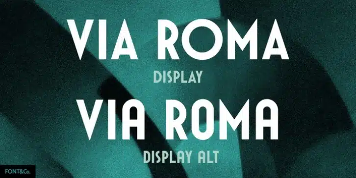
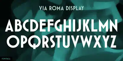
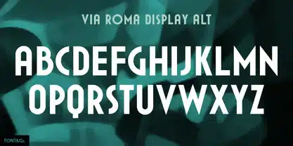
Designed by designer Francesco Gianesini, Via Roma draws inspiration from regime propaganda inscriptions found in Italian buildings of the 1920s and 30s. This was a period marked by bold Art Deco and Modern architectural lettering styles.
Many public spaces featured severe, attention-grabbing phrases meant to inspire loyalty and national pride. Gianesini artfully captured the spirit of this vintage Italian lettering in Via Roma. You can see the influence in the font’s commanding verticals, strong diagonals, and geometric precision.
Why did I Choose Via Roma Font for packaging design?
When selecting a font for product packaging, you need something that is legible, eye-catching, and thematically appropriate. After testing out Via Roma, I knew it checked all those boxes and was perfectly suited for packaging.
First, the letterforms are very readable and distinct, which is essential for product information, ingredients, and other compact text on labels.
Also, those Art Deco-inspired thick strokes and ornamental angles create a standout visual impact. The font leaps off the package, demanding attention on crowded store shelves.
So, any designer specializing in packaging should check out Via Roma.
If you want to learn more about the usage of display fonts like this, click here.
Via Roma Font Download: Final Words
As you can see, Via Roma is a flexible, versatile font that brings an eye-catching style to any design. If you want to give your packaging, signage, advertising, or digital creations a healthy dose of vintage charm, I highly recommend downloading this font.
Font License
This is a PREMIUM FONT.
What is the easiest way to install this font on my device?
There’s no reason to be worried. Please follow our directions.
You may also find out more about typography and how it is classified from here.
Please do not hesitate to contact me if you have any questions. Thank you very much!


Leave a Reply