

Futura & Trade Gothic Font
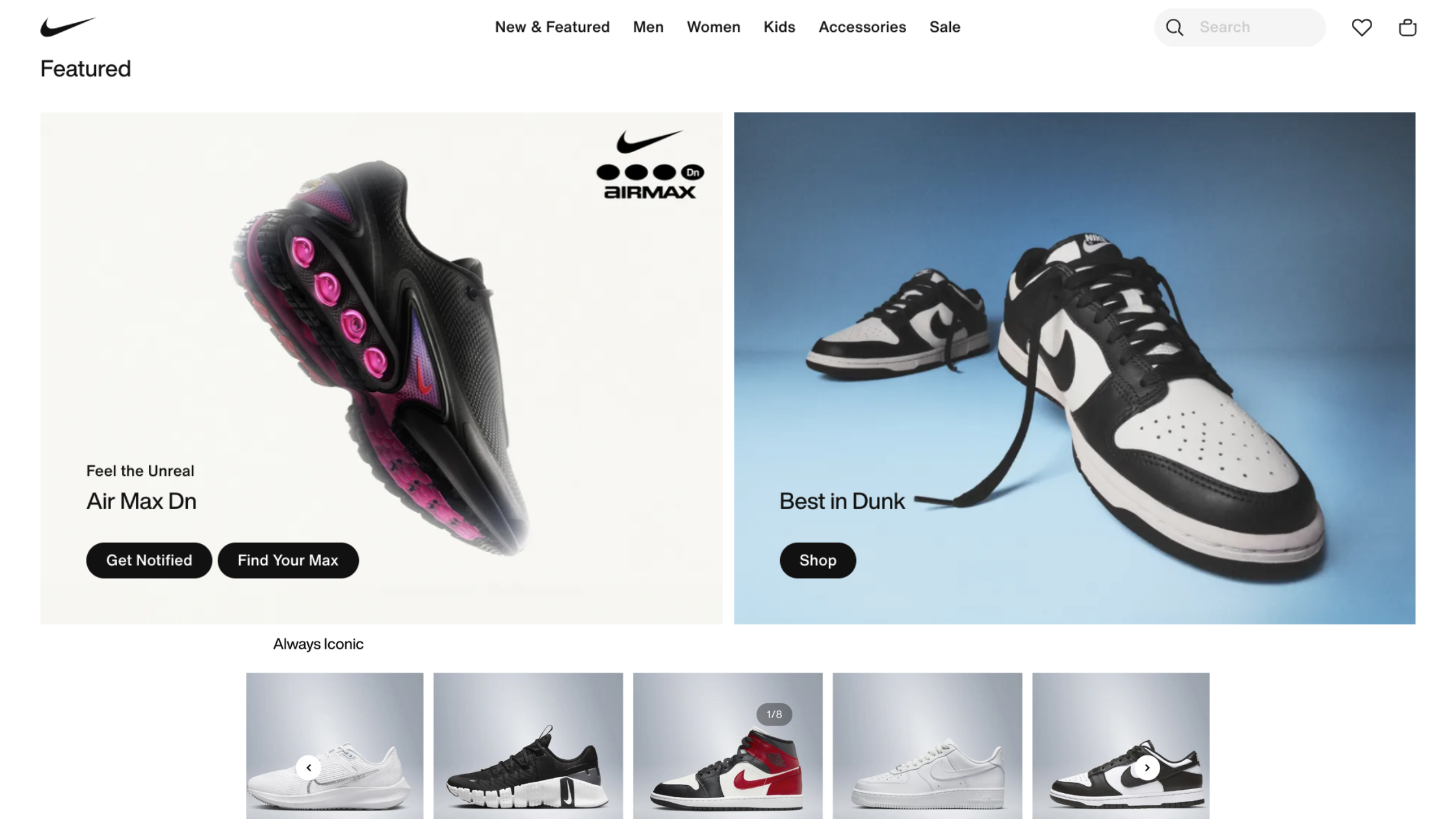
The Nike logo uses a modified version of the Futura Bold Condensed font. The font is specifically designed for the brand. However, the Nike website has transitioned to using Trade Gothic as the primary typeface. Some areas still use Futura Extra Bold Condensed.
The Futura font has become synonymous with the Nike brand and is easily recognized worldwide.
Download the Nike Font free from here: Nike Font Free Download.
Nike Font Generator
Why did Nike use Futura?
Futura’s geometric shapes and even weight distribution give a feeling of stability and strength. These qualities match Nike’s athletic performance and determination image.
The clean lines and sharp edges of Futura help Nike stand out in the visual noise of competitors, ensuring clear communication.
Futura represents forward-thinking design and efficiency, aligning with Nike’s innovation focus. Its versatility in print and digital media keeps Nike’s branding consistently recognizable.
Characteristics of Futura font
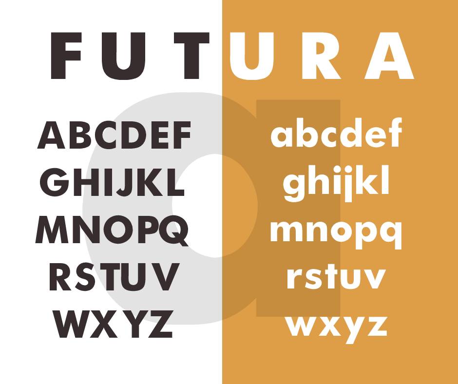
Geometric Foundation
Futura, designed by Paul Renner in 1927, is a geometric sans-serif typeface. Its letterforms are inspired by simple geometric shapes—circles, squares, and triangles. This gives it an air of mathematical precision. It also has a timeless quality that appeals to Nike’s ethos of excellence.
Uniform Stroke Weight
Typical of geometric sans-serifs, Futura boasts a uniform stroke width. This evenness balances the text’s lightness and density, making it ideal for headlines and branding. The harmonious visual balance aligns with Nike’s reputation for crafting products that seamlessly marry performance with style.
“Futura’s clean lines and robust geometry make it an ideal choice for brand design, reflecting Nike’s bold and forward-thinking approach.”
Martin Fox, Typography Specialist
Alternatives to Futura font
Avenir Font
Adrian Frutiger’s Avenir dropped in ’88, is a modern alternative with similar geometric roots. It keeps that forward-motion vibe, making it a fitting swap for brand systems seeking a Futura upgrade.
Proxima Nova Font
Created by Mark Simonson back in 2005, Proxima Nova gives a fresh spin to the geometric sans-serif font for the 21st century. It’s a go-to choice for brands aiming to capture a modern, sleek vibe without the historical weight of typefaces like Futura.
“While Futura is iconic, designers should always explore alternatives to ensure their brand’s visual identity is unique and adaptable.”
Alex Johnson, Branding Consultant
Characteristics of Trade Gothic
While primarily known for its relationship with Futura, Nike’s typography journey also includes Trade Gothic, an industrial sans-serif with its own story to tell. Trade Gothic is tough, no-frills, and practical—qualities that fit right in with Nike’s mission and vision.
Industrial Heritage
Trade Gothic originates from early 20th-century Geometric types used in US Railway Stations, Packaging, and even on the Titanic. This font showcases American industrial strength, aligning with Nike’s history and its innovation focus.
Variety of Weights
Trade Gothic offers a variety of weights, from the light to the very bold, making it versatile for both text letter and display usage. This range in weight is beneficial for designers, allowing them to create strong hierarchies while keeping a consistent visual identity across different media.
Alternatives to Trade Gothic
Gotham Font
With its own strong historical and visual ties to New York, Gotham by Tobias Frere-Jones could be considered a spiritual sibling to Trade Gothic. It has a wide range of weights and widths that make it a flexible and comprehensive tool for modern design systems.
Arial Font
Arial is often considered a more pragmatic, down-to-earth cousin of Trade Gothic, albeit a very widely available and universally installed one. For brands with very large and diverse audiences, it’s an effective and economical choice for web use and cross-platform consistency.
Final Words About Nike Font
The choice of typeface for a brand identity can be as crucial as the design of the logo itself.
Nike has really upped its game by bringing Futura and Trade Gothic into the mix. These typefaces are killing it at embodying strong brand vibes!
As designers, it’s not just about the typeface you like, but the story it tells and the legacy it holds. While it’s important to recognize and respect the typographic choices of iconic brands, it’s equally important to explore alternatives, lest we fall into the trap of homogeneity.
Nike’s swoosh may be ever forward, but the best design is an alchemy of the timeless and the cutting-edge.
What is the easiest way to install this font on my device?
There’s no reason to be worried. Please follow our directions.
You may also find out more about typography and how it is classified from here.
Please do not hesitate to contact me if you have any questions. Thank you very much!


Leave a Reply