
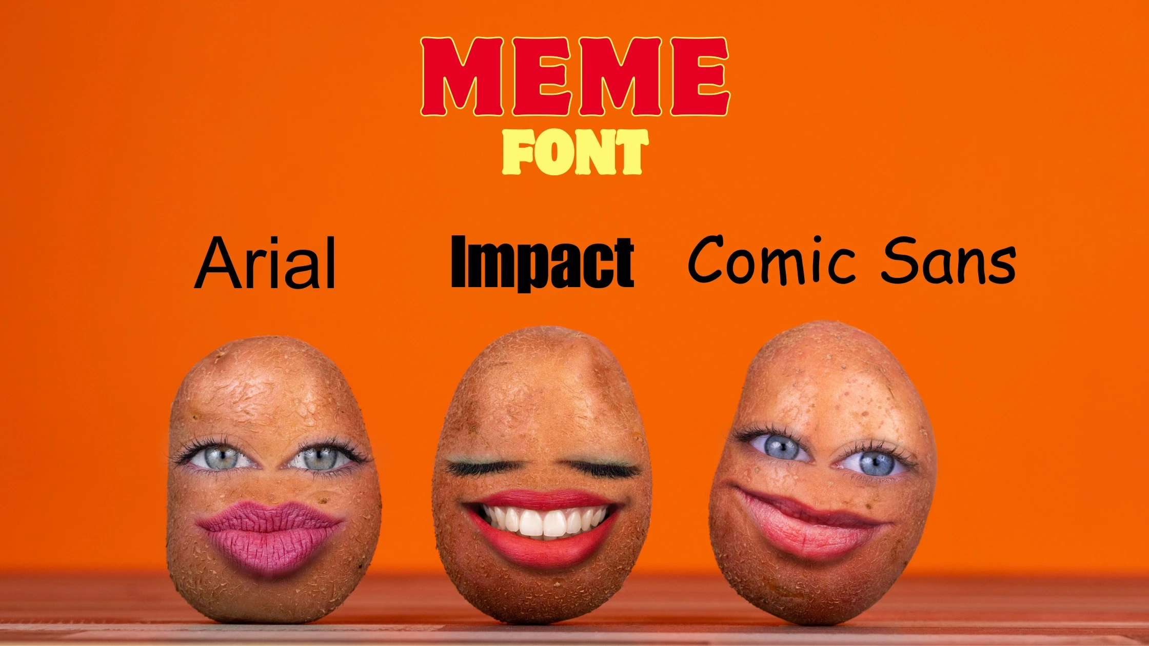

The font used for memes can vary, but some popular choices include Impact, Arial, Comic Sans MS, Helvetica, and Montserrat.
Impact is often considered the classic meme font, known for its bold, uppercase letters and black outline. Arial is a simple and widely used font for memes, while Comic Sans MS is sometimes used for a more playful or ironic effect.
Helvetica and Montserrat are also mentioned as popular choices for creating modern and stylish meme text.
These fonts are often used to add humor, emphasis, or context to the images in memes. It’s worth noting that the font choice for a meme can depend on the context and intended message of the meme. Some memes may use a combination of different fonts or even incorporate custom text designs.
The Role of Typography in Memes
Memes have come a long way from just funny pictures with captions. They’re like this whole mix of culture, politics, and human experiences – kind of like the internet’s artwork. And you know what? Typography is how we play around with words in this online world.
The font in a meme isn’t random; it’s like playing chess, where each typeface adds its own vibe to the mix. Whether it’s the bold Impact, the laid-back Comic Sans, the breezy Montserrat, or the classic Arial, each font boosts the message and comedic punch of the meme.
Typography in memes is akin to the tone of voice in a conversation; it has the power to affect mood and comprehension,
Rashed Ahmed, a Senior Graphic Designer.
Let’s take a look at some best meme fonts to make your meme attractive.
Impact Font: The Powerhouse
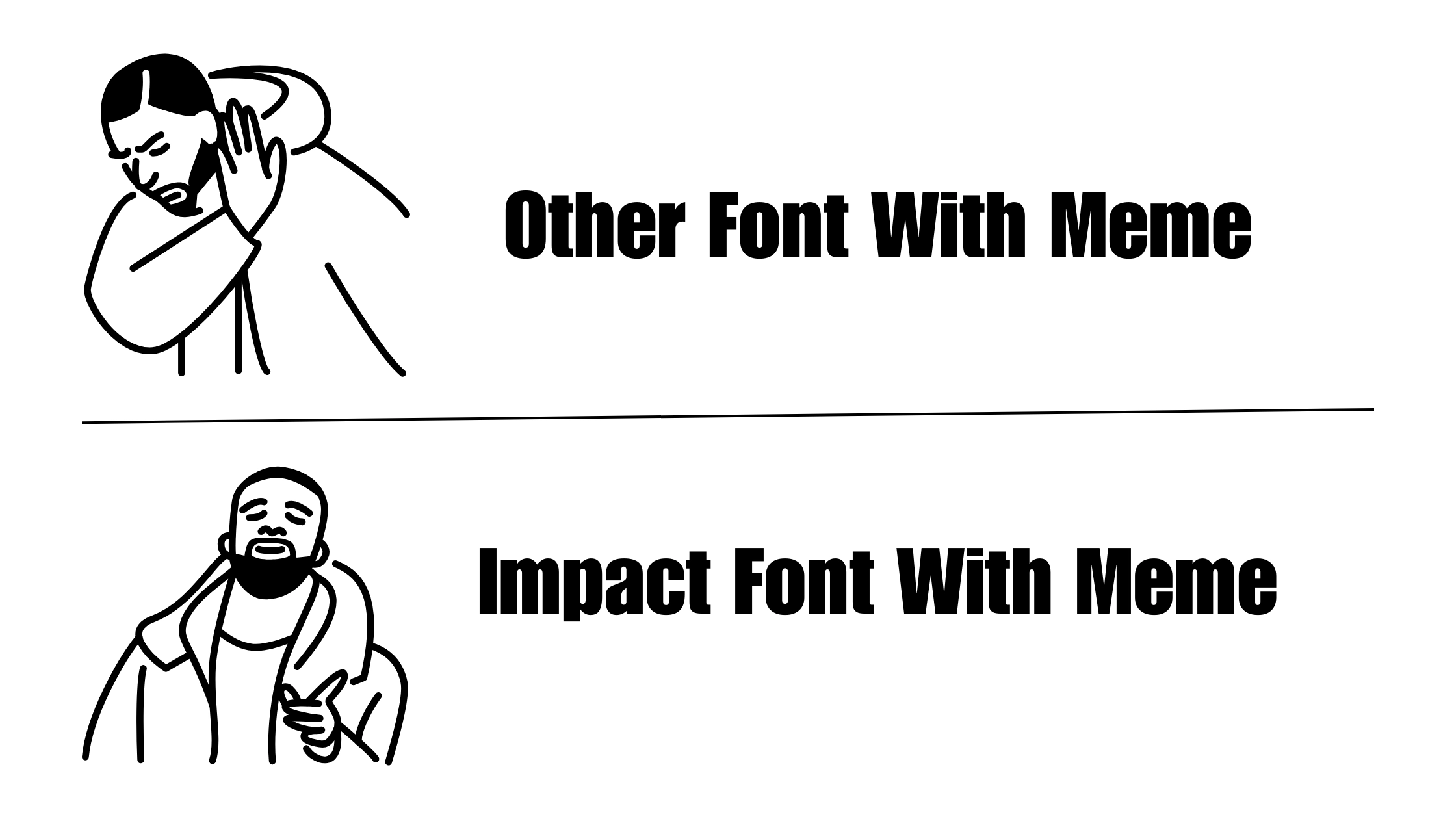
Bold, all-caps, large – Impact doesn’t do subtle. It’s all about that grandeur of despair and the raw unleashing of rage. This font is like the OG of ‘dank memes’, famous for the LOUD NOISES humor and those impactless statements. Impact doesn’t just sit there on the page; it shouts out loud and clear – it’s not just a font; it’s a whole vibe.
The Psychology of Impact
Experts believe that Impact’s boldness and all-caps style give the message a sense of urgency and seriousness, almost bordering on the grotesque. When a statement is begotten with Impact, one cannot simply scroll past without experiencing something akin to a textual punch.
Arial Font: The Understated Hero
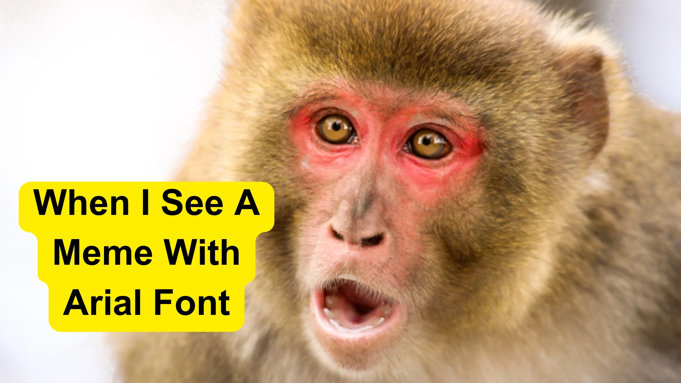
Arial, often called the unsung hero of meme typography, is like that friend who casually drops wisdom. While Impact yells, Arial whispers its point in a calm, direct way, not seeking attention but making you think twice.
Minimalistic Marvel
Design experts hail Arial for its clean, modern look, which makes it suitable for a wide array of visual aesthetics. Its ‘go-anywhere, do-anything’ demeanor allows it to blend seamlessly into any meme, where the focus is not on the font but the featuring.
Comic Sans: The Love-Hate Font
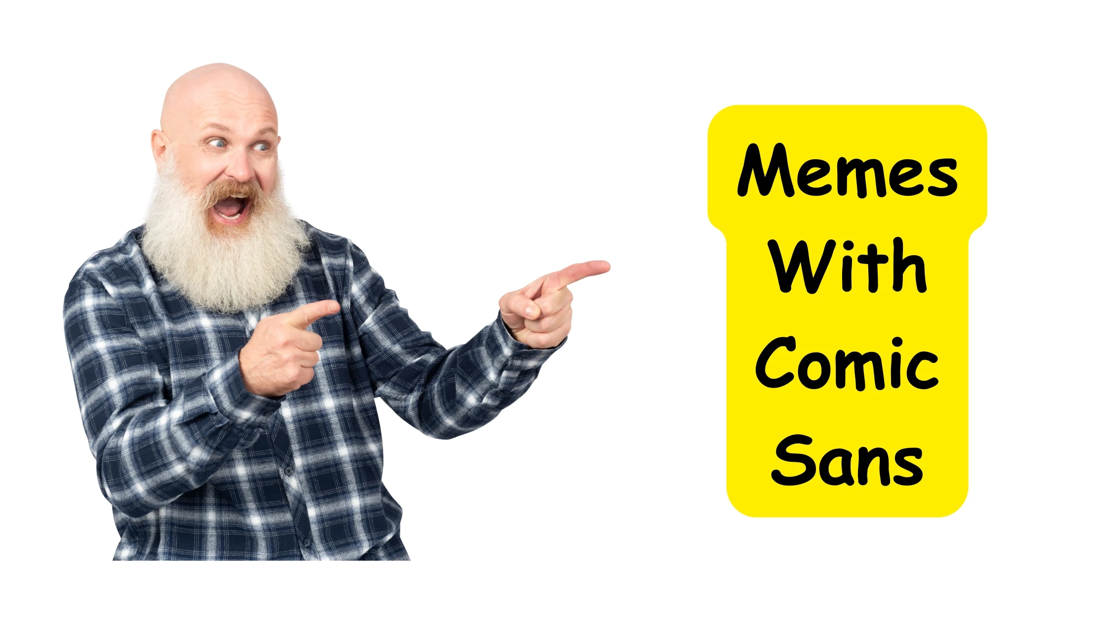
Comic Sans – the love-it-or-hate-it font of the meme world! With its playful vibe, it sparks instant reactions that swing from one extreme to the other. But hey, that’s the magic of Comic Sans – perfect for memes that bring out your inner child or poke fun at the super serious.
An Ode to Playfulness
Despite the professional world’s near-universal disdain for Comic Sans, there’s something undeniably endearing about its simplicity. In a meme, this often serves as an effective tool to underline the humor or sarcasm, with the added irony of puerile decorum.
“The choice of a font in a meme is not trivial. A font like Comic Sans might seem dismissively whimsical, but it carries the punch of nostalgia and a dash of rebellious glee against typographic norms.”
Typographer Joe Davies.
Montserrat Font: The Millennial Whisper
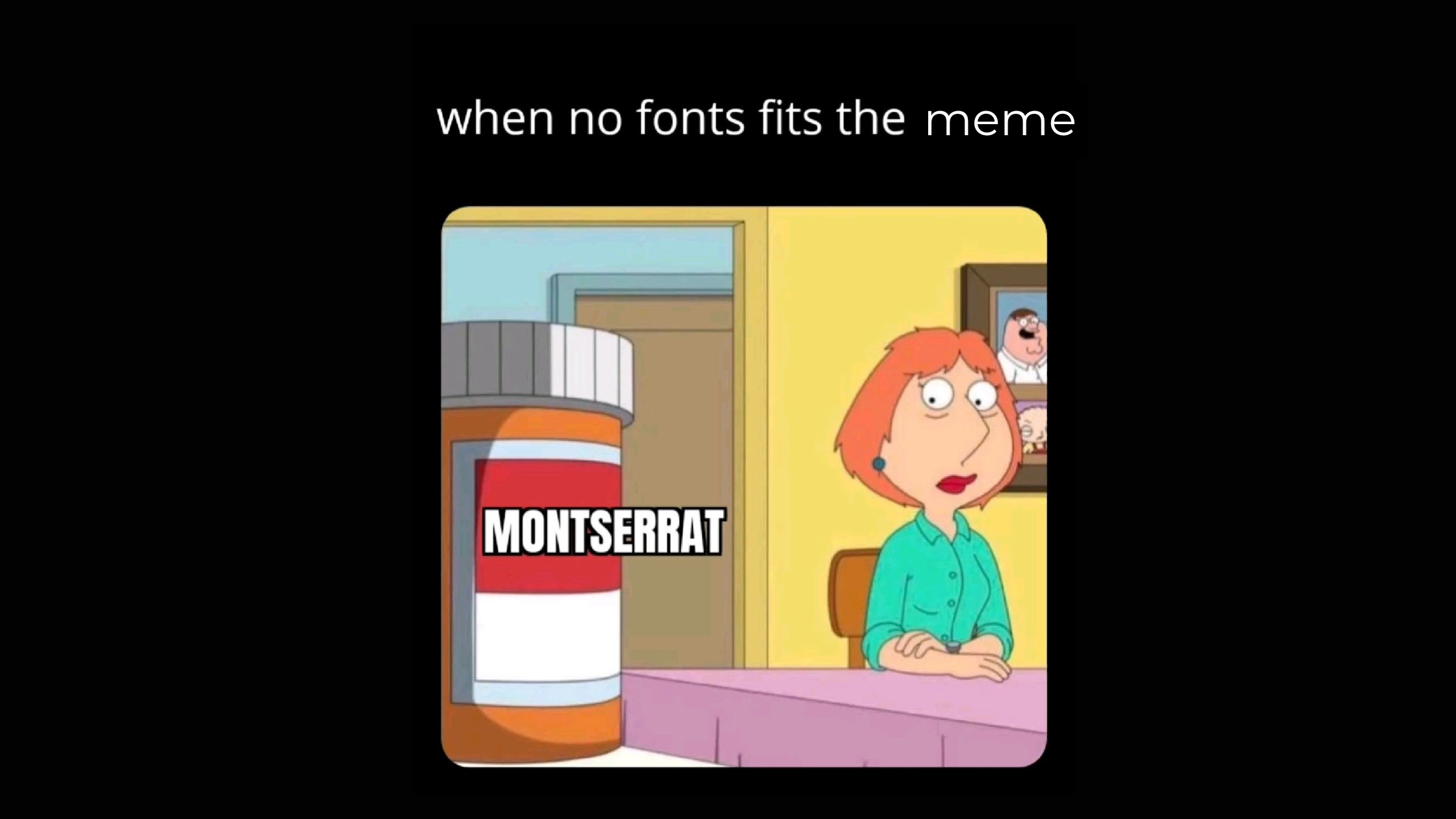
So, there’s this new player in the meme world – Montserrat. It brings this cool, modern vibe that millennials and Gen Z totally dig. It’s the font that’s like, “Hey, this isn’t just any meme; it’s a style statement.”
Millennial Pink of the Typography World
With its refined curves and minimalist charm, Montserrat typifies the sleek sensibilities of the contemporary digital age. It’s a font that plays well with aesthetically driven, restrained memes, often with a twist of Gen Z humor and social commentary.
Myriad-Pro: The Corporate Crusader
In the meme-verse, Myriad-Pro often signals a narrative with corporate overtones or a meme that pokes fun at the mundane magnificence of everyday office life. With its polished, professional demeanor, Myriad-Pro inserts a monochrome lanyard into the party that is meme culture.
Office Space Aesthetics
If memes were personified, those employing Myriad-Pro would be the well-meaning, slightly out-of-place intern at the office. They bring a certain formality to the virtual water-cooler conversations, navigating the fine line between workaday wit and existential humor.
Final Words: Best Meme Fonts
So, when it comes to meme typography, it’s not just about picking a font. It’s this whole mix of culture, emotions, and identity, all inside those digital squares that pop up on our screens. Meme makers create memes using meme templates that often feature popular fonts that are easy to read.
Design and typography pros shed light on the personalities of fonts, each adding its own flair to the social chatter.
Decoding meme visuals reveals all these layers of subtle expressions. In the lively, ever-changing meme world, the fonts we see in popular memes aren’t just text holders; they’re characters shaping the story one meme after another.
What is the easiest way to install this font on my device?
There’s no reason to be worried. Please follow our directions.
You may also find out more about typography and how it is classified from here.
Please do not hesitate to contact me if you have any questions. Thank you very much!


Leave a Reply