

San Francisco Font
The default font used by iPhones is San Francisco (SF), which is a sans-serif typeface designed by Apple. SF Pro is the system font in iOS and iPadOS, while NY is also available for use in iOS and iPadOS apps. SF Pro is also the system font in macOS, while NY is available for use in macOS apps.
Before San Francisco, Apple used Helvetica Neue in the UI of iOS 7 iOS 8, and OS X Yosemite. Some devices even used it with iOS 4 through iOS 6. Apple has used Helvetica in its software design since the 1st-generation iPhone in 2007. Before that, Apple’s typeface was a custom variant of the ITC Garamond typeface. It was called Apple Garamond.
iPhone Font Generator
Characteristics of San Francisco font
The San Francisco typeface is for the Apple ecosystem. It embodies the ethos of modernity, sleekness, and tech advancement. Its roots trace back to the iPhone 4. Apple needed a font that could sharply display on a high-def screen. This was the start of the Retina Font. It came before the San Francisco typeface, which came with iOS 9.
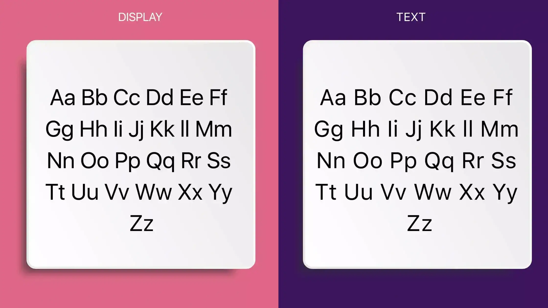
San Francisco is a sans-serif design. That means its letterforms lack the small lines (serifs) at the ends of characters. San Francisco is known for its legible and clean aesthetic. It was strategically developed to be readable on screens of all sizes. The font’s family also shows this adaptability. It has variations like San Francisco Text and San Francisco Display. Each is made for specific screen uses.
The Readability Factor
The decision to create San Francisco was not just an aesthetic one. Readability on small screens involves more than just font size. Spacing, character design, and screen brightness are also key. The San Francisco font takes these factors into account:
1. Optimal Character Spacing: The font has optimal character spacing. It is spaced and kerned for maximum legibility. This is true even at small sizes, where the pixel grid can add visual noise.
2. Ink Traps: Tiny recesses carved into the junctures where a stroke meets in a letter, designed to pull the eye toward the character.
3. Clear Distinctions: The ‘I’, ‘l’, and ‘1’ characters, often a source of confusion with sans-serif fonts, have clear distinctions, ensuring a concise reading experience.
The typeface reflects Apple’s focus on user experience. It ensures even mundane tasks, like checking the time on your lock screen, align with the brand’s commitment to quality.
Alternatives to San Francisco font
While San Francisco is synonymous with the iPhone experience, it’s not the only option. Customization in iOS and design spaces often require a diverse portfolio of fonts, or sometimes, just a change in aesthetics. Apple’s app ecosystem has many alternate fonts. Users can change the system font in different ways, but doing so usually requires jailbreaking or complex OS changes.
Proxima Nova: With a slightly different geometric approach to San Francisco, Proxima Nova is often the go-to for designers wanting to maintain a clean, modern look without entirely replicating the San Francisco aesthetic.
Avenir: Avenir’s humanistic touches give it a distinct character, with a warm and inviting feel that contrasts the more mechanical undertones of San Francisco.
The presence of these alternatives shows the role of a font goes beyond legibility. It is part of the storytelling that design aims to communicate. It shows the difference between formal and casual, robust and airy.
How has the font used in iPhones evolved over time, and what significance does it hold for Apple’s branding?
The font used in iPhones has evolved from Helvetica to San Francisco, with variations like Helvetica Neue. This evolution is significant for Apple’s branding as it distinguishes its products and interfaces, setting them apart from competitors.
What font changes were implemented in iOS 14 for iPhone users?
In iOS 14, Apple delivered the San Francisco and New York fonts in an adjustable font format for default use on iPhones, providing users with new font options for customization.
Why did Apple introduce the ability to install custom fonts starting from iOS 13?
Apple introduced the ability to install custom fonts in iOS 13 to allow users to personalize their devices and enhance the visual experience by using different fonts beyond the default options.
What is the easiest way to install this font on my device?
There’s no reason to be worried. Please follow our directions.
You may also find out more about typography and how it is classified from here.
Please do not hesitate to contact me if you have any questions. Thank you very much!


Leave a Reply