

CashMarket Font & Agrandir Wide Font
The font used in the Cash App logo is a custom font called CashMarket, which was created in-house by the Cash App team. The promotional content for Cash App uses a font called Agrandir Wide by Pangram Pangram Foundry.
Cash App Font Generator
Agrandir Wide: The Typeface That Shouts Silently
What Makes Agrandir Wide Special:
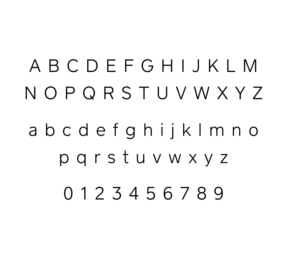
Alex Slobzheninov designed Agrandir Wide. It is a wide, geometric sans-serif typeface with a distinct European flavor. Its charm lies in its clean, simple lines and generous, open letterforms, which make it highly legible.
Cash App chose Agrandir Wide for its app and ads. This choice speaks volumes about the brand. It’s a font that exudes a sense of solidity and excellence. It’s perfect for a financial app that wants to instill confidence in its users. The ‘Wide’ version specifically offers a hearty stance, ideal for headlines and shorter texts that need impact.
Alternatives to Agrandir Wide: When You Want to Stand Apart
Agrandir Wide is synonymous with Cash App. But, sometimes a brand needs to stand out with a different yet similar font. Here are a few options:
- Schott: Schott is another sans-serif font. It has the modern look of Agrandir Wide. But, it has subtle variations in letter shapes, making it distinctive.
- Product Sans: This font was developed by Google to be used in its products and is a close cousin to Agrandir Wide. However, it’s optimized for screen use, making it an excellent choice for digital platforms.
- Brandon Grotesque: Brandon Grotesque is a more humanistic sans-serif font. It shares some of Agrandir Wide’s traits but has slightly narrower proportions. This gives it a unique touch while keeping a modern feel.
What Font Does Cash App Use In The Logo?
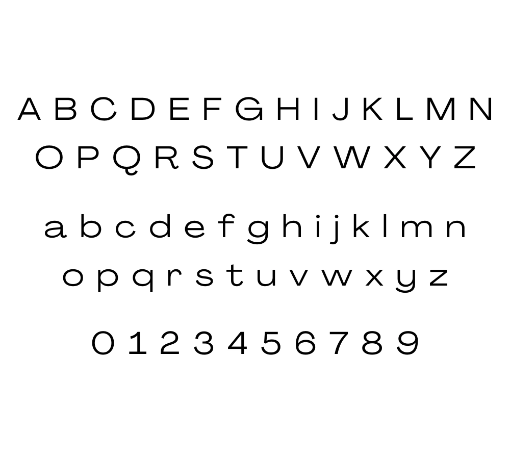
The Cash App logo uses the ‘CashMarket’ typeface, which is custom-made and not commercially available at the time of writing. However, we can unravel the features of the CashMarket font to understand what makes it tick.
Characteristics of CashMarket font
From a designer’s view, CashMarket’s typeface is an interesting mix. It combines modern, bespoke, and adaptable elements. It features geometric precision without sacrificing a sense of warmth and individuality. This balance is crucial for a FinTech brand like Cash App. It needs to seem both high-tech and friendly.
Alternatives to CashMarket font
Brands love Cash App’s font but can’t access the custom CashMarket typeface. Here are some commercial options that could work as well.
- Coves: This sans-serif typeface shares similar traits to CashMarket, such as clean lines and clear geometric forms. It’s a versatile choice for a wordmark, offering various weights and italics for different uses.
- Proxima Nova: A widely used typeface for user interfaces and branding, Proxima Nova is a modern classic. It strikes a balance between professionalism and user-friendliness, not unlike the CashMarket typeface.
- Circular: If you like the circles in the CashMarket typeface, Circular is an excellent alternative. This font has a similar geometric look. It’s very popular for editorial and digital uses.
What is the easiest way to install this font on my device?
There’s no reason to be worried. Please follow our directions.
You may also find out more about typography and how it is classified from here.
Please do not hesitate to contact me if you have any questions. Thank you very much!


Leave a Reply