
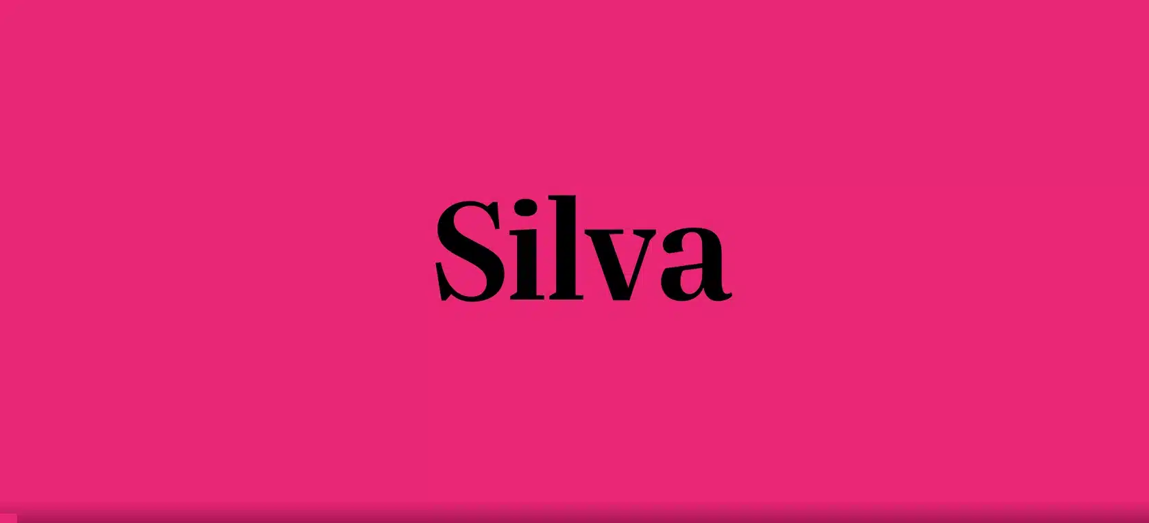

When a font makes reading feel effortless, you know the designer got it right. Silva Display font accomplishes just that with its clean, modern serifs and versatile styles. As a designer well-versed in typography, I’ve used Silva before and am excited to share my thoughts.
Read on as I break down the key features that make this font a go-to addition to any designer’s toolkit. I’ll also share where Silva Display truly shines and situations where it may not be the best pick.
Designer: Blackletra Type Foundry.
Type: Display.
Works on PC & Mac.
Silva Display Font Download
Features of Silva Display: A Great Font for All Uses
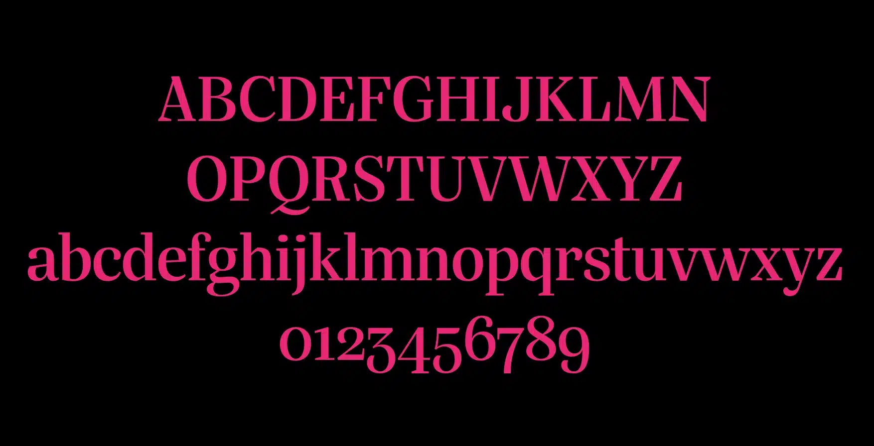
Silva Display is an easy-to-read font that works wherever you need it – online, in print, ads, posters, you name it. Its slightly condensed letters give more space between words. This makes it very comfortable to read.
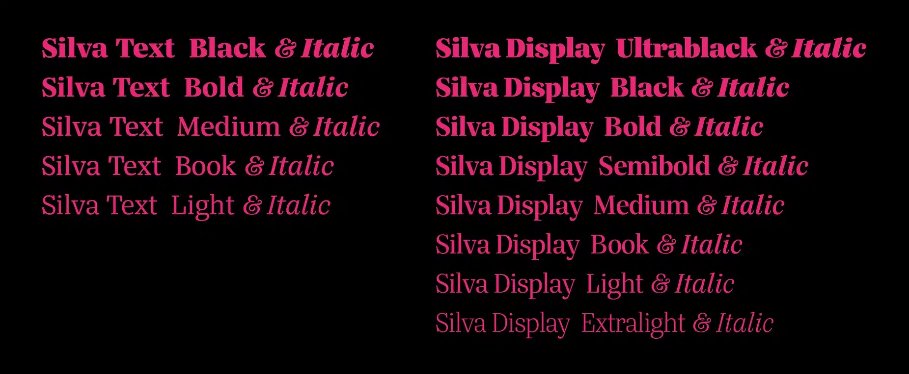
Silva Display comes with 26 fonts, including italics, to capture multiple moods- whether you seek a fun, casual vibe or bold impact. So you can set all kinds of tones, from fun and casual to bold and eye-catching.
The Details Matter
Silva Display has options for any numeric style you need. Lining figures are all the same height and blend with words. Old-style figures vary like handwriting. Both come in even widths for data or custom widths for design.
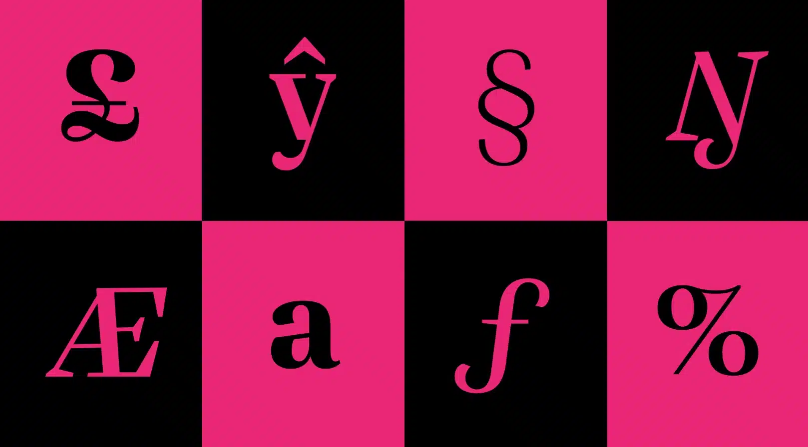
It has fractions, decimals, superscripts, and subscripts too. Whatever details you want to show, this font fits right in with flexibility and charm.
In a friendly way, Silva Display brings good design and readability together. It’s a font that can handle any typography job with ease.
Where Can You Use the Silva Display Font?
Silva Display is a really versatile font that looks great in:
- Websites: It’s easy to read online as body text or bold headers. Fits nicely across all screen sizes.
- Logos: Its many styles work well together for brand identities. Customize widths to make them unique.
- Ads – Condensed Silva Display delivers a clear sales message. Use small caps for attention.
- Magazines and Books: The elegant serifs give a classy look to articles or stories. Shows hierarchy.
- Social Media: Compact styles maximize small ad spaces. A friendly vibe appeals to youth.
- Posters: Large x-height and thick lines are readable from afar. Grabs eyes for events.
With clarity and adaptability across media old and new, Silva Display is a stellar choice to engage readers wherever eyeballs gather.
If you want to learn more about the usage of display fonts like this, click here.
Font License
This is a PREMIUM FONT.
What is the easiest way to install this font on my device?
There’s no reason to be worried. Please follow our directions.
You may also find out more about typography and how it is classified from here.
Please do not hesitate to contact me if you have any questions. Thank you very much!


Leave a Reply