

About Abolition Font
I first tried the Abolition Font while working on a bold poster for a local event. I needed something loud, simple, and strong, but not messy or over-styled. This typeface caught my eye because it felt direct and fearless, with a clean impact that worked well in tight layouts.
What drew me in was its mix of blocky shapes and clear legibility. Many loud display fonts look great in a mock-up but fail in real text. Abolition stayed readable across different backgrounds, which made me curious to test it more deeply for Free Fonts Lab and real client work.
Font Style & Design Analysis
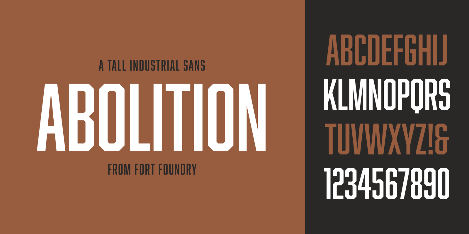
The Abolition Font is a display typeface with a heavy, industrial flavour. Its forms feel like stencilled lettering, but with smoother edges and fewer visual distractions. The overall impression is strong, condensed, and built for high-impact headlines where you want the message to land fast.
The designer of this font is designer unknown, at least from all the sources I could reliably verify. That uncertainty makes me treat it more carefully, especially when it comes to licensing and attribution. Since I cannot credit a clear foundry or author, I focus strictly on its behaviour in layout and typography tests.
The letterforms are tall and firmly condensed, with tight counters and short crossbars. This gives the font family a compact rhythm that works well in stacked text. Spacing feels intentionally snug, almost poster-like, which supports strong visual identity work. The strength lies in big, punchy headlines. The limitation appears in long paragraphs, where the dense shapes can feel tiring and heavy.
Where Can You Use Abolition Font?
In practice, I see the Abolition Font as a tool for posters, covers, banners, and bold web headers. It performs best at medium to large sizes, where its display nature can shine without crushing legibility. For event graphics or protest-inspired layouts, its voice feels sharp, clear, and confident.
On small screens or tiny body text, it struggles. The condensed structure and blocky letterforms close up and lose detail. I avoid using it below headline or subheading size. For supporting copy, I usually pair it with a clean sans-serif or a neutral serif font style that softens the overall reading experience and keeps the design friendly.
Branding-wise, it suits projects that want a tough, direct tone: sports teams, streetwear, political graphics, gig posters, or bold social media tiles. When used with generous line spacing and strong contrast, this display font can anchor a very clear visual identity. The key is restraint: a few strong words, not long sentences.
Font License
From what I could confirm, the licensing for the Abolition Font is not fully standardised across all sources. I never assume it is free for commercial work. For any serious project, especially paid or public use, I always check the original publisher and read the latest licence details before using it. My own takeaway: use it carefully, and only when the licence is absolutely clear.


Leave a Reply