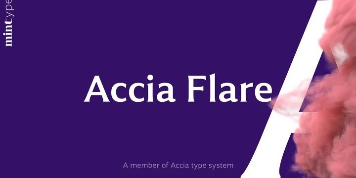
About Accia Flare Font
I came across Accia Flare Font while searching for a serif that felt sharp but still friendly for a packaging job. The client wanted something modern, but not cold or minimal. I needed a typeface with a bit of drama in the forms, yet calm enough for everyday reading.
What pulled me in was the flared strokes and elegant contrast. It looked like a bridge between classic book typography and sleek brand lettering. I first tested it on title lockups and short product descriptions, then later explored it deeper for a review on Free Fonts Lab. It held up better than I expected.
Font Style & Design Analysis
This is a serif font with a clear flared style that gives it a sculpted, carved feel. The stems start firm, then widen softly toward the ends, which creates a subtle, almost calligraphic energy without looking like script. It sits somewhere between traditional book serif and stylish display, with a polished, deliberate presence.
The exact creator of Accia Flare Font is designer unknown, at least from the sources I could confirm. That limits how much background story I can attach to it. So my view here focuses fully on how it behaves in actual design work, rather than on any branding or narrative from a known foundry.
The letterforms show medium contrast, with crisp curves and slightly tightened joints that feel controlled but not stiff. Spacing out of the box is decent for headlines, though I nudged the tracking a bit for smaller subheads. The rhythm leans elegant and steady, not playful. It shines in titles, logos, and short text, but long paragraphs can feel a touch formal and intense, especially at small sizes.
Where Can You Use Accia Flare Font?
I found Accia Flare Font works best in roles where the serif style can actually be seen and appreciated. In large sizes, the flared details add a quiet drama that suits premium packaging, magazine covers, posters, and hero headlines. It gives brands a smart, slightly luxurious tone without shouting for attention.
At medium sizes, it handles subheadings, pull quotes, and menus fairly well, as long as line length stays moderate. I would not pick it as my first choice for long body text, even though it is a serif. The forms are a bit too distinctive for dense pages, and readers may tire over time. For audiences in fashion, beauty, tech hardware, or editorial brands, it can carry a refined voice.
In layout work, I like pairing this font family with a clean sans-serif for body copy. Something neutral and open helps balance its stronger personality. It also works nicely with light graphic systems, generous white space, and grid-based layouts. Used with care, it can anchor a visual identity and make logos, wordmarks, or mastheads feel intentional and crafted.
Font License
Before using Accia Flare Font in any project, especially for commercial work, always check the official licence details from the original source. Some releases allow only personal or testing use, while others may permit full commercial usage with conditions. I always confirm the latest licence terms to stay safe for myself and my clients.
My honest takeaway as Ayan Farabi: this serif rewards careful use. When I give it space and clear roles, it brings a confident, polished voice to my designs without feeling forced.


Leave a Reply