
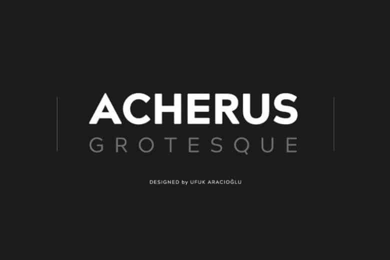

About Acherus Grotesque Font
My first reaction to the Acherus Grotesque Font was simple: it felt clean but not cold. I like sans-serif fonts that stay friendly, and this one caught my eye right away. The shapes looked modern, open, and easy to read, which always interests me as a working designer.
What pulled me in most was its balance between strict geometry and a human touch. I decided to test it on a brand identity study and some interface mock-ups for a client. I also explored it deeper for a review on Free Fonts Lab, because I wanted to see how far I could push this font family in real layouts.
Font Style & Design Analysis
From my view, this is a modern grotesque sans-serif typeface with a gentle geometric flavour. The overall design direction feels neutral, but not bland. It aims for clarity first, then adds subtle character through curves and terminals. That mix makes it quite flexible for both digital and print typography.
I was not fully sure about the original creator, so I treat it as designer unknown when I discuss it with clients. For me, that does not change how the font behaves in design work, but it does matter when teams ask about licensing and brand ownership. I always log this detail in my project notes.
Looking closely at the letterforms, I notice rounded joints, calm curves, and fairly open counters. The spacing feels even and stable, which gives the text a smooth reading rhythm. At medium sizes, the mood sits between professional and approachable. At very large sizes, some shapes feel slightly plain, so it works better as a supporting hero font than a loud display style.
Where Can You Use Acherus Grotesque Font?
In my own projects, I found this font family very helpful for user interface work and simple brand systems. It handles navigation labels, buttons, and small UI text without visual noise. At smaller sizes, the clear shapes and generous spacing hold up well on screens, even on lower-resolution displays.
When I used the font for a visual identity concept, it suited tech, education, and lifestyle brands best. It sends a modern but calm message, which works for products that need trust and clarity. For headings and taglines, I often pair it with a warmer serif typeface, so the layout gains contrast and personality.
On posters and social graphics, I like it for clean grids, simple colour blocks, and minimal layouts. At large sizes, I prefer tighter tracking to avoid a loose feel. For long paragraphs, it remains readable, though I usually keep line lengths moderate. I would not pick it for expressive editorial work, but it shines in rational, organised design.
Font License
From what I can confirm, licence terms for the Acherus Grotesque Font may vary across sources and versions. I always treat it with care, using it for testing first and checking the official licence before any commercial brand, app, or print use. My rule is simple: never rely on assumptions, only on the current licence text.
My main takeaway as Ayan Farabi: this font is a solid, dependable tool when you need quiet clarity. It will not carry a concept on its own, but it gives a strong, stable base that lets colour, layout, and imagery do the louder work.


Leave a Reply