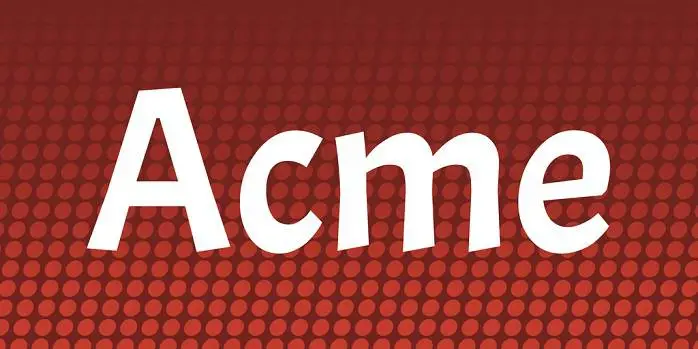
About Acme Font
I came across Acme Font while searching for a bold title face for a poster series. The project needed something playful but still clear, with strong shapes that would hold up on busy backgrounds. The name caught my eye first, but the chunky forms kept me looking.
I decided to test it on a set of event graphics for social media. I wanted a typeface that felt fun, slightly retro, and easy to read at a glance. For the review on Free Fonts Lab, I kept using it across several layouts to see how flexible it actually was in real work.
Font Style & Design Analysis
Acme Font is a display typeface, and it looks made for big, loud text. The letters are wide, rounded, and quite compact, giving a friendly cartoon-like presence. It has a strong vertical push, so words feel tall and energetic rather than calm or neutral.
The designer is listed as unknown, and there is no clear foundry credit attached to the font family. That usually makes me a bit careful, but in this case I focused on how the font style behaves in real layouts. The construction feels consistent enough for headline use.
The letterforms have heavy strokes, with soft corners that soften the bold weight. Spacing is quite tight by default, which helps create strong word blocks but can feel crowded in longer phrases. The rhythm works well for short headlines, logos, or badges. It struggles a bit in dense paragraphs, where the boldness and tight spacing reduce legibility. As a display font, its strength is impact, not quiet reading.
Where Can You Use Acme Font?
I found Acme Font most effective in large sizes: posters, banners, YouTube thumbnails, and social media covers. At big scales, the chunky shapes feel confident and fun. It suits youth brands, events, games, and anything that leans into playful visual identity rather than minimal design.
At medium sizes, such as subheadings or short callouts, it still works if you give it enough breathing room. I would not use it for long body text, small captions, or UI labels. The weight and tight tracking make it tiring to read when the font size drops too far.
For pairing, I like to combine Acme Font with a clean sans-serif for body copy, or a simple geometric typeface to balance the bold display character. Keep layouts simple and avoid other heavy fonts nearby. Let it take the role of main headline voice, and support it with light, open text styles around it.
Font License
The licence terms for Acme Font can change depending on the source, so I never assume anything. Before using it in client or commercial projects, always check the official licence details, including print, web, and app use. I recommend reading the latest terms carefully and saving a copy for your project files.
For me as Ayan Farabi, Acme Font is a solid choice when I need loud, friendly headlines, as long as I treat it as a focused tool rather than a do-everything typeface.


Leave a Reply