
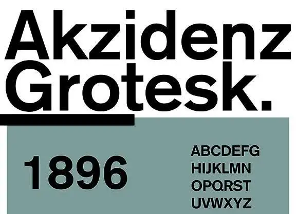

About Akzidenz Grotesk Font
I reached for the Akzidenz Grotesk Font while working on a clean identity system for a tech client. They wanted a simple, honest voice without trendy tricks. I needed a typeface that felt neutral, but still human and calm.
This font kept coming up in my research, and its history in modernist design pulled me in. I tested it in logos, interface labels, and long text. For Free Fonts Lab, I also explored how it behaves across layouts, from strict grids to more open editorial pages.
Font Style & Design Analysis
This is a classic sans-serif font family with a very sober, functional look. The design leans towards clean geometry, but never feels cold or mechanical. Strokes look even and stable, with modest contrast. When I set a paragraph, the block feels flat and well-balanced, almost like a calm grey texture on the page.
The Akzidenz Grotesk Font comes from the historic foundry Berthold, and it predates many famous modern grotesques. You can feel that early industrial era influence in its structure. It is less polished than newer neo-grotesk faces, and that slightly rough honesty gives it character without turning it into a display stunt.
The letterforms have closed apertures, firm shoulders, and tight curves, especially in letters like “a”, “c”, and “e”. Spacing runs on the compact side, which helps in headlines but needs care in dense text. The rhythm feels steady and serious. It handles grids and strict layouts well, but can look stiff in playful, loose compositions. As a sans-serif, it shines where clarity and discipline matter most.
Where Can You Use Akzidenz Grotesk Font?
I find this typeface works very well in identity systems, corporate reports, and institutional branding. It brings a sense of authority without shouting. In large sizes, titles and headlines look firm and controlled. The shapes hold their form nicely, even on bright, high-contrast backgrounds.
In smaller sizes, the Akzidenz Grotesk Font stays readable, but its tight counters can feel heavy if tracking gets too close. I usually add a touch of extra letterspacing for long paragraphs, especially on screens. It suits navigation, form labels, and product details where you want order and clarity.
For layout pairings, I like joining this font with a warm serif for body text, to soften the overall mood. It also pairs well with a lighter humanist sans for captions or side notes. For audiences in tech, finance, public institutions, or design-driven brands, it sends a serious, grounded message without drifting into fashion.
Font License
Licensing for the Akzidenz Grotesk Font can vary between vendors and formats. Terms for personal and commercial projects are not always the same. Before using it in client work or large distribution, always check the current licence details from the official source or trusted distributor.
For me, this font remains a reliable tool when I need a disciplined, honest voice in my typography. It rewards careful spacing and layout planning, and when treated with respect, it quietly supports the design instead of competing with it.


Leave a Reply