
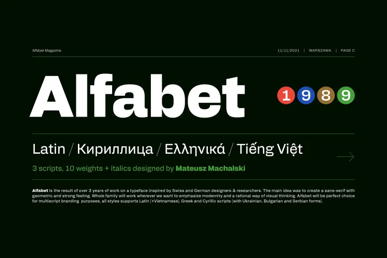

About Alfabet Font
I first tried Alfabet Font while testing type options for a clean dashboard layout. I needed a calm, readable voice that did not fight with charts and icons. The name sounded simple and confident, so I dropped it into a few frames to see how it behaved under real content.
What kept me exploring this font was its quiet balance. It felt neutral but not dull, modern but not cold. I used it in several mockups for Free Fonts Lab, mainly for interface screens and short headings. I wanted to see if this typeface could handle everyday tasks without drawing too much attention to itself.
Font Style & Design Analysis
Alfabet Font is a clean sans-serif typeface with a very rational feel. The shapes lean toward a geometric style, but the curves stay soft enough to avoid stiffness. Strokes keep a steady weight, which gives text a smooth, even colour on the screen. It sits firmly in the modern, minimal camp.
The designer is unknown, at least from the sources I checked, so I approached it without any brand story in mind. That actually helped. I could judge it only by how it worked in layout. Without a famous name attached, the font had to earn its place through clarity, spacing, and comfort in use.
The letterforms are tidy, with open counters in letters like a, e, and s, which helps legibility at smaller sizes. Spacing feels slightly generous, so text breathes well in body copy. The rhythm is steady, and lines look stable, not jumpy. This sans-serif font family shines in simple interfaces and short paragraphs, but it might feel too plain for expressive branding that needs strong personality.
Where Can You Use Alfabet Font?
I see Alfabet Font working best in digital products, dashboards, and simple corporate sites. At larger sizes, it gives headings a neat, controlled presence without shouting. On landing pages, it can support clean layouts where colour, imagery, and spacing do the heavy lifting instead of very loud typography.
In smaller sizes, this typeface stays sharp enough for menus, buttons, and labels. The open shapes keep text readable on low-resolution screens. For long paragraphs, it works fine if you keep line length moderate. I would avoid very tight tracking, though, because the default spacing already leans on the airy side.
For pairing, I like setting Alfabet Font as the main UI and pairing it with a warmer serif for editorial sections or quotes. You can also match it with a bold display face for hero titles, letting this font handle navigation and supporting copy. It suits technology brands, education platforms, and simple portfolios that want a clear, honest visual identity.
Font License
Before using Alfabet Font in any serious project, it is important to check its current licensing terms. Usage rules can change, and personal or student use does not always cover client or commercial work. I always confirm rights from the official source or distributor before sending final files to a client.
My main takeaway as Ayan Farabi: I reach for Alfabet Font when I need a quiet, steady worker that supports the design instead of leading it.


Leave a Reply