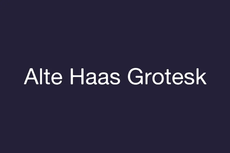
About Alte Haas Grotesk Font
I came across the Alte Haas Grotesk Font while searching for a clean typeface for a quiet, low-key poster series. I wanted something neutral, but not cold. When I saw its simple shapes and slightly old-school mood, I felt it could balance clarity with personality.
I first tested it on a set of editorial-style layouts I was building for a client preview on Free Fonts Lab. The typeface looked honest and direct, without shouting for attention. That made me curious to see how far I could push it in real design work, from headings to small notes.
Font Style & Design Analysis
Alte Haas Grotesk Font is a sans-serif typeface with a clear link to early grotesque designs. The overall look is straightforward and calm. Strokes feel even, counters are open, and nothing feels overly polished. It has that slightly rough, human quality that many modern geometric sans fonts lack.
The designer is unknown, at least from the sources I could check with confidence. That anonymity actually fits the font’s character. It feels like something you might find on old signage or in a mid-century manual. The font family does not try to build a strong brand story around itself; it simply offers practical, usable shapes.
The letterforms have a gentle stiffness, especially in the uppercase. Curves in letters like “C” and “G” are not perfectly smooth, which creates a subtle retro tone. Spacing is fairly generous, so text breathes well in display sizes. In dense body copy, though, I found I needed to tighten tracking a bit. It works best for short paragraphs, headings, and captions where a slightly gritty, honest mood supports the visual identity.
Where Can You Use Alte Haas Grotesk Font?
I found Alte Haas Grotesk Font especially handy in editorial layouts, posters, and simple brand systems. In large sizes, the quirks in the letterforms become more visible and help create a quiet, retro-flavoured voice. It does not look flashy, which suits cultural projects, zines, and independent brands.
At smaller sizes, the sans-serif structure helps legibility, but I would not use it as a long-reading book typeface. For long text, the spacing and slightly uneven feel can become tiring. It works better for pull quotes, navigation labels, interface labels, and small sections of copy in brochures or digital layouts.
For pairings, I like matching Alte Haas Grotesk Font with a warm serif typeface for body text. The contrast between a calm serif and this stripped-back grotesk creates a balanced hierarchy. In grids, it responds well to tight alignment and strong margins. It suits brands that want a modest, almost anonymous typography style rather than a loud, expressive one.
Font License
Before using Alte Haas Grotesk Font in client or commercial work, I always suggest checking the current licence details from the original source. Some releases allow personal use only, while others permit wider use. I treat licensing with care and confirm terms each time, rather than relying on memory.
My personal takeaway as Ayan Farabi: this font works best when you need a quiet, slightly nostalgic sans that does its job and steps aside, letting the design speak.


Leave a Reply