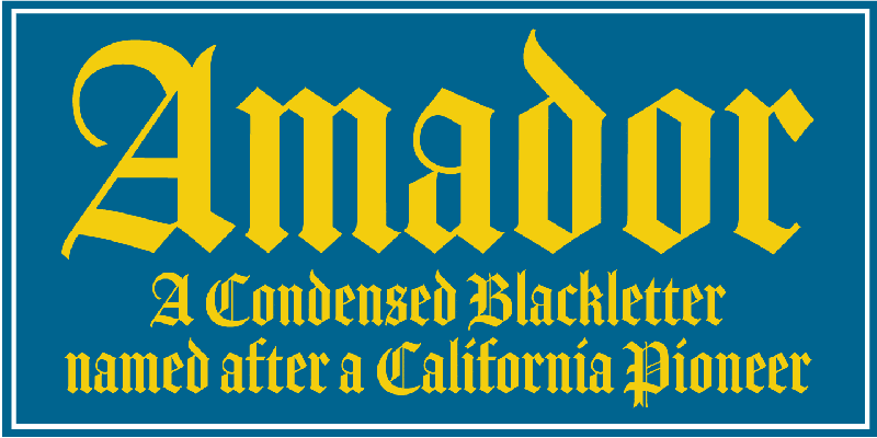
About Amador Font
I first reached for Amador Font during a poster job for a local metal band. They wanted something sharp, historic, and moody, but still readable from a distance. I needed a typeface that could bring drama without turning the whole layout into visual noise.
As I explored options for Free Fonts Lab, Amador kept catching my eye. The shapes felt strict yet expressive, with a strong sense of weight and tradition. That mix of power and control made me curious, so I decided to test it in real layouts, not just in a sample line of text.
Font Style & Design Analysis
Amador Font is a blackletter typeface with a very architectural feel. The strokes are heavy and upright, with sharp angles and tight internal spaces. It looks like it belongs on stone, banners, or carved wood. The overall font style leans more controlled than wild, which makes it feel serious rather than playful.
The designer is not clearly documented, so I will treat this as designer unknown. That said, the work feels considered, not rushed. The font family appears focused on display use, without extra weights or styles. You can sense a clear respect for historic blackletter models, shaped to suit modern digital layouts.
The letterforms are dense, with compact counters and strong vertical stress. Capitals are tall and ceremonial, while the lowercase keeps a steady rhythm across a line. Spacing is tight by default, typical for a blackletter, so I often add a touch of tracking for headlines. The mood is stern, gothic, and formal. Its strength lies in headlines, logos, and short phrases; for long text, it becomes heavy and tiring quite fast.
Where Can You Use Amador Font?
In my own work, Amador Font has worked best in large sizes. Think posters, album covers, event titles, book covers, or bold logotypes. At big sizes, the sharp details and heavy strokes feel powerful and clear. You can control the drama by how much space you give it around other elements.
In small sizes, this blackletter style loses clarity. The tight counters and dense forms start to blur, especially on screens. For body text or UI work, I pair Amador with a simple sans-serif or serif typeface. I let Amador handle the main headline, then use the supporting font family for menus, captions, and long copy.
Amador Font suits projects with a gothic, metal, medieval, or fantasy edge. It also works for heritage branding, craft beer labels, or themed events when used with restraint. For balanced typography, I keep layouts clean and give the letterforms room to breathe. One or two strong words in Amador, plus calm supporting text, tends to create the best visual identity.
Font License
The licensing terms for Amador Font can change depending on the source you use. You should never assume it is free for commercial work, even if it appears on free sites. Always review the current licence details on the official distribution page before using it in client or paid projects. For me, it is a font I reach for when a design needs controlled gothic weight, and I use it carefully where it can truly speak.


Leave a Reply