
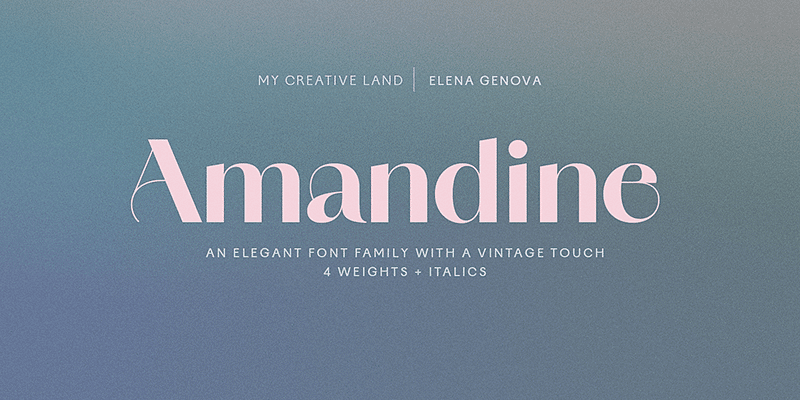

About Amandine Font
I came across Amandine Font while searching for a clean typeface for a calm wellness brand. The client wanted something soft, modern, and easy to read on screens. The name felt gentle, so I dropped it into a few early layout tests to see how it behaved.
My first impression was that it had a quiet confidence. Nothing flashy, but pleasant to look at for a long time. I tried it in simple hero headers, short taglines, and app-style UI labels. That early test made me curious enough to explore it deeper for a review on Free Fonts Lab.
Font Style & Design Analysis
Amandine Font is a sans-serif typeface with a soft, human feel. The shapes look open and airy, with a friendly voice that does not shout. Strokes stay mostly even, and there are no sharp or aggressive details. It feels like a modern workhorse designed for simple, clean typography.
The designer of this font is designer unknown, at least from the sources I could check with confidence. That lack of clear authorship does not change how it performs, but it does mean I stay cautious about licensing. When a typeface has no clear foundry name, I test it more carefully before suggesting it for brand work.
The letterforms lean towards rounded shapes, with soft corners and generous counters. Spacing feels slightly loose by default, which helps on screens and at small sizes. The rhythm of the text looks calm and steady, without quirky forms grabbing attention. This is a strength for body copy, but it can feel a bit too modest for bold, loud display titles. As a sans-serif font family, it works best when you want clarity and warmth rather than drama.
Where Can You Use Amandine Font?
I would use Amandine Font for brands that want to feel gentle, modern, and accessible. Think wellness products, skincare, lifestyle blogs, and simple tech dashboards. It suits user interfaces, basic app screens, and clean website layouts where readability comes first. It handles labels, buttons, and short menus with little effort.
At larger sizes, like hero titles or poster headlines, it stays readable but does not carry a strong display personality. You may need layout support, such as colour blocks, icons, or strong photography, to give it more impact. It pairs well with a sharper serif or a bold display face for key words while it takes care of supporting text.
At smaller sizes, especially on mobile, the open letterforms and slightly loose spacing really help. Paragraphs remain comfortable to read, and the strokes do not clog up. For long articles, guides, and UI-heavy dashboards, this font style stays quiet in the background, which is often what we want. It suits audiences who value clarity and a relaxed visual identity.
Font License
The licence terms for Amandine Font can vary between sources, so I never assume it is free for every use. Before you apply it to client work or large commercial projects, always read the official licence details carefully and confirm both personal and commercial rights from the original provider.
My honest takeaway: I reach for Amandine when I need a soft, reliable sans that supports the design instead of competing with it.


Leave a Reply