

About Amarillo Font
I came across Amarillo Font while searching for a smooth script for a vintage-style café rebrand. I needed something that felt handwritten but still clean enough for menus and takeaway cups. The first test lines already showed me it had a soft, flowing rhythm that felt friendly, not flashy.
I decided to try it across a simple logo lockup and some social post templates. The font handled short words and names quite well, with lively curves and a relaxed personality. For Free Fonts Lab, I explored it further, checking how it behaved in real layouts rather than just a single headline screenshot.
Font Style & Design Analysis
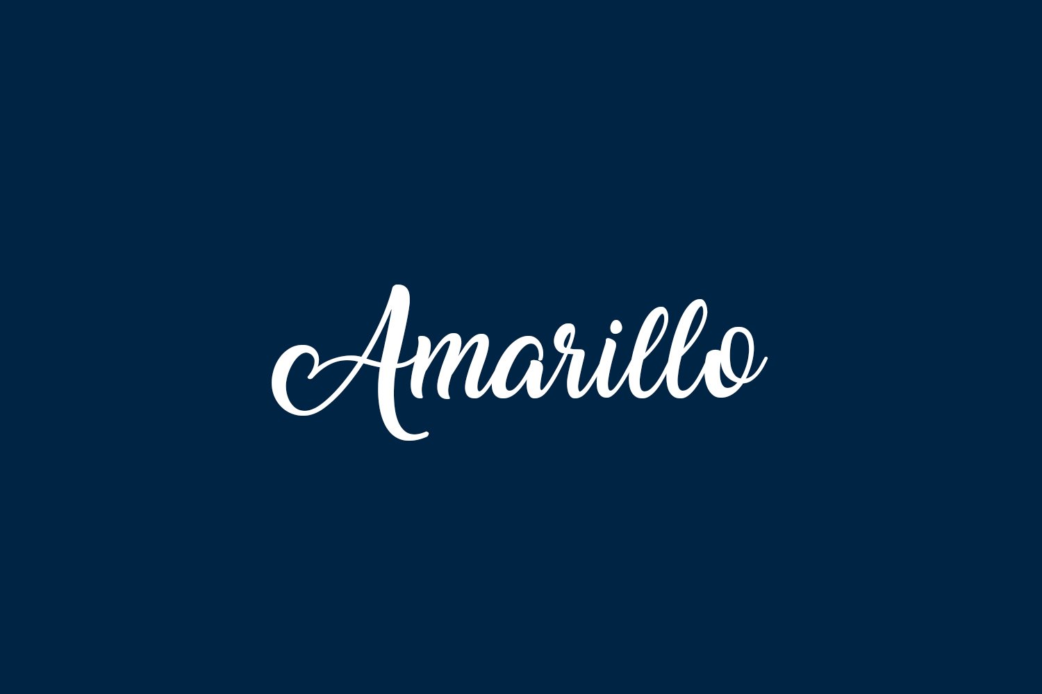
Amarillo Font is a script typeface with a clear hand-drawn feel and smooth, looping strokes. The font style leans towards casual calligraphy, but it stays controlled and fairly consistent. The baseline has a slight bounce, which adds charm without making the text unstable. It reads like a personal note written by someone with neat handwriting.
The designer is unknown, at least from the sources I could verify. Because of that, I treated it carefully, testing it in mock projects rather than active client work at first. Even without a famous foundry name behind it, the typeface shows a fair level of craft in its shapes and connections, especially in common letter pairs.
The letterforms are rounded and soft, with gentle entry and exit strokes that help words connect smoothly. Spacing is fairly tight by default, which suits logos and short phrases but can feel cramped in long lines. The rhythm works best with mixed-case words, as all-caps lose the script flavour. Its mood is warm, easy-going, and slightly nostalgic. It performs well for display use, but long paragraphs become tiring, so I avoid using this script font family for body text.
Where Can You Use Amarillo Font?
I find Amarillo Font most effective in branding where you want a friendly, handmade voice. Café logos, bakery packaging, personal blogs, and boutique shop signage all suit its script nature. It works nicely on invitations, thank-you cards, and quote graphics, especially when you want a human touch without messy strokes.
At large sizes, the curves and loops feel smooth and confident, which makes it strong for hero headlines, logotypes, and social media banners. On smaller text, especially under 14pt, strokes start to close up and lose clarity. I usually pair it with a clean sans-serif for body copy to balance its expressive script style and create a clear visual hierarchy.
For audiences, it speaks well to lifestyle, food, crafts, beauty, and wedding-related projects. It is less suitable for strict corporate or tech brands, where the relaxed rhythm might feel out of place. Used in moderation, a few words in this script can highlight key phrases, while the rest of the layout relies on simpler typography to keep things readable.
Font License
The licensing terms for Amarillo Font can vary depending on where you download it. Some sources list it as free for personal use, while commercial use may require a proper licence. I always recommend checking the official distributor or creator for current licence details before using it in paid client work.
For me, Amarillo works best as a characterful accent script, used with care and good spacing, rather than as a catch-all font for every part of a design.


Leave a Reply