

About American Capitan Font
I first tried American Capitan Font while working on a bold logo for a sports-themed poster. I needed a strong, heroic feel without going full comic book style. The font caught my eye because it promised weight, drama, and clear shapes that could hold up in big, loud layouts.
At Free Fonts Lab, I often test typefaces across different mock-ups before trusting them. With this one, I was curious how its heavy characters would behave in stacked titles and badge-style marks. It looked powerful, but I wanted to know if that power stayed readable and flexible once I started to push it in real designs.
Font Style & Design Analysis
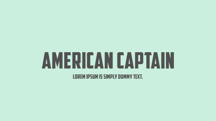
American Capitan Font is a logo font, and every part of the design leans into that role. The letters feel built for big, punchy wordmarks rather than long text. You get thick strokes, sharp corners, and a solid, blocky stance that suggests strength, courage, and maybe a hint of vintage action-movie drama.
The designer is unknown, but the font family clearly takes cues from bold comic and patriotic poster typography. It reminds me of those 80s and 90s action titles where names needed to shout from far away. Still, it avoids looking like a direct copy. Instead, it sits in that space between retro nostalgia and modern logo-focused display design.
The letterforms are wide, with tight spacing that pushes characters closer to each other, which works well for compact logo lockups. The rhythm feels heavy and steady, not playful. That weight gives strong impact in short words, but long phrases start to feel crowded. It shines in single names, initials, and emblems, yet feels too dense for paragraphs or detailed taglines.
Where Can You Use American Capitan Font?
I see American Capitan Font working best in sports, gaming, and action branding where the logo must feel tough and bold. Use it in main wordmarks, team badges, event posters, or e-sports graphics where the central title carries the mood. It quickly sets a heroic, almost cinematic visual identity when used at large sizes.
At big scales, the logo style of this typeface comes alive. The thick strokes handle outlines, shadows, and gradients very well. On jerseys, banners, and thumbnails, it remains readable and striking. At smaller sizes, especially on mobile interfaces or body copy, the tight spacing and weight start to hurt clarity, so I avoid it there.
For pairings, I usually match this logo font with a clean sans-serif for supporting text. Something neutral keeps the layout balanced and stops the page from feeling too aggressive. Let American Capitan Font handle the main title or logo, then use a light, simple font style for menus, captions, and long copy, so the design breathes.
Font License
Before using American Capitan Font in any client or commercial project, always check the official licence details from the source. Terms can change, and personal use, logo use, and large-scale branding often follow different rules. I never rely on memory and always confirm usage rights for every new project.
For me, this font is a solid option when I need a loud, heroic logo that will not disappear in a busy layout. Used with care, in short words and bold marks, it does its job very well.


Leave a Reply