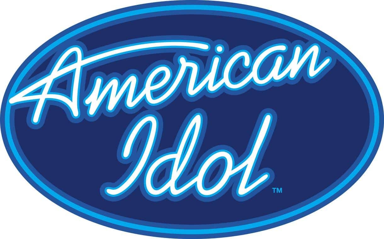
About American Idol Font
I first tried the American Idol Font while building a quick title treatment for a music-themed poster. I needed a bold style that felt familiar, but not too flashy or modern. This typeface caught my eye because it carried a classic mood with a slightly dramatic twist.
As I tested it inside layouts for Free Fonts Lab, I noticed how easily it set the tone for performance, talent shows, and entertainment graphics. It looked strong in headlines, yet kept a clear sense of order. That balance made me curious to see how far I could push it across different formats.
Font Style & Design Analysis
The American Idol Font is a serif typeface, and it leans heavily into that traditional, structured character. The serifs give each letter a firm base, which helps the font feel grounded and reliable. It has a slightly formal presence, but it still works in fun, pop-culture settings because of its bold proportions and confident stance.
The exact designer is unknown, and that sometimes makes it harder to trace the original intention behind the font family. Without a clear foundry or creator name, I approach it more carefully when planning professional identity systems. I focus instead on how the letterforms behave in real compositions, and judge it by performance rather than reputation.
The letterforms are fairly wide, with strong vertical strokes and clear contrast between thick and thin parts. That contrast helps the typography read well at medium to large sizes, especially in titles and logotypes. Spacing feels slightly tight by default, so I often open the tracking a bit for long words. It handles short phrases better than dense paragraphs, and it loses clarity in very small text, which limits it to display and heading roles rather than body copy.
Where Can You Use American Idol Font?
I find the American Idol Font most comfortable in branding and graphics linked to music, talent shows, events, and pop culture. It works nicely on posters, show titles, banners, and social media graphics where a bold serif statement is needed. At large sizes, the details of the strokes show clearly and give the layout a strong centre of attention.
For smaller text, such as captions or long paragraphs, this serif font starts to feel heavy and cramped. I usually pair it with a clean sans-serif for body copy to keep reading easy. The serif personality remains in headlines and logos, while the supporting typeface keeps the design calm and legible. This mix helps balance drama and clarity in one visual identity.
The typeface also suits retro or TV-inspired graphics, especially when you want a sense of competition or performance. It can sit well on ticket designs, merchandise mockups, and streaming thumbnails. When I use it, I keep word counts short, give the letters room to breathe, and rely on simple colour palettes so the strong letterforms stay in focus.
Font License
The licence for the American Idol Font can vary depending on the source where you download it. I never assume that it is free for commercial projects, even if it appears on free sites. For any client or paid work, I always check the official licensing details and terms before using it. My takeaway as Ayan Farabi: treat this font as a bold, situational tool, not an all-purpose workhorse.


Leave a Reply