
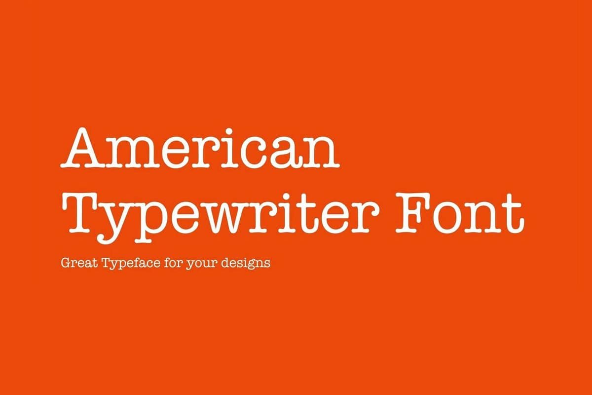

About American Typewriter Font
I first reached for the American Typewriter Font while working on a book cover that needed a quiet, nostalgic tone. The client wanted something that felt printed, but not rough or grungy. I needed a typeface that suggested history without looking like an old prop.
As I tested options for Free Fonts Lab, this one stood out because it balanced structure and warmth. It looked familiar, like classic typewritten pages, yet it sat neatly in modern layouts. That mix of character and control made me want to explore it more in real projects.
Font Style & Design Analysis
This is a serif font with a clear, mechanical influence that still feels human. The strokes are steady, with gentle curves and rounded terminals that echo real typewriter keys. You get the flavour of old documents, but the drawing is cleaner than most vintage-inspired faces, so it does not collapse on screen.
The original American Typewriter Font is widely known as a classic digital typeface, though the exact designer details can vary across versions, and some releases list the designer as unknown. Many modern cuts try to copy the same feel, with small shifts in weight, spacing, and hinting quality.
The letterforms have solid vertical stress, open counters, and compact shapes that give a firm rhythm across a line. Spacing leans slightly tight, which helps in headings but can feel dense in long blocks if you do not adjust tracking. The mood is calm, organised, and a bit nostalgic. It is strong for display and short text, but less ideal for tiny captions or very long, low-contrast reading.
Where Can You Use American Typewriter Font?
I find the American Typewriter Font works best in projects that need a story-driven or archival feel. Editorial covers, memoir titles, book interiors, and documentary posters all benefit from its typewriter voice. At larger sizes, the serif details hold up nicely and give a clear sense of time and place.
In small sizes, the compact shapes can feel heavy, especially on low-resolution screens. For body text, I usually increase line spacing a bit and let the letters breathe. It performs better in short paragraphs, pull quotes, sidebars, and interface labels where you want a subtle retro touch without full decorative drama.
For pairing, I like matching this serif font with a clean geometric sans for contrast. The sans handles body copy or UI elements, while the typewriter style takes titles, tags, and highlights. It suits audiences who enjoy history, crafts, literature, or analogue themes, and it fits branding for cafes, stationery, editorial brands, and gentle storytelling products.
Font License
Licensing for American Typewriter Font can change between versions and distributors, so it is important not to assume terms. Always check the official source for the specific cut you use, and confirm whether your project allows only personal use or full commercial work.
For me, this typeface shines when I need quiet personality, not loud nostalgia. Used with care, it gives just enough typewriter charm without overwhelming the design.


Leave a Reply