
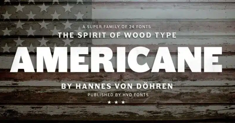

About Americane Font
I ran into Americane Font while I was planning a bold poster series for a local event. I needed a strong headline typeface that could hold attention from a distance but still feel crafted and intentional. The name caught my eye first, but the shapes kept me looking.
I decided to test it for a trial layout on Free Fonts Lab, mainly to see how its heavy forms behaved in busy compositions. I wanted something that could sit over photos, bright colours, and textured backgrounds without getting lost. During testing, I focused on balance, legibility, and how it responded to tight grids.
Font Style & Design Analysis
Americane Font is a bold display typeface with a clear focus on impact and weight. This display design feels built for headlines, logos, and loud statements rather than quiet body copy. The letters sit wide and confident, with tight internal spaces that create a compact, solid block of text when set in all caps.
The designer is unknown, but the font family feels like it comes from someone who studies classic American sign lettering and sports branding. The strokes are thick, the counters are small, and the outlines feel carefully drawn rather than rushed. It does not try to look trendy; it leans more toward sturdy, practical power.
Looking closely at the letterforms, I noticed short, slightly squared terminals and a modest contrast between vertical and horizontal strokes. The spacing is on the tighter side, which helps when you need dense, bold typography, though it can feel cramped at very small sizes. The mood is strong, assertive, and a bit industrial, which works well for posters and titles but makes long text blocks tiring to read.
Where Can You Use Americane Font?
In my tests, Americane Font worked best as a display typeface on posters, banners, and digital covers. At large sizes, the heavy shapes feel confident and readable, even over busy images. It also held up well on simple web hero sections, especially when paired with plenty of white space and a light supporting font style.
I would trust it for sports graphics, music event titles, gaming visuals, and bold branding with a strong, no-nonsense voice. It also fits packaging that needs to shout from the shelf, such as snacks, energy drinks, or streetwear labels. At medium sizes on print, it still works, though you should give the letters room to breathe.
For small text, like captions or long paragraphs, I found it too dense and heavy. I usually paired Americane Font with a clean sans-serif for body copy, letting Americane handle the main headings and striking words. This contrast keeps the visual identity energetic but still readable, and it helps guide the eye through layered layouts and complex grids.
Font License
The licence for Americane Font can change depending on where you download it from. Some sources may allow personal use only, while others might offer broader commercial rights. Before you use it in client work or branding, always read the official licence details carefully and confirm what is allowed.
For me as Ayan Farabi, Americane Font is a strong display tool I reach for when I need volume, structure, and clear impact, as long as I keep it away from long text.


Leave a Reply