
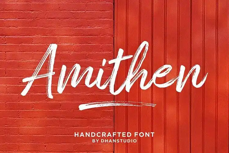

About Amithen Font
I first reached for Amithen Font while working on a bold poster for a streetwear event. I needed something rough, loose, and energetic, but still readable from a distance. Many brush fonts felt either too messy or too clean. This one sat somewhere in the middle, which made me curious.
I decided to test it more deeply for some mock brand concepts I was building for Free Fonts Lab. The gritty strokes, broken edges, and casual movement gave my layouts a strong handmade feel without looking childish. That balance convinced me to explore how far I could push this brush typeface in real design work.
Font Style & Design Analysis
Amithen Font is a true brush typeface with a raw, painted look. The strokes feel like they came from a thick marker or dry brush on rough paper. You can see small breaks, ink pools, and pressure changes in each stroke. This gives the font style a strong human touch and a slightly wild energy.
The designer is unknown, at least from the version I tested. Even without a clear name behind it, the intent is obvious. Someone wanted a brush font family that captures fast handwriting, like notes on a wall or a quick poster sketch. It does not aim for elegance. It aims for impact and movement instead.
The letterforms lean slightly forward, which adds speed and attitude. The capitals are wide and loud, while the lowercase letters feel looser and more casual. Spacing is fairly tight, so words look compact and punchy. This helps for headlines but can feel heavy in longer lines. The rhythm is uneven on purpose, which creates a grunge mood. It shines in short, strong phrases, but it is not a good choice for body copy or long paragraphs.
Where Can You Use Amithen Font?
In my tests, Amithen Font worked best in big sizes. Posters, album covers, streetwear graphics, and social media titles all benefit from its rough brush texture. When you scale it up, the painted edges and broken strokes become clear and add character. It speaks well to younger, urban, or creative audiences.
For branding, I would use this brush font for very specific identities only. It suits skate brands, music events, extreme sports, or bold personal logos. I paired it with a clean sans-serif typeface for body text, which helped balance the noise. The calm secondary font keeps layouts readable while Amithen handles the loud moments.
At smaller sizes, the texture can start to blend and feel muddy, especially in dense text. I avoid using it below medium headline sizes. It does best in short words, taglines, or callouts rather than full paragraphs. If you keep the copy brief and give it space to breathe, the brush energy feels strong instead of chaotic. Used with care, it can be a powerful display tool.
Font License
The licensing for Amithen Font can vary depending on where you download it. Some sources may allow personal use only, while others might include commercial rights. I always recommend checking the official licence details before using it in paid client work or large branding projects.
For me as a designer, Amithen is a font I reach for when I want fast, messy energy without losing legibility. It is not a daily workhorse, but when the brief calls for impact and grit, it earns its place in my toolbox.


Leave a Reply