
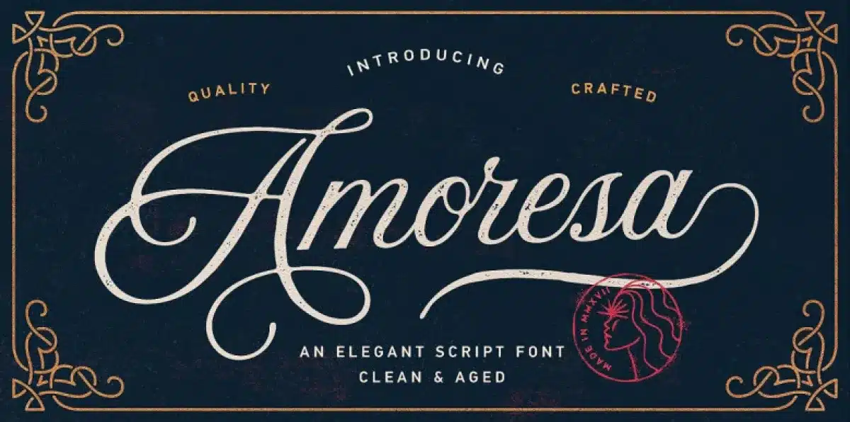

About Amoresa Font
My first reaction to the Amoresa Font was simple: this feels soft and romantic. I was looking for a script typeface that felt warm, but not messy. Many script fonts look too busy for client work, so I wanted something calmer and easier to read.
What drew me in was the flowing stroke and gentle curves. I tried it in a small wedding brand study for Free Fonts Lab, then later in a few logo sketches. During those tests, I checked how the font style behaved in short words, longer names, and simple quotes.
Font Style & Design Analysis
In my view, Amoresa Font sits firmly in the script and calligraphy space. The visual direction leans towards elegant, slightly playful handwriting, with a clear romantic mood. Strokes feel smooth and confident, which works well for soft branding, wedding stationery, and personal signatures.
As far as I could confirm, the original designer is unknown, at least from the sources I checked. That does not hurt the font family itself, but it does mean I treat the typeface more carefully in client projects. Without a clear foundry, I always double check the licence and file quality before serious commercial use.
Looking closely at the letterforms, the lowercase letters have gentle curves and nice internal rhythm. The spacing feels a bit tight in some pairs, especially around rounded shapes and loops, so I often adjust tracking slightly. It shines in short words and names, where the flowing connections create a clear, romantic voice. Long paragraphs look heavy and lose clarity, so I keep it for headlines, logos, and short phrases.
Where Can You Use Amoresa Font?
From my tests, Amoresa Font works best in branding that needs a soft, emotional tone. Wedding logos, save-the-date cards, and beauty product labels are obvious fits. It also suits social media graphics aimed at a mostly female audience, especially around themes like love, self-care, and lifestyle.
At large sizes, the script details look clean and graceful, and the curves feel elegant. On posters or hero headers, each stroke holds up well, and the calligraphic feel adds personality. At smaller sizes, especially under 12pt, some fine hairlines start to fade, so I avoid it for small body text or dense captions.
For pairing, I usually place this script beside a simple sans-serif or light serif font. A clean supporting typeface helps balance the romantic script and keeps the layout readable. I like using the script for key words in a logo or title, then switching to the supporting font family for taglines, menus, and long copy.
Font License
From what I found, licence details for Amoresa Font are not fully clear in every source. Some sites treat it as free for personal use, but rules may differ for commercial projects. I strongly recommend checking the official licence text and terms before using it in any paid or client work. My own use stays cautious.
After spending time with this script in real layouts, my honest take is simple: I like Amoresa Font for focused, emotional moments, not for everything. When I need a romantic, handwritten touch in a logo, title, or short phrase, it does the job with charm. Used with care and proper pairing, it can add just enough feeling without overwhelming the design.


Leave a Reply