
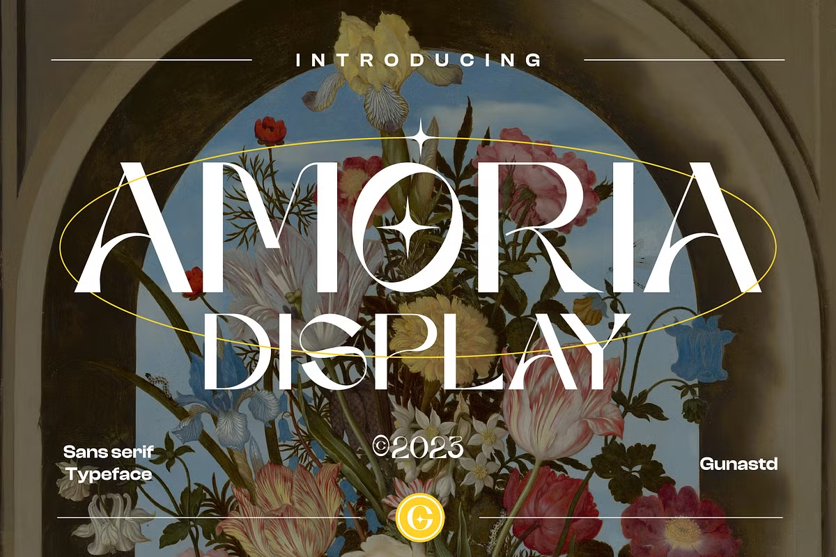

About Amoria Font
I came across Amoria Font while searching for a bold title style for a romantic poster series. I needed something expressive but still readable. The name caught my eye first, then the strong shapes pulled me in. It felt emotional without looking messy or overdone.
I tested it on a few mock covers and social graphics for a concept project at Free Fonts Lab. I wanted to see if it could hold a clear visual identity across print and screen. The font looked striking at once, so I decided to explore it more deeply in real layout situations.
Font Style & Design Analysis
Amoria Font is a pure display typeface, built to grab attention rather than handle long reading text. The shapes feel dramatic, with sharp contrasts and strong curves that push the eye toward the word as a whole. It carries a romantic, slightly theatrical tone that leans towards drama more than subtlety.
The designer is unknown, at least from what I could reliably confirm. That lack of clear authorship makes it harder to trace its design roots, so I focused mainly on how it behaves in layout. I treated it like any other display font family on my system and tested it side by side with similar bold title styles.
The letterforms have tight internal spaces and confident strokes, which give the words a dense, solid feel. Spacing tends to be on the closer side, so I often opened the tracking a notch for headlines. The rhythm works best in short words or compact phrases. It shines in emotional, bold titles, but struggles in small body sizes or busy, text-heavy layouts. As a display font, its strength is mood, not long-form readability.
Where Can You Use Amoria Font?
I found Amoria Font most effective in large headline work. It works well for book covers, film posters, event titles, or dramatic hero banners. When set big, the heavy contrast and sculpted shapes feel intentional and powerful. The emotional tone suits romance, drama, lifestyle, beauty, and some fashion projects.
At medium sizes, like subheads or pull quotes, it can still work if the text is short and has room to breathe. I would avoid using it for UI labels or long captions. On screen, strong anti-aliasing helps, but the detail can feel cramped when the size drops too far. It wants space and scale.
For pairing, I had good results matching it with a clean sans-serif or a neutral serif for body copy. Let Amoria Font do the expressive work in titles, and keep everything else calm and simple. In branding, I would limit it to logotypes, wordmarks, or key phrases, rather than full systems. Think of it as the dramatic accent piece in your typography toolkit.
Font License
The licence for Amoria Font can vary depending on where you get it, and the terms may change over time. Do not assume it is free for commercial work. Always read the official licence carefully and confirm that your planned use, both personal and professional, is clearly allowed.
For me, Amoria sits in that category of fonts I reach for when a layout needs strong feeling in just a few words, and nothing more.


Leave a Reply