

About Andrea Font
I came across Andrea Font while searching for a warm, personal handwriting style for a small packaging job. I needed something casual but still readable, with a touch of charm rather than messy scribbles. The font looked friendly on screen, so I decided to test it in a few layout drafts.
What caught my eye first was the easy flow of the strokes and the soft, rounded shapes. It felt like a quick note from a friend, not a stiff design tool. I tried it in a short headline, a product label, and a simple quote graphic for Free Fonts Lab, just to see how far I could push it.
Font Style & Design Analysis
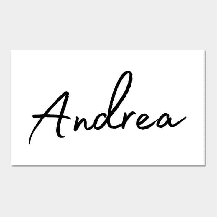
Andrea Font is a handwritten typeface with a relaxed, everyday tone. The letters look like they were written with a smooth pen on clean paper, not a brush or marker. It has a gentle slant, loose curves, and a slightly bouncy baseline that gives the font style a human rhythm without going wild or childish.
The designer is unknown, and that does show a bit in how the font family is built. There is usually just one weight, with no bold or italic companions. That limits deep typographic systems, but for a simple handwritten voice, the core style does enough. It feels like a one-purpose tool rather than a full family.
The letterforms are open and airy, with rounded counters and soft terminals. Spacing is on the wide side, which keeps words breathable in headings but can feel loose in dense body copy. The rhythm works well for short lines and quotes, where the casual flow shines. For long passages, the informal mood and wide tracking become tiring, so I treat it as a display handwriting font with clear strengths in small bursts.
Where Can You Use Andrea Font?
I find Andrea Font most effective in friendly, human projects where personality matters more than strict structure. It works well on greeting cards, thank-you notes, product labels, and light social media graphics. At large sizes, the handwritten character feels warm and inviting, especially when paired with soft colours and simple backgrounds.
At smaller sizes, such as long paragraphs or dense UI text, the wide spacing and loose forms start to break the reading flow. I would not use it for long articles or serious business documents. Instead, I pair this handwritten style with a clean sans-serif for body copy. The contrast lets Andrea Font handle headings, names, and little emphasis lines without overwhelming the layout.
This typeface also fits youth-focused brands, handmade products, or any visual identity that aims to feel personal and unpolished in a controlled way. It can sit nicely on notebook covers, stickers, and casual logos, as long as you keep the text short. When I plan a layout, I usually keep it to 5–7 words per line with generous margins, which keeps the handwritten energy clear and readable.
Font License
The licence terms for Andrea Font can vary depending on where you download it. I never assume a font is free for commercial jobs, even if it looks that way. Always read the official licence and check if you need a separate commercial or extended use permission before using it in client work or products for sale.
For me, Andrea Font is a useful, single-purpose handwritten tool that works best in short, friendly bursts. When I need a calm, personal note in my typography, I keep it in mind, but I use it with care and clear limits.


Leave a Reply