

About Anurati Font
I first tried Anurati Font while working on a simple sci-fi title screen for a short video project. I wanted something sharp, clean, and a bit futuristic, but not too complex or noisy. Many options felt overdone or hard to read, so I kept searching.
When I tested Anurati inside that layout, the mood clicked right away. The sliced shapes and open gaps gave the title a strong digital feel. I later wrote about my first tests at Free Fonts Lab, because I felt this typeface solved a very specific visual problem: it delivers a clear futuristic voice without drowning the design in effects.
Font Style & Design Analysis
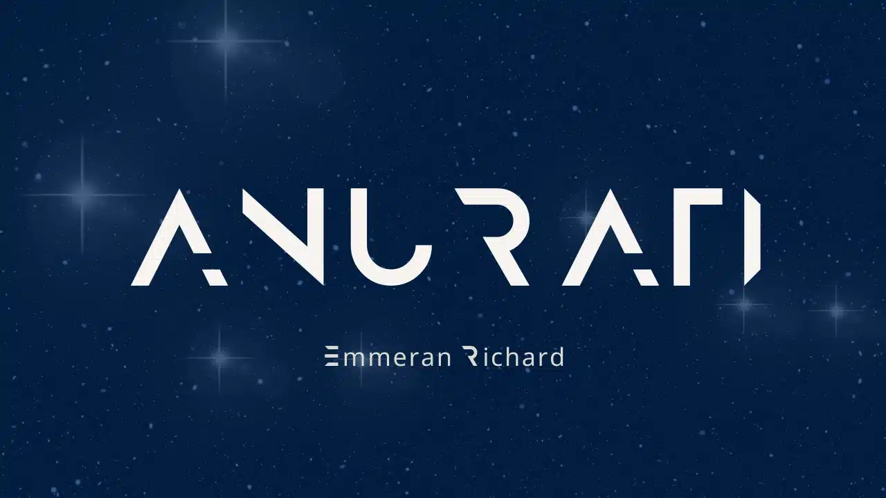
Anurati Font is a pure display typeface, built for large, bold headlines rather than long reading text. The design leans into a futuristic and tech-driven look, using cut-out sections and simplified geometry. Each character looks like a digital stencil, which gives the whole font family a strong sci-fi tone.
The designer unknown choice is interesting here, because the typeface still feels very personal and intentional. The shapes show a clear idea: remove just enough strokes to feel modern, but keep the letters readable. It sits between cyberpunk posters and sleek tech branding, and that balance makes it quite flexible for visual identity experiments.
The letterforms are wide and spaced with a steady rhythm, so words feel calm and structured, not chaotic. Those internal gaps and missing strokes add style, but they also reduce legibility at small sizes. In my tests, the font style worked best for short words, names, and logos. It struggles with long paragraphs or tight body copy, but shines when you let it speak in just a few powerful words as a display highlight.
Where Can You Use Anurati Font?
I find Anurati Font most useful in projects that want a futuristic or tech flavour without heavy 3D effects. Think sci-fi posters, game splash screens, DJ event flyers, or short wordmarks for digital products. On large screens or print, the cut-out strokes look crisp and intentional.
At small sizes, the missing parts of the letters start to blend together, so I avoid it for captions or detailed UI text. It performs best as a headline font style, especially when paired with a simple sans-serif for body copy. I like matching it with a neutral grotesque or geometric sans to support a clear layout.
For audiences, it speaks well to gamers, tech start-ups, music producers, and any brand leaning into sci-fi or cyber themes. On darker backgrounds with strong contrast, the typography feels bold and cinematic. Used with plenty of spacing and breathing room, the display nature of the typeface helps create a strong, memorable first impression.
Font License
The licensing for Anurati Font can change over time, and terms may differ for personal and commercial work. I always recommend checking the official source before using it in paid client projects or large campaigns. Read the licence carefully, especially for logo use or wide distribution, to avoid any legal surprises later.
For me, Anurati works best as a focused tool: great when a project needs a clean, futuristic headline, but not a font I reach for daily. When I do use it, I treat it like a visual spice—strong, specific, and very effective in the right amount.


Leave a Reply