
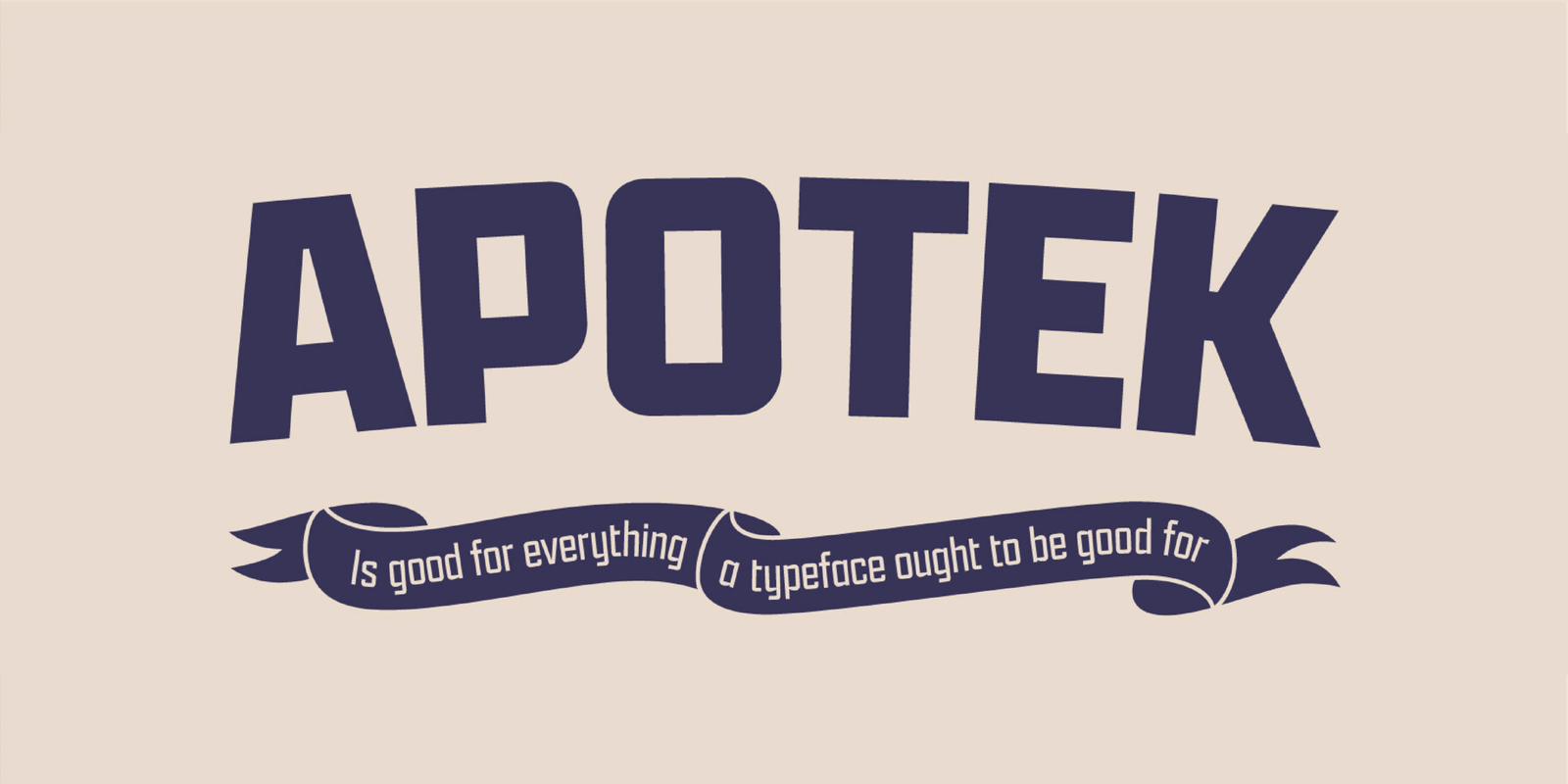

About Apotek Font
I came across Apotek Font while searching for a clean typeface for a pharmacy brand concept. I wanted something simple, modern, and clear, without feeling cold or too technical. The name caught my eye first, but the shapes kept my attention during testing.
I tried it in a mock health campaign at Free Fonts Lab, mainly for posters and basic packaging. I needed a font that stayed readable in busy layouts and worked well with icons and simple colour blocks. It looked promising, so I decided to run it through a few real design scenarios.
Font Style & Design Analysis
Apotek Font is a sans-serif typeface with a clean and controlled look. The overall design feels rational, but not stiff. Strokes are mostly even, with gentle contrast that keeps the letters from looking flat. It sits somewhere between neutral corporate style and soft, human-centred branding.
The designer of this font is designer unknown, at least from what I could confirm through regular research. Because of that, I treated it carefully and tested it more before using it in any public-facing work. Even without a known foundry, the structure of the font family feels considered and consistent.
The letterforms have a slight squareness, but edges stay rounded enough for friendly reading. Counters in characters like “a”, “e”, and “o” are open, which helps on screens and small print. Spacing is on the tighter side, but not cramped, giving a steady rhythm in text. As a sans-serif, it adapts well to grids, though long paragraphs may feel a bit clinical if you don’t add enough line spacing.
Where Can You Use Apotek Font?
I found Apotek Font works well for health, wellness, and tech-related branding, where clarity really matters. It handles product labels, pharmacy signs, app interfaces, and clinic brochures with ease. Its clean typography style helps build trust, without leaning into cold hospital aesthetics.
At larger sizes, like headlines and wayfinding signs, the font style feels confident and direct. The open shapes and solid stroke weight keep it legible from a distance. In smaller sizes, like descriptions or dosage text, it stays readable if you give it enough tracking and line height. On low-resolution screens, it still holds up fairly well.
I like pairing this typeface with a soft serif or a light script for contrast in visual identity projects. For example, using Apotek Font for headings and UI elements, then a subtle serif for body copy creates a nice balance. It also sits nicely in minimalist layouts with simple icons and flat colour schemes.
Font License
I could not confirm a single, fixed licence for Apotek Font, so I treat it with caution. Before using it in any personal or commercial project, you should always review the licence details from the original source and make sure the permissions match your intended use.
Using this font reminded me that clean design is not about flair, but about quiet control. When I need a calm, clear voice in a project, I keep Apotek in mind as a careful option.


Leave a Reply