

About Archaic Font
I came across Archaic Font while hunting for a dramatic title style for a fantasy poster. I needed something bold, strange, and a bit unsettling, but still readable at a glance. The name caught my eye first, then the shapes pulled me in and made me curious enough to test it.
I tried it on a mock book cover and a game UI screen for a Free Fonts Lab concept project. Right away, I could see it was a very specific tool, not a general workhorse. That made me pay closer attention to how this display typeface behaved in real layouts and colour schemes.
Font Style & Design Analysis
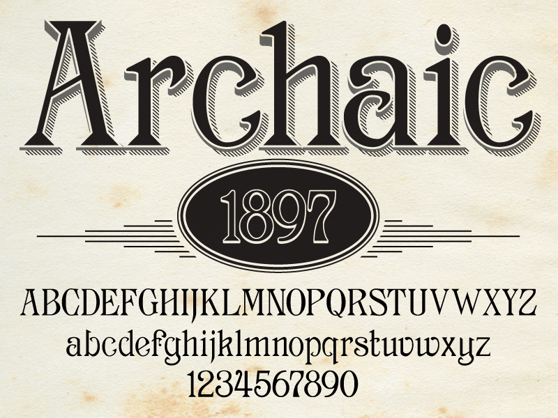
Archaic Font is a pure display font, built to grab attention rather than sit quietly in long text. Its visual direction feels worn, rough, and slightly mysterious, like old carved stone or aged runes. The font style leans into heavy contrast and sharp edges, which makes every word look intentional and staged.
The designer is unknown, which sometimes happens with niche experimental fonts that move around design communities. Because of that, I treat this font family with extra care, especially for client work. Without a clear foundry or author, there is no easy way to ask questions or expect ongoing updates or refinements.
The letterforms are chunky, uneven, and often exaggerated, with strokes that look chipped or eroded. Spacing runs tight in many combinations, so words can feel compressed if you do not adjust tracking. The rhythm is slow and heavy, giving a strong, archaic mood but limiting small-size use. Its strength is big, dramatic typography; its weakness is subtlety and fine detail.
Where Can You Use Archaic Font?
I see Archaic Font working best in fantasy book covers, game titles, posters, and event graphics that need a dark or ancient tone. At large sizes, the display character really comes alive, and the texture in the letterforms supports a strong visual identity. For small captions or UI labels, it breaks down and becomes tiring to read.
On screen, it works well for headers, splash screens, and menu titles, as long as you give it enough breathing room. For print, I would use it in short headlines, logos, or chapter openers only. Long paragraphs in this typography style feel too heavy, even with generous line spacing and adjusted kerning.
In terms of pairing, I usually match Archaic Font with a clean sans-serif for body text, or a calm serif for supporting subheads. Let the display letters handle mood, and let the partner typeface handle clarity. When you keep layouts simple and avoid clutter, the archaic look stays striking instead of messy or chaotic.
Font License
Licensing for Archaic Font can change depending on where you download it, so I never assume usage rights. Before using it in any client or commercial project, always read the licence on the original source. I only proceed once I know what is allowed for personal and professional work.
My honest takeaway: Archaic Font is a bold display tool for very specific moments. When I use it with restraint and clear purpose, it adds strong character without overwhelming the whole design.


Leave a Reply