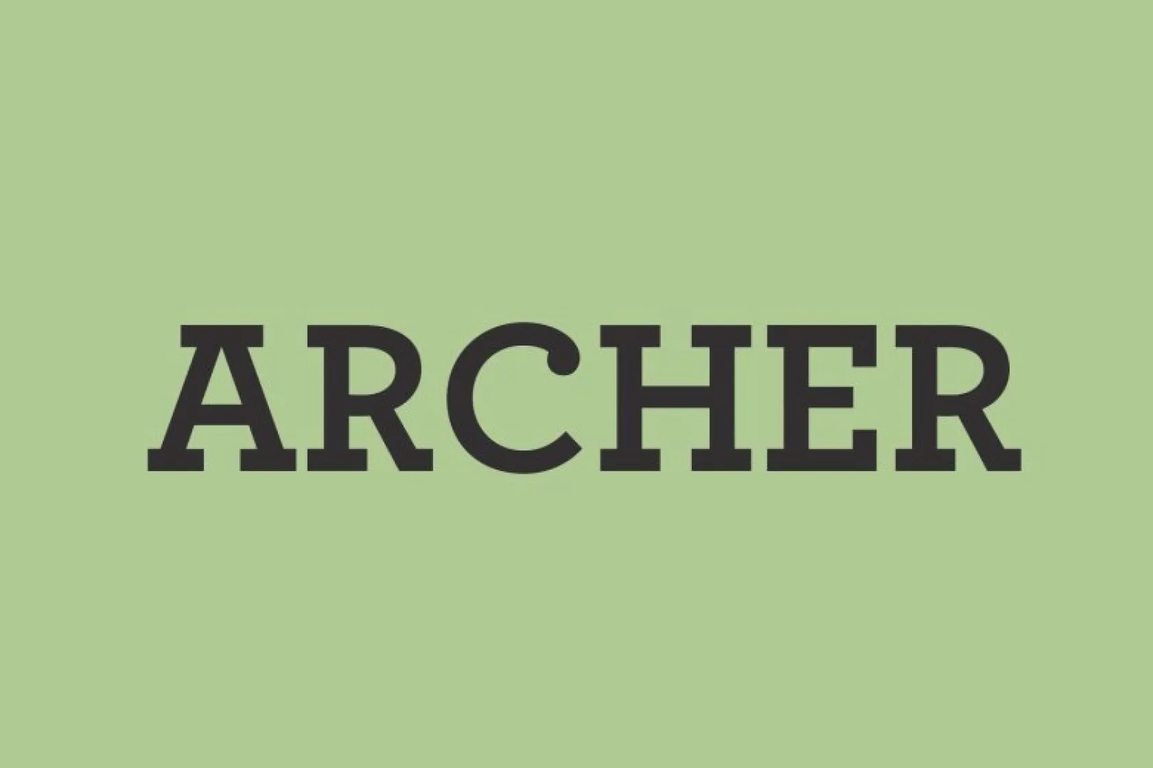
About Archer Font
My first reaction to Archer Font was simple: it felt calm, smart, and friendly at once. I had seen it many times in magazines and brand decks, so I wanted to test it properly in a few client layouts and a small editorial project I was building for Free Fonts Lab.
What pulled me in was the mix of warm slab serifs and modern clarity. It promised structure without feeling stiff. I used it in headings, pull quotes, and short bits of body copy to see how it handled different roles. Very quickly, I noticed how steady and trustworthy the typeface felt on the page.
Font Style & Design Analysis
From a design point of view, Archer sits clearly in the slab serif family, but with a softer voice than many classic slabs. The overall direction feels human and approachable, not mechanical. Rounded terminals and gentle curves give it a relaxed tone, while the strong verticals keep the typography anchored and confident.
As far as I know, Archer came from experienced type designers focused on editorial use and branding work rather than display novelty. The font family has multiple weights, which helps when building a full visual identity system. Exact credit and release details can vary by source, so I treat the designer information as partly uncertain and check documentation when needed.
Looking closely at the letterforms, the proportions feel balanced, with open counters and a generous x-height that supports clear reading. Spacing feels even and measured, which creates a smooth rhythm in paragraphs. In lighter weights, the mood leans gentle and conversational; in bold weights, it becomes solid and grounded. It handles headings, subheads, and short text very well, but for extremely long small-print text, I find a simpler serif can sometimes read a bit easier.
Where Can You Use Archer Font?
In real projects, Archer Font has worked best for me in branding systems that want to feel friendly but still grown-up. It fits well in editorial layouts, packaging, and presentation decks aimed at lifestyle, education, or cultural audiences. When a client needs approachable authority, this font family often sits high on my list.
At large sizes, the slab serif details really shine in posters, covers, and headlines. The rounded shapes and clean structure hold up well on screens and in print. At smaller sizes, especially in long paragraphs, it stays readable, but I take care with line spacing and contrast to keep the text feeling light and not too dense.
For pairings, I like Archer as the primary display and subheading face, combined with a simple sans-serif for body copy. This mix keeps layouts clean and modern while letting Archer carry the personality. It also works nicely in grids with strong margins and clear hierarchy, where each font style has a clear job in the overall composition.
Font License
From what I have seen, Archer Font is usually offered as a commercial typeface, not a free one. Terms can change between vendors, so I never assume usage rights. Always check the official licence details before using it in any client, brand, or commercial project. That habit has saved me many headaches, and it still guides me today as Ayan Farabi.


Leave a Reply