

About Atlanta College Font
I came to the Atlanta College Font while working on a retro sports poster for a school event. I needed something bold, sturdy, and a bit old-school, but not too decorative. The name caught my eye first, then the blocky shapes pulled me in.
I tested it on headlines, jersey numbers, and badge-style logos to see how it behaved in real layouts. The strong college look felt right for that project, so I kept pushing it in different colour schemes and textures. Later, I wrote up my notes for Free Fonts Lab so other designers could judge if it fits their work.
Font Style & Design Analysis
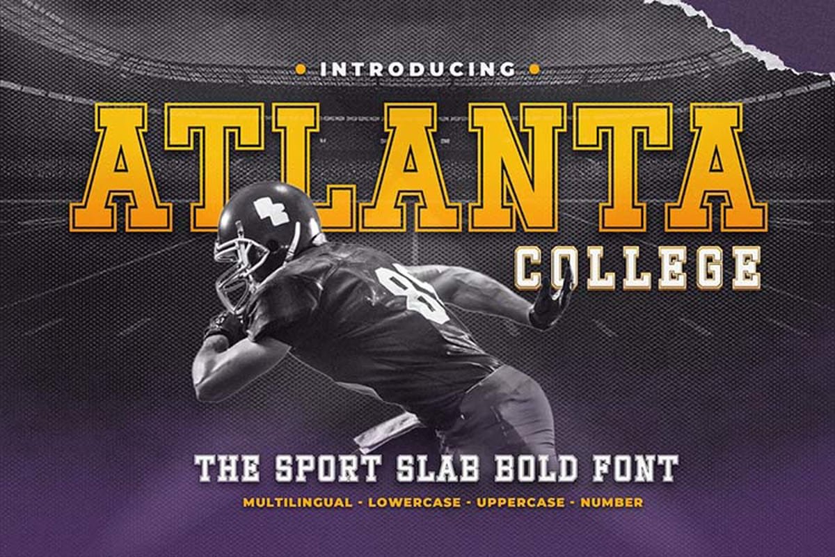
This typeface is a slab-serif font, and that character shows in every letter. The serifs are thick, almost like small blocks attached to each stroke. It has a classic college and varsity mood, with strong vertical lines and a very solid frame that holds attention from a distance.
The exact creator of this font is designer unknown, at least from what I could confirm. That makes it a bit harder to trace its design story or foundry standards. Still, the work feels focused on sports graphics, campus branding, and old-school American sign painting traditions.
The letterforms are wide, with firm shoulders and tight inner spaces, which gives the font family its heavy, grounded feel. The spacing is quite compact, so words form dense blocks, especially in all caps. That density works well for short headlines, but longer text can feel crowded. As a slab-serif option, it carries authority and energy, yet it lacks nuance for delicate or highly refined typography.
Where Can You Use Atlanta College Font?
The Atlanta College Font fits best in projects that need a strong sports or campus identity. Think team posters, tournament banners, gym walls, or club merchandise. It works well for badges, numbers, and bold wordmarks where you want that instant college feel without extra ornament.
At large sizes, the heavy serifs and chunky shapes look crisp and confident. You can easily use it on stadium signs, t-shirt designs, or social media graphics. At small sizes, though, the tight spacing and weight can start to blur, so I avoid it for captions or body text. It is a headline tool, not a paragraph worker.
For pairing, I usually combine it with a clean sans-serif for supporting text, so the layout stays readable. A light or regular sans body font balances the strong slab structure nicely. In branding systems, I keep Atlanta College Font for logos, main headers, and numbers, then let a simpler typeface handle all functional typography for menus, details, and long copy.
Font License
Before using this typeface in paid client work, I always check the licence from the original source. Terms for personal and commercial use can change over time. Do not assume it is free for every purpose. Read the licence carefully and make sure it covers your print, web, or merchandise needs.
My honest takeaway as Ayan Farabi: this font is a strong, niche tool for sports and college themes, and it works best when you use it with restraint and clear intent.


Leave a Reply