

About Atlantis Font
I first tried Atlantis Font while exploring bold titles for a fantasy game cover. I needed a dramatic display font that felt adventurous, but not childish. The name caught my eye, but the shapes kept me testing it longer than planned. It had a strong voice without shouting too loud.
As I played with it inside mock-ups for Free Fonts Lab, I noticed how quickly it set a mood. This typeface made my layouts feel like part of a story world. That made me curious to see how it behaved in different colours, textures, and backgrounds, so I pushed it through a few more test pieces.
Font Style & Design Analysis
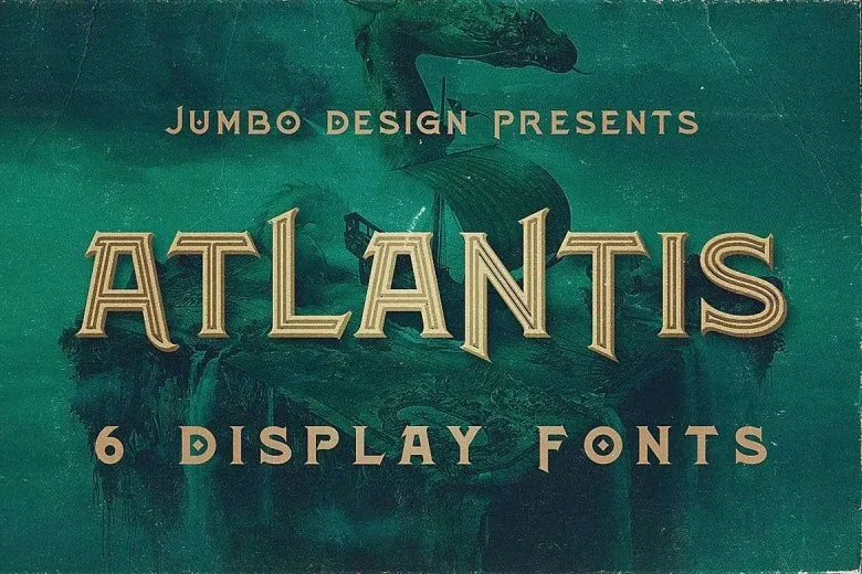
Atlantis Font is a pure display typeface, clearly built for big, attention-grabbing text. The overall font style leans towards fantasy and adventure, with bold, stylised letterforms that look almost carved. It feels like something you might see on a treasure map, a game title, or a classic adventure film poster.
The designer is unknown, at least from the sources I checked. That can happen with many popular display fonts shared across design sites. In cases like this, I tend to focus on behaviour and quality in real layouts, rather than the story behind the creator, since that information is not always clear or verified.
The letterforms have strong vertical strokes and slightly compressed shapes, which give the font family a tight, powerful rhythm. Spacing is on the snug side, especially in uppercase, so headings feel solid and compact. It works well for short words, but longer titles may look heavy if you do not adjust tracking. The mood is dramatic, mysterious, and a bit old-world. As a display font, it is not suited for body copy, but it adds real character to logos, posters, and covers when used with restraint.
Where Can You Use Atlantis Font?
I see Atlantis Font working best in projects that need a sense of magic, mystery, or ancient worlds. Think fantasy book covers, game interfaces, escape room posters, or themed event branding. It shines in large sizes, where the details in the letterforms can breathe and the strong typography style feels intentional.
At smaller sizes, the tight spacing and decorative shapes start to blend, especially on screens. I would avoid using it for long taglines or UI labels. Instead, I pair it with a clean sans-serif or simple serif for body text. That contrast helps the display letters feel like a title, while the supporting font carries readability for everyday content.
For visual identity work, I would use this font as a hero accent rather than the only typeface in a brand system. A game logo, a film title, or a special campaign headline can all benefit from its unique mood. It works nicely with centred layouts, generous margins, and textured backgrounds like stone, parchment, or worn metal.
Font License
Licensing for Atlantis Font can vary between sources, so I never assume usage rights. Before using it in any client or commercial project, check the original distributor for clear licence terms. Make sure personal, commercial, and web use are all allowed for your specific case.
For me, Atlantis Font is a tool I reach for when I want strong, fantasy-flavoured headlines without going too cliché. Used carefully and in the right context, it can anchor a layout and give a project a distinct narrative tone.


Leave a Reply