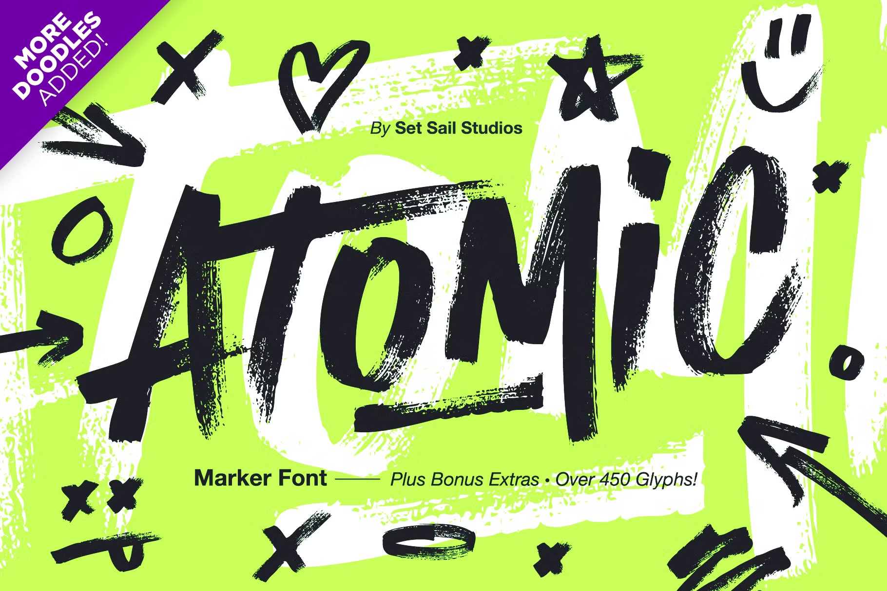
About Atomic Marker Font
I came across Atomic Marker Font while working on a lively poster for a local art market. I wanted something loud, rough, and human, but not messy beyond control. This typeface caught my eye because it looked like real ink dragged across paper, with just enough structure to stay readable.
I tested it in a few quick mockups for headlines and short taglines. The way the strokes overlapped felt raw yet intentional, which suited the project mood. I later explored it more deeply for a review on Free Fonts Lab, as I was curious how it would behave in different layouts and colour palettes.
Font Style & Design Analysis
This is a bold brush typeface with thick, streaky strokes and a strong handmade feel. The letters look like they were drawn with a chunky marker on slightly rough paper. The edges are jagged, with visible texture that adds energy. It pushes towards a graffiti or street-art look, but keeps enough order for clear display use.
The exact creator of Atomic Marker Font is designer unknown, at least from the sources I could check with confidence. Because of that, I treated the typeface more as a raw visual tool than a full, carefully documented font family. The lack of clear authorship also made me more cautious about licence checks before any client work.
The letterforms have a tight, forward-leaning rhythm, which gives the typography a sense of motion. Strokes are heavy, with strong contrast between thick runs and sharp tapering ends. Spacing is quite compressed, so words feel like solid shapes. This helps for punchy headlines, but becomes a limitation for long text. In small sizes, finer details blur, and counters close up, so I would avoid it for small body copy.
Where Can You Use Atomic Marker Font?
I see Atomic Marker Font working best in loud, expressive branding where personality matters more than polish. Think music posters, streetwear labels, skate brands, or event graphics for creative festivals. In large sizes, the brush texture stands out and adds grit, which can support a bold visual identity.
On packaging, it can work for snacks, energy drinks, or youth-focused products that want to feel rebellious or playful. I would pair it with a simple sans-serif typeface for body text or details, so the layout stays readable. Using it only for key words, short phrases, or logotypes keeps the design balanced and stops the page from feeling chaotic.
On screens, Atomic Marker Font holds up nicely for hero banners, thumbnails, or social media graphics, as long as the text size stays large. It struggles in long captions or UI labels. For younger audiences, or any project leaning into urban culture, it can speak in an authentic way. For corporate or formal work, though, it will likely feel too aggressive and informal.
Font License
The licence terms for Atomic Marker Font can vary depending on where you download it. Some sources may allow personal use only, while commercial projects might need a paid or extended licence. I always recommend checking the official licence details carefully before using it in any client or paid work.
My personal takeaway as Ayan Farabi: I reach for Atomic Marker Font when I need raw, high-impact headlines, and I avoid it whenever clarity and calm mood are more important than expressive texture.


Leave a Reply