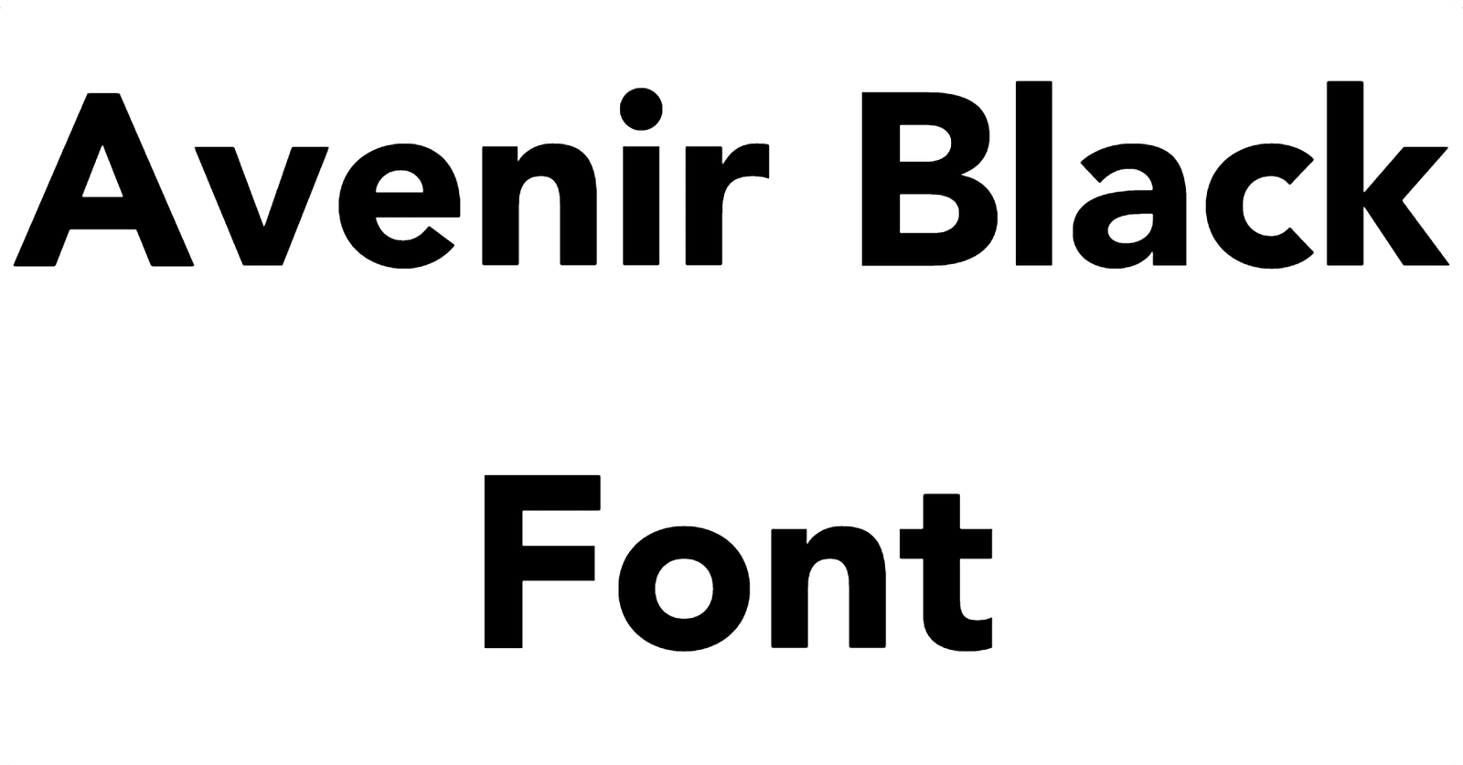
About Avenir Black Font
I first reached for Avenir Black Font during a bold rebrand project that needed calm strength, not loud gimmicks. The client wanted a clean, modern voice that still felt human and approachable. I needed a typeface that could hold a logo, headings, and tight layouts without falling apart.
As I tested options for Free Fonts Lab, this weight of Avenir kept pulling me back. The heavy strokes, simple geometry, and clear rhythm gave me a stable base for branding work. It looked confident on screen and in print, which made me trust it quickly during real design tasks.
Font Style & Design Analysis
Avenir Black Font is a geometric sans-serif typeface with a strong, compact presence. The shapes feel clean and balanced, with rounded details that soften the heavy weight. It gives a modern look, but it never feels cold or harsh. The dark, thick strokes create strong blocks of text that stand out in any layout.
The original Avenir font family was designed by Adrian Frutiger, one of the most respected names in modern typography. His work focused on clarity and simple structure, and this weight follows that same idea. Even though this is a heavier style, you can still feel that careful design logic in every curve and angle.
The letterforms in Avenir Black Font have generous counters and clean terminals, which helps the heavy weight stay readable. Spacing feels tight but controlled, so headings look unified rather than crowded. The rhythm is steady, making short text blocks easy to scan. It excels in titles, logos, and bold captions, but long paragraphs in this weight can feel dense. I see it as a powerful display partner rather than a body text workhorse.
Where Can You Use Avenir Black Font?
I find Avenir Black Font works best in projects where you need strong, clear emphasis. It shines in brand identities, posters, hero banners, app headers, and packaging. At large sizes, the heavy strokes and simple shapes look sharp and confident, which is great for tech, fashion, and editorial work.
At smaller sizes, this sans-serif weight still holds up for short labels, buttons, and menu items, but I avoid using it for long body copy. The thick strokes can make dense text feel heavy on the eye. I usually pair it with a lighter weight of Avenir or another clean sans-serif for paragraphs, so the hierarchy feels natural and easy to follow.
In terms of visual identity, this font style brings a sense of modern stability. It speaks well to audiences who expect clarity and trust, such as in finance, software, education, or lifestyle brands. I like using it for strong wordmarks and bold pull quotes, then balancing it with generous white space and simpler supporting typography.
Font License
The licensing for Avenir Black Font can vary depending on the source, platform, and use case. Before using it in client work, apps, or commercial branding, always check the official licence details. Make sure the permissions cover desktop, web, and any extended use you need. I never skip that step when planning real projects.
For me, this weight of Avenir has become a reliable tool when I need bold clarity without drama. Used with good spacing and thoughtful pairing, it can anchor a design system in a very steady, professional way.


Leave a Reply