

About Averta Font
I first reached for Averta Font while working on a clean, tech-focused brand that needed warmth without noise. The client wanted something modern but not cold, simple but not boring. I was searching through my usual library, and this typeface kept catching my eye with its calm, open shapes.
I decided to test it across the whole visual identity system, from logos to app screens. The more I used it, the more it felt like a steady, reliable tool. For this review at Free Fonts Lab, I went back to that project, opened the old files, and checked how the font behaved in real layouts, not just in a specimen.
Font Style & Design Analysis
Averta Font is a sans-serif typeface with a very balanced, almost neutral voice. It sits in that space between geometric and humanist, so it feels both precise and friendly. The shapes look clean and controlled, with rounded forms that soften the overall look. On screen and in print, it gives a stable, grounded presence.
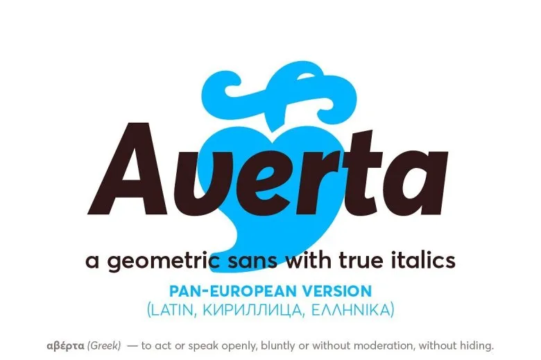
The typeface comes from the well-known foundry Intelligent Design, created by designer Panagiotis Haratzopoulos. Knowing the source helped me trust it for professional branding work. The family is quite broad, with multiple weights and styles, which makes it flexible for systems where typography carries a lot of the design logic.
When I study the letterforms closely, I see careful attention to curves and counters. The lowercase “a” and “e” feel open and airy, which supports good readability. Spacing is even, with a rhythm that holds up in long text blocks. The mood is modern, rational, and gently approachable. As a sans-serif font family, it works better in clean, structured layouts than in very expressive or decorative settings. It can look a bit too controlled if you need strong personality or drama.
Where Can You Use Averta Font?
I find Averta Font particularly strong in branding, digital products, and editorial systems that call for clarity and order. It handles large display sizes well, so headlines and hero text look crisp and confident. At the same time, it can sit quietly in UI labels, menus, and small captions without drawing unwanted attention.
For body copy, it stays readable at smaller sizes, especially on high-resolution screens. Print use also feels safe, as the letterforms stay clear in brochures, reports, and catalogues. I would use it for start-ups, tech platforms, cultural brands, universities, or public sector work where trust and clarity matter. It speaks to audiences who expect clean, thoughtful design.
In terms of pairings, I like combining this typeface with a more expressive display font for titles or pull quotes. It also pairs nicely with a simple serif for long-form reading, where the serif handles the text and Averta supports navigation, charts, and UI elements. Layouts with strong grids, plenty of white space, and calm colour palettes tend to bring out its best qualities.
Font License
Licensing for Averta Font can vary depending on the source and package you choose. Some licences cover only personal or testing use, while others include full commercial rights. Before using it in client work, apps, or large branding projects, always check the official licence terms carefully and make sure they match your needs.
My honest take as Ayan Farabi: I reach for Averta when I need a solid, modern base that does its job quietly and well, without fighting the rest of the design.


Leave a Reply