
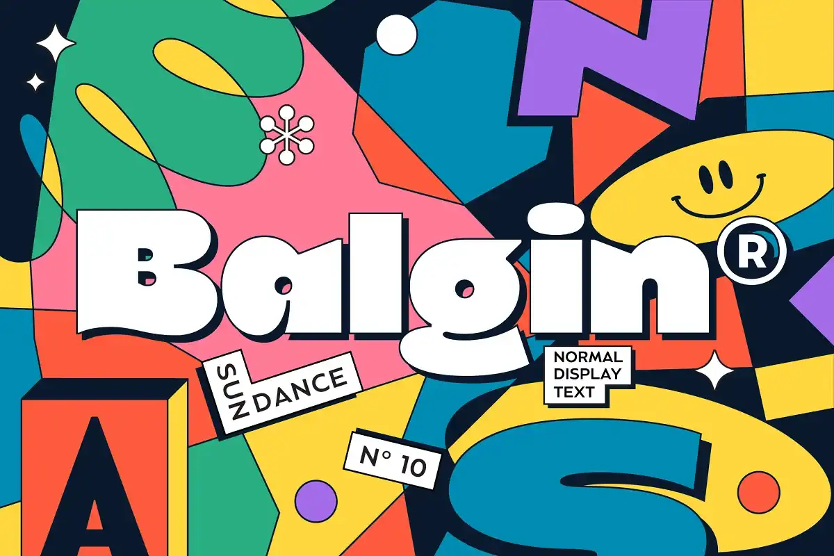

About Balgin Font
I came across the Balgin Font while working on a clean brand refresh for a digital product. I needed a modern sans with a friendly voice, something that felt confident but not cold. Balgin looked like it could balance that mix, so I decided to test it in a full interface layout.
During that project, I tried Balgin for headings, navigation labels, and small captions. It held together well across each role, which made me curious to explore it deeper for Free Fonts Lab. The more I used it, the more I noticed how its rounded details shape the overall tone of the typography.
Font Style & Design Analysis
Balgin is a sans-serif font family with a clear geometric base and a soft, approachable finish. The structure feels organised, with clean strokes and simple shapes, but the rounded corners and subtle curves keep it from looking too strict. It sits in that space between technical and human, which makes it useful for many visual identities.
The font is published by Craft Supply Co., a foundry known for contemporary display and branding faces. You can see their usual taste in Balgin’s wide range of styles, from light to bold. The family feels planned for real design systems, not just a single logo use.
The letterforms have a steady rhythm, with even counters and generous spacing that make text easy to follow. The lowercase has a friendly, almost soft tone, while the uppercase looks stable and solid. In long paragraphs, Balgin stays readable, though very dense text can start to feel a bit mechanical. Its main strengths sit in headlines, short body copy, and clear interface text, where the font style can breathe.
Where Can You Use Balgin Font?
The Balgin Font works well in brand identity work where you want something modern but not too sharp. I have used it in SaaS dashboards, slide decks, and simple landing pages. In large sizes, its geometric letterforms look clean and polished, especially in logos, hero headlines, and bold calls to action.
At smaller sizes, Balgin’s sans-serif structure helps it stay legible on screens. Navigation menus, buttons, and form labels remain clear, even on mobile. For long-form reading, I would keep line lengths moderate and line spacing slightly open to avoid a blocky feel. Pairing it with a warm serif for body text can create a nice contrast.
I also found Balgin effective in editorial-style layouts and social graphics, where hierarchy matters. Use the heavier weights for strong titles and the lighter ones for supporting text. When pairing, simple sans-serif companions or a neutral serif work best, so the main typeface keeps its voice. For playful brands, the rounded forms can soften strict grids without losing clarity.
Font License
The Balgin Font comes with licence terms that may differ between personal and commercial use. I always recommend checking the current licence details from the official source before using it in client work or large projects, as terms can change over time.
For me, Balgin has become a solid option when I need a calm, modern sans that still feels human, and I keep it in mind for future interface and branding tasks.


Leave a Reply