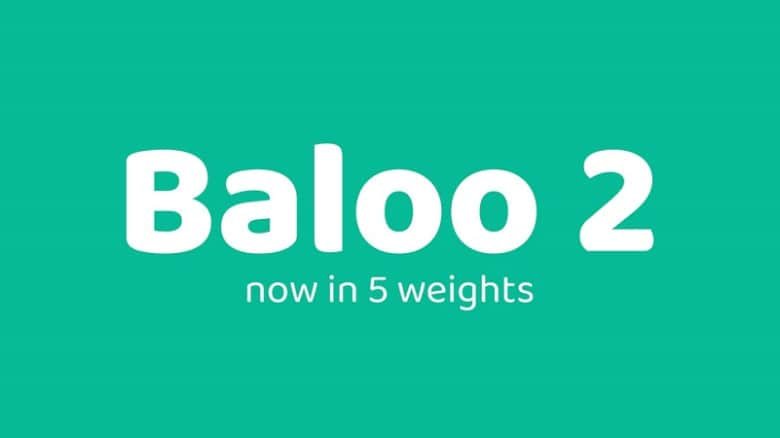
About Baloo 2 Font
I first reached for Baloo 2 Font while working on a set of friendly app screens for kids. I needed a typeface that felt bold, round, and cheerful without looking childish or messy. The heavy weight and soft curves caught my eye straight away.
As I tested it across headings, buttons, and short labels, the font felt playful but still clear. That balance made me curious to explore it deeper for Free Fonts Lab. I wanted to see how far this font family could stretch beyond just one fun project.
Font Style & Design Analysis
Baloo 2 Font is a sans-serif typeface with very chunky, rounded letterforms. Each character looks inflated, almost like a soft block. The large counters and generous curves give it a friendly, cartoon-like voice that still remains readable in short text.
The font comes from the Ek Type foundry, who focus on Indian language support and clear, modern typography. That background shows here, because this font family includes many scripts and still keeps a steady rhythm. The care in spacing and shaping feels thoughtful rather than flashy or random.
When I look closely at the letterforms, I see wide bowls, low contrast strokes, and tight but not cramped spacing. The rhythm is bouncy, which works great for headings, logos, and UI labels. It does struggle in long paragraphs, where the heavy weight can tire the eye. As a sans-serif display option, though, it delivers strong mood and easy alignment.
Where Can You Use Baloo 2 Font?
I like using Baloo 2 Font in projects that need warmth and approachability. It fits well in children’s apps, classroom posters, event graphics, and friendly brand identities. In large sizes, the round shapes shine and give a clear, happy tone that feels inviting to younger audiences and families.
On screens, I keep it mostly for headings, buttons, and short pull quotes. At smaller sizes, the heavy strokes and tight curves can feel dense, especially in long text blocks. Pairing it with a lighter, more neutral sans-serif body font often helps. This combo keeps the visual identity playful but still easy to read.
For packaging, social media graphics, and logotypes, the font style works best when you keep copy short and bold. It holds colour very well, especially bright palettes and gradients. I avoid using it for serious corporate or formal projects, because the mood leans clearly towards fun, casual, and energetic typography.
Font License
From what I know, Baloo 2 Font is usually available under an open licence, but terms can change. Before using it in any client or commercial project, always check the latest licence details from the official source. I never rely only on memory for licence decisions.
For me, Baloo 2 works best as a bold, friendly voice used in the right doses, and I reach for it when a project truly needs that playful edge.


Leave a Reply