

About Baloo Font
I first tried Baloo Font while working on a friendly learning app for kids. The client wanted text that felt playful, but still clear and easy to read. I needed a typeface that balanced fun shapes with proper structure, so the interface would not look messy or childish.
During testing, the rounded forms and bold presence caught my eye right away. It felt cheerful without shouting. I decided to explore it deeper for Free Fonts Lab and see how it behaved in different layouts, colours, and sizes. That process showed both its charm and its limits.
Font Style & Design Analysis
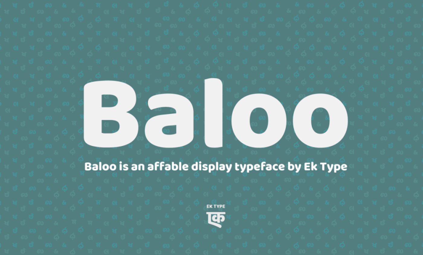
Baloo Font is a rounded sans-serif typeface with a very friendly voice. The letters are wide, bold, and soft, with almost bubble-like curves. It has a strong, chunky silhouette that pulls attention quickly, especially in short words. The mood is casual and warm, almost like a playful brand mascot in text form.
The font comes from the Ek Type foundry, which focuses a lot on Indian script support and approachable design. That background shows in the way the font family is built. It feels carefully drawn, with a clear idea of being inclusive and readable. The designer handled weight and shape very consistently.
The letterforms are open and generous, with big counters and tight joins that still stay legible. Spacing is on the loose side, which helps at display sizes, but can feel heavy in dense text blocks. The rhythm is bouncy rather than strict, which gives energy but reduces formality. As a sans-serif font family, it works best for headings, logos, and short UI labels, but not for long reading passages.
Where Can You Use Baloo Font?
I have found Baloo Font very useful in kid-focused and youth projects. It works well for educational brands, gaming dashboards, cartoons, and fun event posters. At large sizes, its thick strokes and rounded corners shine, especially when paired with bright colour palettes and clean, simple layouts around it.
In user interfaces, it can handle buttons, tags, and short labels, as long as you give it enough breathing room. For longer text, I usually pair it with a more neutral sans-serif typeface for body copy. A lighter, calmer companion font keeps the screen readable, while Baloo adds personality to titles and key messages.
For print, it works nicely on packaging, stickers, badges, and signage where you want a soft, welcoming tone. It suits family brands, food products, children’s books, and community projects. I would avoid using it for serious corporate identities or luxury brands, because its mood feels too playful and informal for those audiences.
Font License
The licence for Baloo Font can change depending on the source and version you use. Always read the official licence notes before any project, especially for client or commercial work. I recommend checking usage terms directly from the original foundry or distributor so your design and your client stay fully protected.
For me, Baloo works best as a focused tool: great when a project needs warmth, clarity, and bold friendliness, but not the right choice when quiet, long reading or strict professionalism is the goal.


Leave a Reply