

About Bank Gothic Font
I first reached for Bank Gothic Font while working on a simple sci-fi game mock-up. I needed something sharp, square, and cold, but not too loud. This typeface felt familiar from old movie posters and tech branding, so I decided to test it more seriously for that project.
What drew me in was its strict geometry and very clear structure. The shapes looked clean on screen, even at medium sizes. I later wrote about the font on Free Fonts Lab, after trying it in a few layouts and seeing where it worked and where it clearly did not.
Font Style & Design Analysis
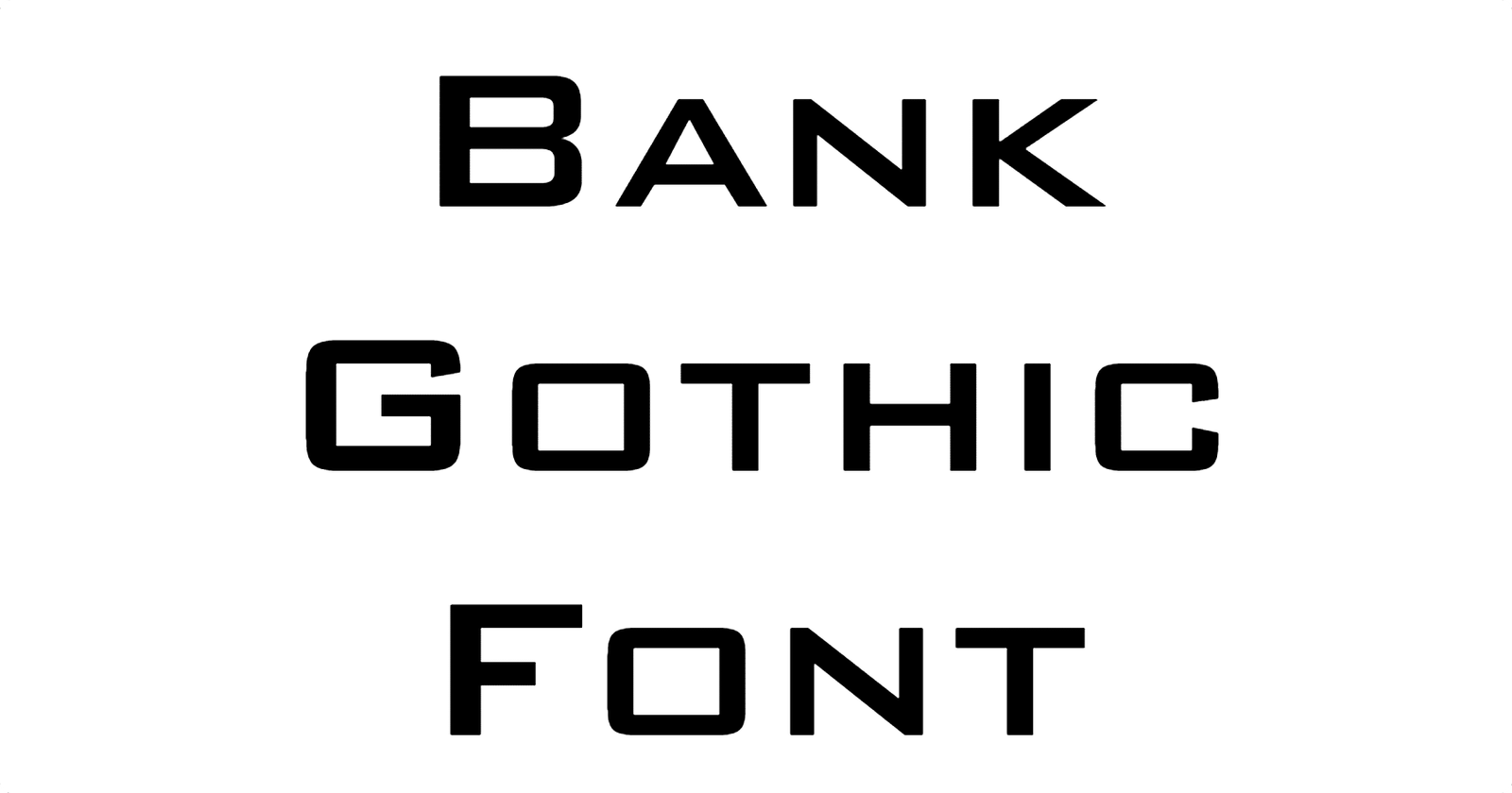
Bank Gothic Font is a sans-serif typeface with a strong industrial feel. The strokes are straight, the corners are mostly squared, and the forms sit inside a tight rectangle. It gives a hard, engineered mood that reminds me of machines, metal panels, and mid-century science fiction graphics.
The designer of this digital version is often unclear, so I treat it as “designer unknown” unless a specific foundry is named in the files. The design itself, though, clearly follows early 20th-century American gothic styles. You can see that in its rigid structure and the way the letters fill their box.
The letterforms have narrow proportions and very small curves, which makes words look compact and controlled. Spacing tends to feel tight, especially in all caps settings, so I often add a bit of tracking. The rhythm is stiff, almost mechanical, which suits titles but can feel tiring in long text. This sans-serif font family works best when you embrace its cold, futuristic voice and avoid body copy or very dense paragraphs.
Where Can You Use Bank Gothic Font?
I find Bank Gothic Font most useful in display work: logos, wordmarks, and short headlines. It shines in sci-fi themes, gaming titles, tech brands, and security or defence-related graphics. When you set it large, its square geometry becomes a clear design statement and builds a strong visual identity.
At medium sizes, like UI labels or menu titles, it still holds up, but you must watch the spacing. The narrow shapes can start to blend if the text is too long. In very small sizes, the straight strokes and tight counters lose clarity, so I avoid it for body text, captions, or long UI strings that users need to read quickly.
I often pair Bank Gothic Font with a softer humanist sans or a simple serif for longer reading. That way, the title keeps the hard, futuristic voice, and the supporting copy feels more friendly. It works nicely in layouts with strong grids, dark backgrounds, and neon or metallic colour schemes aimed at tech-savvy or gaming-focused audiences.
Font License
Licensing for Bank Gothic Font can change between different releases and foundries, so I never assume rights. For any client or commercial project, I always check the official source and read the licence text carefully before using it beyond personal experiments or mock-ups. That small step has saved me trouble more than once as Ayan Farabi.


Leave a Reply