

About Barcelony Font
I came across Barcelony Font while searching for a relaxed, personal signature style for a small beauty brand. The client wanted something soft, handwritten, and friendly, without looking childish or messy. The samples caught my eye because the strokes felt smooth, almost like fast pen writing on good paper.
I tested it first on a simple logo lockup, then on social media posts and packaging mockups. I wanted to see how this typeface behaved in different sizes and colours. For Free Fonts Lab, I also looked at how it fits inside a wider font family system, especially with clean sans-serif partners.
Font Style & Design Analysis
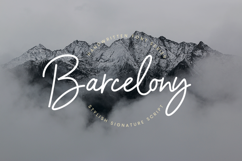
Barcelony Font is a handwritten script with a clear, flowing line that reads like a modern signature. The typography has relaxed curves, gentle loops, and a casual rhythm that still feels controlled. It sits in that space between personal handwriting and a styled logo wordmark, which gives it real flexibility.
The designer is unknown, which often makes me a bit careful, but the execution here feels deliberate. The stroke contrast is light, the curves are smooth, and the joins are mostly clean. Even without a famous foundry name attached, the font style shows a good eye for balance and visual identity, especially for branding work.
The letterforms lean slightly right, adding motion and energy without becoming wild. Spacing is fairly tight, so words feel connected and cohesive, which suits a handwritten category font. Some pairs need manual kerning in logos, but nothing dramatic. It shines in short words, names, and headings. Long text lines look repetitive and can feel tiring, so I avoid it for paragraphs or UI labels.
Where Can You Use Barcelony Font?
I find Barcelony Font works best in branding that wants warmth and personality, like beauty, lifestyle, or small craft businesses. It suits logos, packaging, and social media graphics, where a handwritten touch feels honest and human. At large sizes, the curves and loops look confident and elegant.
On smaller text, such as captions or menu details, the thin joints can start to break down. I usually keep it for headings, names, or short phrases, then pair it with a simple sans-serif for body copy. That mix keeps the visual identity clear while staying readable. A clean geometric or humanist sans usually sits nicely beside it.
This handwritten script also fits wedding invitations, greeting cards, quote posts, and signature-style email graphics. For more serious or corporate audiences, I use it very lightly, maybe just in a signature or a small accent. When I compare it to other handwritten fonts, it feels more polished than many free options, but still casual enough for everyday creative projects.
Font License
The licence for Barcelony Font can vary depending on where you download it, so I never assume it is free for commercial work. Always read the current licence terms from the original source before using it in client projects, logos, products, or large campaigns.
My honest takeaway as Ayan Farabi: it is a charming handwritten option when used with care, best kept for key words, names, and moments where a human touch matters.


Leave a Reply